When using a numeric column for the X-axis in a visualization (the category axis in a bar chart), you sometimes may want to bin the values to compare segments of the data to each other. One very handy tool to help you dynamically do this is the binning slider.
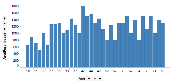
The bar chart below shows the average purchases of a customer group, where each bar represents the age of the customers.
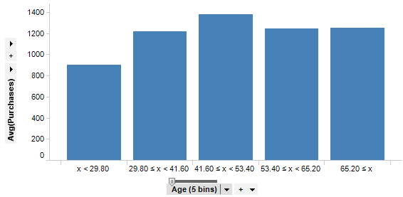
By right-clicking on the category axis selector, and selecting Auto-bin Column, the bars are automatically binned. In the example below there are five bins, which means all customers between 0 to 29 are gathered in the first bar, customers between 30 to 41 in the second bar, and so on.
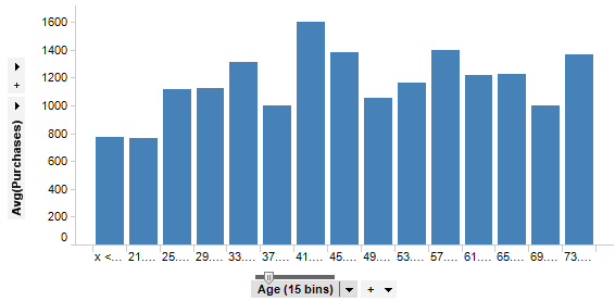
As you see there is a small slider with a handle just above the axis selector. This is the binning slider. By dragging this horizontally, you can alter the number of bins dynamically. In the example below, the slider has been set to show 15 bins.
You can also double-click on the slider handle to open a dialog where you can specify the desired number of bins.
Tip: The Auto-bin Column functionality is actually creating a custom expression using the BinByEvenIntervals function. There are more binning functions available in the Custom Expression dialog.
See also: