Option |
Description |
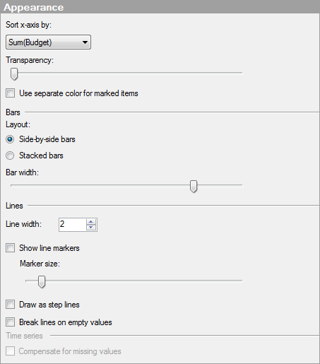
Sort
x-axis by |
Selecting (None) sorts the contents of the visualization by the natural sort order of the column chosen on the X-axis. However, you can also sort the visualization by any of the Series you have created in the combination chart. |
Transparency |
Drag the slider to change the transparency of the bars and lines. This can be useful if you want to be able to see lines or curves placed in the background through the bars, or if the visualization contains many lines which are placed on top of each other. |
Use
separate color for marked items |
Select this check box to use the specified marking color to distinguish marked items in this visualization. If the check box is cleared, then unmarked items will be faded out instead, and the original color will be kept for the marked items. See Marking in Visualizations for more information. |
Bars |
|
Layout |
|
Side-by-side
bars |
Use this option to place bars from the series category side-by-side next to each other instead of stacked on top of each other. |
Stacked
bars |
Use this option to keep series categories stacked on top of each other. |
Bar
width |
Drag the slider to modify the width of the bars. |
Lines |
|
Line
width |
Specifies the width of the lines in the combination chart. |
Show
line markers |
Determines whether or not markers should be displayed for the axis values. |
Marker
size |
Use the slider to increase or decrease the size of the markers. |
Draw
as step lines |
Select this check box if you want the lines to be drawn in incremental steps rather than as straight lines directly between each value. |
Break
lines on empty values |
Determines whether lines should be broken or remain connected when an empty value is found in the data that was used to create the line. |
Time
series |
|
Compensate
for missing values |
Select this check box if you are using a Date, Time or DateTime column somewhere in the visualization and you need to perform some calculation where a required time period is missing. For example, if you have created a visualization showing cumulative sums and there are missing data for some categories, selecting this check box will produce a bar or line value of the same size as the previous bar or line value instead of showing no value at all. See Working With Time Hierarchies for more information. Enabling this setting will temporarily add new rows with empty values for the missing periods so that they can be used in the calculation. |
See also:
How to Use the Combination Chart