Available Diagnostic Visualizations
This section lists the available diagnostic plots for the
model. They can be an aid to help determining the validity of a predictive
model. Different model methods display different lists of diagnostic plots.
Click on an option to display the visualization in the model page.
Residuals vs.
Fitted
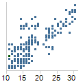
The residuals vs. fitted visualization is a scatter plot
showing the residuals on the Y-axis and the fitted values on the X-axis.
You can compare it to doing a linear fit and then flipping the fitted
line so that it becomes horizontal. Values that have the residual 0 are
those that would end up directly on the estimated regression line. The
residuals vs fit plot is commonly used to detect non-linearity, unequal
error variances and outliers.
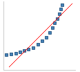
Shape (exaggerated) |
Conclusion |

|
When a linear regression
model is suitable for a data set, then the residuals are more
or less randomly distributed around the 0 line. |

|
When residuals form
a pattern in the visualization, then the current model might be
less suitable for the data. |
|
|
Normal
Quantile-Quantile
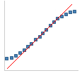
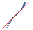
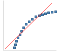
The normal quantile-quantile visualization calculates the
normal quantiles of all values in a column. The values (Y-axis) are then
plotted against the normal quantiles (X-axis).
Things to look for:
Shape (exaggerated) |
Conclusion |
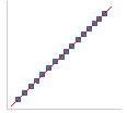
|
Approximately normal
distribution. |
|
Less variance than
expected. While this distribution differs from the normal, it
seldom presents any problems in statistical calculations. |
|
More variance than
you would expect in a normal distribution. |
|
Left skew in the distribution. |
|
Right skew in the distribution. |
|
Outlier. Outliers can
disturb statistical analyses and should always be thoroughly investigated.
If the outliers are due to known errors, they should be removed
from the data before a more detailed analysis is performed. |
|
|
Note:
Plateaus will occur in the plot if there are only a few discrete values
that the variable may take on. However, clustering in the plot may also
be due to a second variable that has not been considered in the analysis.
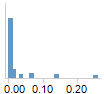
Scale
– Location
The scale –
location plot is similar to the residuals vs fit plot, but instead
of linear residuals it uses the square root of the residuals. It is used
to reveal trends in the magnitudes of residuals. For a good model, the
values should be more or less randomly distributed.

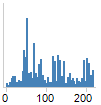
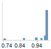
Cook's
Distance
Cook's distance is a statistic which tries to identify
those values which have more influence than others on the estimated coefficients.
High peaks in the bar chart might represent values that should be investigated
further, since they have a larger effect on the coefficients.
Response
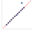
vs. Fitted or Predicted
The Response vs. Fitted or Response vs. Predicted visualization
is a scatter plot of the response variable versus the fitted values for
the model or the predicted values computed from new data using a previously
computed model. The ideal shape for this plot is all points on a line
with an intercept of 0 and a slope of 1 (about a 45 degrees angle). This
would indicate that the response values and values computed from the model
match up perfectly. In reality, the points will be in a diagonal band
around the (0,1) line. Points that deviate greatly from this band
can indicate outliers or deficiencies in the model.
Generally, the Residuals vs. Fitted or Predicted scatter
plot is a better visualization to diagnose model deficiencies, since the
deviations are centered around the horizontal line, y=0, instead of around
the (0,1) line.
Predicted
Probability Histograms
The Predicted Probability is a histogram of the predicted
probabilities for a particular level of the response variable. For a two
level response, you would like to have all the values in one histogram
close to one and, in the other histogram, all the values should be close
to zero.
ROC Curve
An ROC, or receiver operating characteristic curve, shows
the performance of the classifier as the threshold for class prediction
is varied. It is a plot of the sensitivity, or true positive rate of the
classifier, versus one minus the specificity, or false positive rate.
The true positive rate is the number of the predicted positives out of
true positives and the true negative rate is the number of the predicted
negatives out of the number of false positives. The predicted positives
and negatives varies as the threshold for class prediction varies.
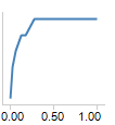
For example, with classes A and B, if the threshold is
set very low for class A (close to zero) then all the tree class A observations
will be classified as A (sensitivity is one). However, many class B observations
will also be incorrectly classified as A leading to a large false positive
rate. The ideal ROC curve starts at (0,0) goes up to (0,1) and then over
to (1,1).
Randomly assigning predicted classes leads to an ROC curve
that is a line with a slope of 1 from (0,0) to (1,1).
Variable
Importance Plot
The variable importance plot shows the importance of each
predictor in the model. For parametric models (linear and logistic regression),
the importance value is the absolute value of the test statistic for the
term in the model. The larger the test statistic, the more significant
the term is. For tree models (regression and classification), the variable
importance is the sum of the goodness of split measure for every split
the variable was used in. The values are scaled as a percentage - the
higher the percentage, the more important the variable is in the model.
See
also:
Using
a Model Summary
Using
a Table of Coefficients