The Column from Marked function is a way to look up which column to assign to a column selector by fetching the cell value in a data table. The cell would then contain the name of the column you want to assign to a property in a visualization, such as what to use on the X-axis or what to color by.
Use the Column from Marked function when you want to update the visualization iteratively and quickly set another column for the property. Once Column from Marked has been configured, pointing to a new cell by marking a row updates the property. If you only want to configure a visualization to use a certain column, you should not use the Column from Marked function.
Example:
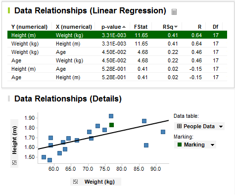
The Data Relationships tool uses the Column from Marked function to display the results from the calculation. The purpose of the Data Relationships tool is to calculate the correlation between the columns in a table, and then find and display highly correlated columns to see what they look like, one plotted against the other. See What is the Data Relationships Tool? for information about how to perform such a calculation.
The result from the Data Relationships tool is a new data table where each row shows the correlation between two columns from the original data table. The row includes the names of the two compared columns, and values for how well they correlate.
The tool creates two visualizations, one table visualization that displays the new correlation data table, and, in the linear regression case, one scatter plot that shows one column plotted against the other from the original data table. As you mark a row in the new correlation data table, the scatter plot is updated to display the two compared columns from that row. In this configuration, the X- and Y-axes of the scatter plot are configured using Column from Marked. That is, the names of which columns to display are fetched from the marked row in the new correlation data table. You change the marking by clicking on a row in the table visualization.
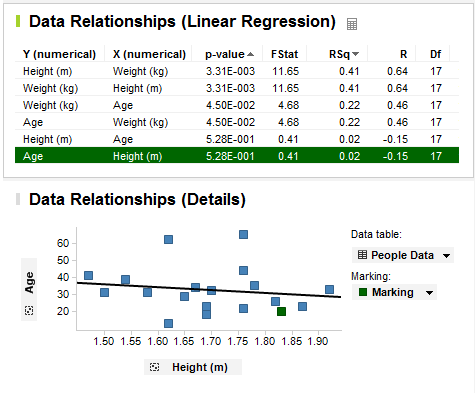
The way this is set up, you can quickly browse the correlation between columns by stepping through the rows in the table visualization. To update the scatter plot manually by interacting with the column selectors of the X- and Y-axes would take a much longer time.
See also: