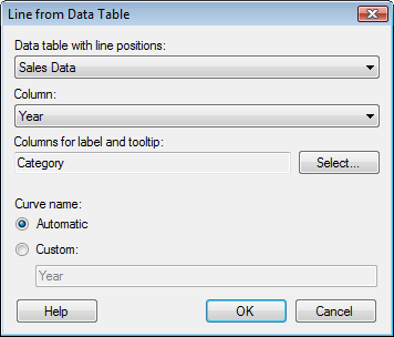
Use this alternative if you want to add lines to a visualization based on an existing data table in your analysis. A simple example is if you have a data table with number of sales for two different products on different dates, you can also have a data table with the minimum acceptable number of sales on any given day for the different products. If the data with number of sales is set as a visualization, you can add lines from the minimum number of sales data table. This gives you an easy way of seeing whether any products have fewer sales than you expect.

Option |
Description |
Data
table with line positions |
Lists the available data tables in the analysis. |
Column |
Select the column in the data table from which you want to create your reference line. |
Columns
for label and tooltip |
Lists the columns from the data table selected above that should also be used in the label and/or tooltip for the line. You can change whether to display the contents from the column in the label, in the tooltip or in both using the Label and Tooltip dialog. |
Select... |
Opens the Select Columns dialog where you can select the columns that should be possible to use in a line's label and/or tooltip. |
Curve
name |
|
Automatic |
Sets an automatic name for the line. |
Custom |
Allows you to set a custom name for the line by typing a name in the text field. |
See also: