3D scatter plots are used to plot data points on three axes in the attempt to show the relationship between three variables. Each row in the data table is represented by a marker whose position depends on its values in the columns set on the X, Y, and Z axes.
A fourth variable can be set to correspond to the color or size of the markers, thus adding yet another dimension to the plot.
The relationship between different variables is called correlation. If the markers are close to making a straight line in any direction in the three-dimensional space of the 3D scatter plot, the correlation between the corresponding variables is high. If the markers are equally distributed in the 3D scatter plot, the correlation is low, or zero. However, even though a correlation may seem to be present, this might not always be the case. The variables could be related to some fourth variable, thus explaining their variation, or pure coincidence might cause an apparent correlation.
You can change how the 3D scatter plot is viewed by zooming in and out as well as rotating it by using the navigation controls located in the top right part of the visualization.
Note: The 3D scatter plot is not supported in TIBCO Spotfire Web Player. It is still possible to open an analysis with a 3D scatter plot in the web player, but the 3D scatter plot will not be shown.
Example:
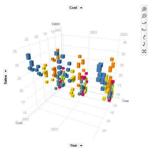
In the 3D scatter plot below, sales, cost, and year are plotted against each other for a number of different products (colored by product).
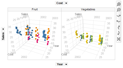
Each category can be shown separately using trellising. In the example below, the markers are colored by product, and trellised by category:
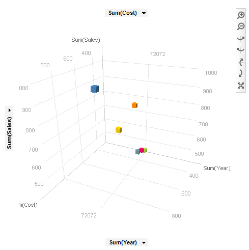
The 3D scatter plot can also be used together with aggregation (for example, Sum or Average) by using the setting Marker By. In this case, the values for a certain category are bundled together to display a single marker for each category as seen in the example below. The aggregated markers can also be sized by the count of items within each category, or by any other column.
Example:
Labels can be used in visualizations to identify and describe markers and the data associated with them.
Example:
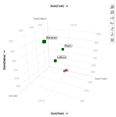
In the 3D scatter plot below, labels show which category each of the marked markers belongs to.
All visualizations can be set up to show data limited by one or more markings in other visualizations only (details visualizations). 3D scatter plots can also be limited by one or more filterings. Another alternative is to set up a 3D scatter plot without any filtering at all. See Limiting What is Shown in Visualizations for more information.
See also: