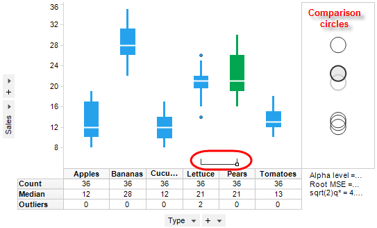
The drawing of comparison circles is a way to display whether or not the mean values for various categories (boxes in the box plot) are significantly different from each other. The circles are drawn with their centers at the mean value for the box to which it corresponds.
If the circles for different groups do not overlap, the means of the two groups are generally significantly different. If the circles have a large overlap, the means are not significantly different.
In the example above, the sum of sales is shown for a number of different fruits and vegetables. The box for Pears has been marked, which is also indicated in the corresponding comparison circle. The marked comparison circle is shown with a darker border and a transparent fill. By looking at the comparison circles or the little relation indicator at the bottom of the visualization area (circled in red on the image), one can see that the sum of sales for Lettuce does not display a significantly different group mean, whereas the group means for all other fruits and vegetables are significantly different from that of Pears. The square in the relation indicator indicates the marked box and the lines in the relation indicator extend to any boxes that are not significantly different from the marked one.
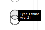
You can also highlight a comparison circle by highlighting its box plot or vice versa. The highlighted comparison circle is drawn with a double lined border:
Tip: You can resize the area containing the comparison circles by placing the mouse pointer over the vertical line separating the circles from the box plots and dragging the handle to the desired position.
See also: