Box plots are graphical tools to visualize key statistical measures, such as median, mean and quartiles.
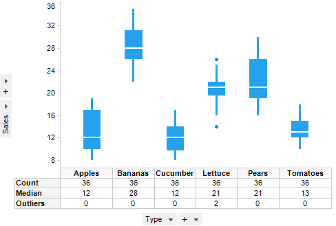
A single box plot can be used to represent all the data. It is also possible to visualize separate statistics for subsets by selecting a column for the X-axis.
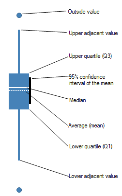
The individual box plot is a visual aid to examining key statistical properties of a variable. The diagram below shows how the shape of a box plot encodes these properties. The range of the vertical scale is from the minimum to the maximum value of the selected column, or, to the highest or lowest of the displayed reference points.
Which reference points should be shown in the box plot is selected in the Properties dialog. There, it is also possible to change the shape and color of each reference point. The shape of outside values cannot be changed. For details of each measure, see Statistical measures.
The axis selectors control which column is mapped to which axis. See Column Selectors for more information about how they work.
The Y-axis should be set to the column or columns on which the statistical measures should be based.
The X-axis can be set to any column. However, since a separate plot will be drawn for each unique value, the column or hierarchy should not contain too many unique values. To summarize the data in a single plot, select (None) on the X-axis. If multiple columns are used on the Y-axis, '(Column Names)' must be used either on the X-axis or in one of the trellis options.
All visualizations can be set up to show data limited by one or more markings in other visualizations only (details visualizations). Box plots can also be limited by one or more filterings. Another alternative is to set up a box plot without any filtering at all. See Limiting What is Shown in Visualizations for more information.
See also: