What is the Data Relationships Tool?
The Data Relationships tool is used for investigating the
relationships between different column pairs. The tool always works on
the currently filtered data. The Linear regression and the Spearman R
options allow you to compare numerical columns, the Anova option will
help you determine how well a category column categorizes values in a
(numerical) value column, the Kruskal-Wallis option is used to compare
sortable columns to categorical columns, and the Chi-square option helps
you to compare categorical columns.
For each combination of columns, the tool calculates a
p-value, representing the degree to which the first column predicts values
in the second column. A low p-value indicates a probable strong connection
between two columns.
The resulting table displays the p-value for each combination
of Y and X columns. The table is sorted by p-value. Clicking on a column
heading will sort the rows according to that column.
Example:
Consider the following data table, which lists a few attributes
of a group of people:
Eye color, Gender, Height (m),
Weight (kg), Age
blue, female, 1.65, 62.7, 29
blue, female, 1.50, 57.0, 31
blue, female, 1.69, 64.2, 18
blue, male, 1.58, 63.2, 31
green, male, 1.76, 70.4, 44
green, male, 1.82, 72.8, 26
green, male, 1.92, 76.8, 33
green, female, 1.54, 61.6, 39
green, female, 1.76, 70.4, 22
brown, female, 1.67, 66.8, 34
brown, female, 1.47, 58.8, 41
brown, male, 1.69, 71.0, 23
brown, male, 1.78, 74.8, 35
brown, male, 1.83, 76.9, 20
brown, female, 1.62, 87, 62
blue, male, 1.87, 86.5, 23
brown, male, 1.76, 92, 65
brown, male, 1.62, 59, 13
green, female, 1.70, 59, 32
(To test the example,
copy all of the above text and paste it in TIBCO Spotfire.)
Select Tools
> Data Relationships....
Response: The Data Relationships dialog is displayed.
Select Linear
Regression (numerical vs numerical) as the comparison method.
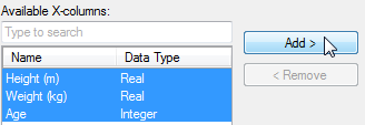
Send all Available Y-columns
to the Selected Y-columns list by clicking on them in the list and
then click on Add >.

Send all Available X-columns
to the Selected X-columns list by clicking on them in the list and
then click on Add >.
Click OK.
Response: A new data relationships table is created,
together with a scatter plot based on the marked row in the table.
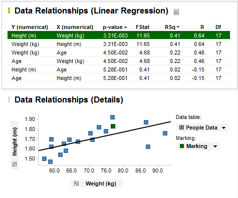
The scatter plot shows the Y and X column from the currently
marked row in the data relationships table. Since Height vs. Weight got
the lowest p-value of all columns investigated, this column pair is listed
first in the data relationships table, and is marked by default. Not surprisingly,
it appears as if there is a correlation between the Height and Weight
of the test persons.
By clicking on a different row in the data relationships
table, the scatter plot changes to display the new column pair:
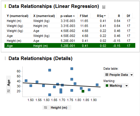
The p-value for Age vs. Height is quite high and according
to the scatter plot, there does not seem to be any significant correlation
between those two columns in the current data.
See also:
How
to Use Data Relationships
Details
on Data Relationships