Trellised visualizations enable you to quickly recognize similarities or differences between different categories in the data. Each individual panel in a trellis visualization displays a subset of the original data table, where the subsets are defined by the categories available in a column or hierarchy.
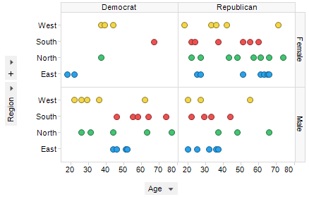
For example, if you choose to trellis a visualization based on the two variables "Gender" and "Political affiliation", this will result in four separate panels representing the combinations Female-Republican, Female-Democrat, Male-Republican, and Male-Democrat. If the "Gender" variable is used in conjunction with another variable that has five different values, this will yield ten panels. From this follows that variables with a continuous distribution and a wide range of values (for example, Real values) should be binned before they are used to form a trellis visualization. Otherwise the number of panels quickly becomes unmanageable.
Example:
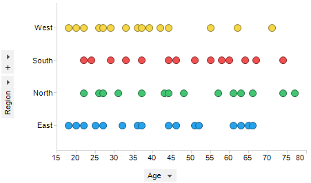
This is a standard non-trellised scatter plot:
By trellising this visualization based on Gender and Political affiliation, it will look like this:
To trellis a visualization:
Select the visualization you want to trellis.
Right-click on the visualization and select Properties.
Select Trellis.
Select the Rows and Columns you want to trellis by.
Specify additional trellis parameters, and click Close.
See also:
Visualization Properties - Trellis