First part of the dialog
Option |
Description |
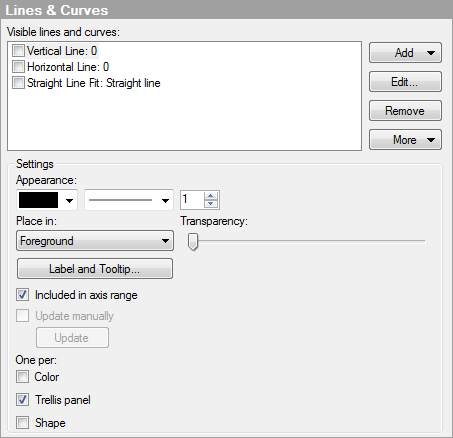
Visible
lines and curves |
Lists the currently added lines and curves. If a check mark is shown in the check box, then the line or curve is shown in the visualization. Clear the check box to hide a line or curve. New lines or curves can be added to this list by clicking on the Add button; see below. |
Add |
Displays a menu where you can select which type of line or curve to add to the list of available lines and curves, and in some cases, opens a dialog where you can specify settings to use for that line or curve. For more information about the different curve types, see Curve Fit Models. |
Edit... |
Opens a dialog where you can change the settings for the selected line or curve (when applicable). |
Remove |
Removes the selected line or curve from the list of available lines and curves. |
More |
|
Duplicate |
Duplicates the currently selected line or curve. This can be particularly useful if you want to add one static curve that is calculated on the whole data set (select the Update curve manually check box) and another one that is changed upon filtering (default). |
Export
Curve Fit Result... |
Opens a dialog where you can choose to export the curve fit result for the selected curve to a text file or to Microsoft® Excel®. The text file can be either a regular tab separated text file, or a Spotfire Text Data Format file, which contains a bit more information about the columns (types, etc.). The Excel file can be either an XLS file or an XLSX file. |
Settings
Option |
Description |
Appearance |
Determines the color, style and width of lines and curves, and the color, style and size of points. |
Place
in |
Select whether to place the line, curve or point in the Foreground or Background of the visualization. |
Transparency |
Determines the transparency of the selected line, curve or point. That is, the degree to which the markers can be seen through it. The transparency is strongly connected to the color. |
Label
and Tooltip |
Opens a dialog where you can determine what information to show in the label and/or tooltip for the selected line, curve or point. |
Included
in axis range |
Sets the automatic zooming so that the line, curve or point is always shown, even if it lies far from the currently filtered values. |
Update
manually |
Select the check box to "freeze" the line or curve so that it is not automatically recalculated upon filtering. You can update the line or curve by clicking the Update button below or by right-clicking in the visualization and selecting Update Lines and Curves and clicking on the one you want to update. Note: Not applicable for points. |
Update |
When a line or curve has been specified to be manually updated, use this button to perform the update. |
One
per |
Determines whether to show one line or curve per Color, Trellis panel, and/or Shape. Note: Not applicable for points. Note that you should apply true categorical coloring before using the color option. If you use a continuous column on the color axis, you may end up with a different result than the expected. This applies even if the continuous color mode looks "categorical" at first sight. |
See also: