Details on Property Control
This dialog is used to define a control device in the text
area that can change the content of a property in an easy way. See Using Properties
in the Analysis for examples of possible areas of application. For
more information about how to set the options to be shown in a control,
see the description for each control below. For a general description
of search expressions, see Searching
in TIBCO Spotfire.
You cannot display more than 1000 values in a property
control. However, you should try keep down the number of available values
as much as possible in order to make the control easier to use.
Click on the Toggle Edit Mode
button,  ,
in the text area title bar.
,
in the text area title bar.
Comment: You can also right-click in the text area
and select Edit Text Area
from the pop-up menu.
In the Text
Area toolbar, click on the Insert Property Control button and
select which type of control to add.
Option |
Description |
Control
type
|
Displays
the type of property control that you have selected to add. You
can choose from:
Label - shows
the current value of the selected property in the text area:

The label can also be used with binary properties.
This means that you can use it to display images as well as text.
Input field -
adds a text box where you can type a new value for the property:
Input field (multiple
lines) - adds a text box where you can type new values
for a string property with multiple lines:
The Input field (multiple lines) control can
only be used with string properties.
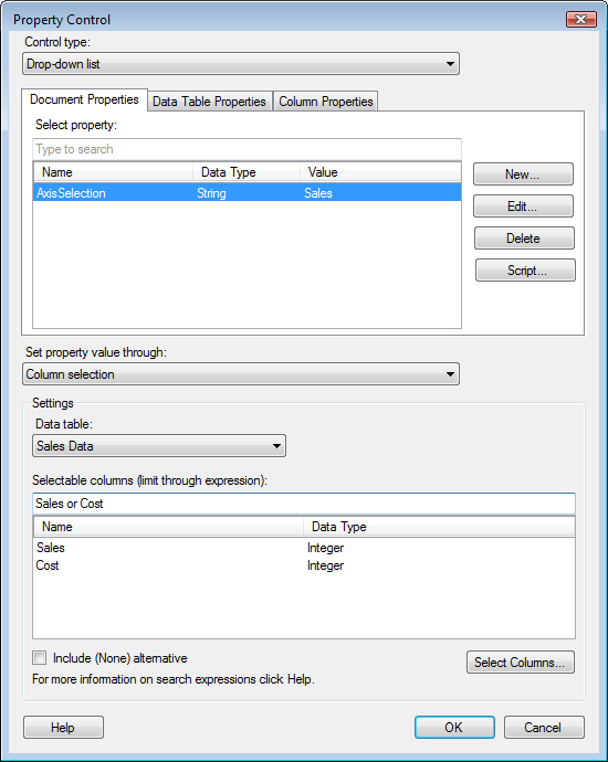
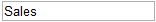
Drop-down list
- adds a drop-down list, where the property value can be
changed by selecting among predefined options:

List box - adds
a list box, where the property value can be changed by selecting
among predefined options:

List box (multiple select)
- adds a list box, where the property value can be changed by
selecting several predefined options:

The List box (multiple select) control can
only be used with multiple line string properties.
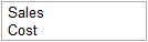
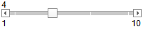
Slider - adds
a slider where the property values can be changed by moving the
slider:
The current property value is displayed in
a label above the slider. |
Document
Properties
|
|
Select
property
|
Click to
select which property that the property control should change. |
New...
|
Opens the
New
Property dialog where you can define a new property which
the property control should change. |
Edit...
|
Allows
you to edit the first (default) value to use on the selected property. |
Delete
|
Deletes
the selected document property. |
Script...
|
Opens the
Script
– Act on Property Change dialog where you can define a script
action that should be performed whenever the document property
changes its value |
Data
Table Properties
|
|
Data
table
|
Select
the data table of interest. |
Select
property
|
Click to
select which property that the property control should change. |
New...
|
Opens the
New
Property dialog where you can define a new property which
the property control should change. |
Edit...
|
Allows
you to edit the first (default) value to use on the selected property. |
Delete
|
Deletes
the selected data table property. |
Column
Properties
|
|
Data
table
|
Select
the data table of interest. |
Column
|
Select
the column of interest. |
Select
property
|
Click to
select which property that the property control should change. |
New...
|
Opens the
New
Property dialog where you can define a new property which
the property control should change. |
Edit...
|
Allows
you to edit the first (default) value to use on the selected property. |
Delete
|
Deletes
the selected column property. |
Set
property value through
|
Allows
you to specify how the property value should be selected:
Column selection
- displays a list of columns to select from.
Unique values in column
- displays a list of values picked from a column.
Expressions -
displays a list of values obtained via more or less complex calculations.
Fixed values -
displays a list of values that you define yourself.
Numerical range
- displays a range of values from min to max using a specified
value interval. |
Settings
|
See the
settings for each method below. |
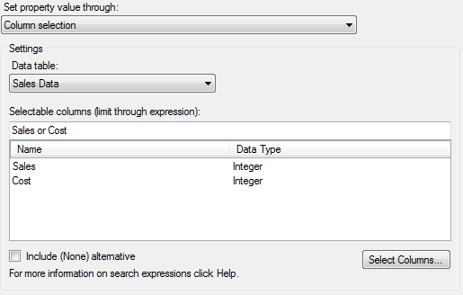
Column selection
Displays a list of columns from which you can select a
column. The columns shown can be either all columns in the data table
or a specified selection of columns.
Option |
Description |
Data
table
|
Select
the data table from which to pick columns. |
Selectable
columns
|
Lists all
columns that will be available for selection in the property control.
If not all columns in the data table should be available, you
can type an expression to limit which columns to show. Expressions
can limit the available columns to ones of a certain data type,
like "DataType:Integer" or simple conditions using the
column names or the beginning of the names to show, e.g., only
columns beginning with A: "A". For more information
about possible search expressions, see Searching
in TIBCO Spotfire. |
Include
(None) alternative
|
Adds the
alternative (None) to the list of available options. |
Constraints...
|
[Available
for multiple select list boxes only.]
Opens the Selection
Constraints dialog where you can determine whether or not
there should be a min or a max number of selections possible in
the list box. |
Select
Columns...
|
Opens the
Select Columns dialog
where you can hand-pick the columns you want to show in the control.
The selected columns will receive the same boolean column property
value and a search expression matching this value will automatically
be added to the Selectable columns field above. |
Unique values in column
Displays a list of the unique values available in
a column. See Example
of Property Controlled On-Demand Data for an example using this type
of property control.
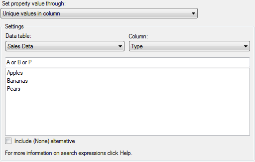
Option |
Description |
Data
table
|
Select
the data table from which to pick columns. |
Column
|
Select
the column containing the values that should be available for
selection. |
Selectable
values
|
Lists all
values that will be available for selection in the property control.
If not all values in the column should be available, you can type
an expression to limit which values to show. Expressions can limit
the available values to show, e.g., only values beginning with
A: "A". For more information about possible search expressions,
see Searching
in TIBCO Spotfire. |
Include
(None) alternative
|
Adds the
alternative (None) to the list of available options. |
Constraints...
|
[Available
for multiple select list boxes only.]
Opens the Selection
Constraints dialog where you can determine whether or not
there should be a min or a max number of selections possible in
the list box. |
Expressions
Available for string properties only. Displays a list of
values obtained via more or less complex calculations. The expressions
option provides a list of strings that can be used as expressions on an
axis, or to define curves, etc. It is a special case of the fixed values
option, and can only be used with string properties.
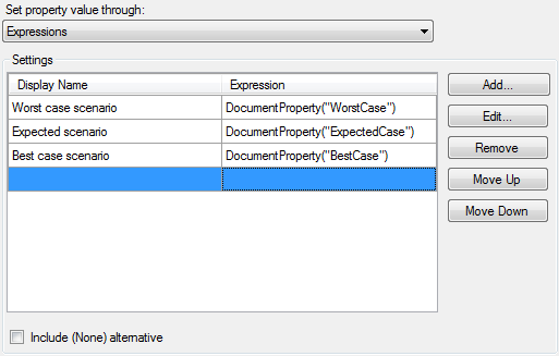
In the example above, each option has been tied to another
(numerical) property which in turn can be changed using other property
controls.
It is possible to copy and paste items in the list using
the pop-up menu or Ctrl+C and Ctrl+V.
Option |
Description |
Display
name
|
Lists a
display name for each option that the end users of the control
should see. |
Expression
|
Lists the
expressions that define each option. |
Add...
|
Opens the
Custom Expression dialog where you can define an expression to
calculate the value. The name you select for your expression will
be the Display name that the end users of the property control
will see. |
Edit...
|
Opens the
Custom Expression dialog so you can edit the expression of the
selected option. |
Remove
|
Removes
the selected option. |
Move
Up
|
Moves the
selected option up one step. |
Move
Down
|
Moves the
selected option down one step. |
Include
(None) alternative
|
Adds the
alternative (None) to the list of available options. |
Constraints...
|
[Available
for multiple select list boxes only.]
Opens the Selection
Constraints dialog where you can determine whether or not
there should be a min or a max number of selections possible in
the list box. |
Fixed values
Displays a list of values that you define yourself. The
display name used in the control can be different from the actual value
of the alternative.
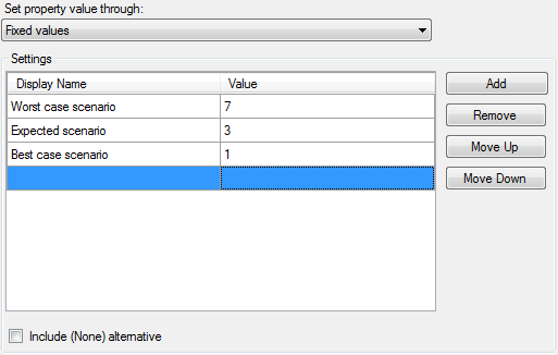
It is possible to copy and paste items in the list using
the pop-up menu or Ctrl+C and Ctrl+V.
Option |
Description |
Display
name
|
Type a
display name for each option that the end users of the control
should see. |
Value
|
Type a
value for each option. |
Add
|
Adds a
new row where you can type a new option. |
Remove
|
Removes
the selected option. |
Move
Up
|
Moves the
selected option up one step. |
Move
Down
|
Moves the
selected option down one step. |
Include
(None) alternative
|
Adds the
alternative (None) to the list of available options. |
Constraints...
|
[Available
for multiple select list boxes only.]
Opens the Selection
Constraints dialog where you can determine whether or not
there should be a min or a max number of selections possible in
the list box. |
Numerical range
Displays a range of values from min to max using a specified
value interval. Can be used with numerical properties only.
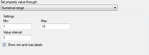
Option |
Description |
Min
|
Allows
you to specify the min value of the numerical range. |
Max
|
Allows
you to specify the max value of the numerical range. |
Value
interval
|
Allows
you to specify the interval between the tick marks in the slider.
For example, with a range from 1-10 and an interval of 1, you
will be able to change the slider in steps of one:
If the value interval is increased to 3, the
number of tick marks will be fewer and the property will increase
its value by three for each step.
If the max number and the interval steps do
not break even, there will be a shorter interval between the last
available values. |
Show
min and max labels
|
Clear the
check box to remove the labels for the max and min values of the
control and just keep the current property value above the control. |
See
also:
How
to Use the Text Area