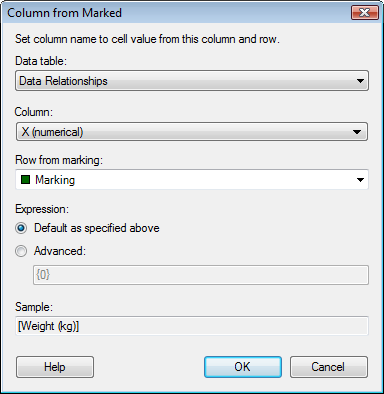
The Column from Marked functionality allows you to create a visualization which changes what column is used on an axis depending on what you mark in a different visualization. This makes it possible to create a visualization that is connected to, say, a table visualization for example, in such a way that when you click on the table, the axes of the new visualization will change to show the values of a specified cell in the table. The cell should contain a column name available in the current data table. For an example of how it works, see the automatically created visualizations from a Data Relationships calculation.
To reach the Column from Marked dialog:
Right-click on the axis selector of the axis of interest.
Select Column from Marked... from the pop-up menu.
Note: Once the Column from Marked functionality has been switched on, it will be used to continuously update the visualization until it is switched off. This means that any other configuration that you try to apply to the visualization will be lost each time the marking changes.

Option |
Description |
Data
table |
Lists the available data tables. This is where you select the data table containing the column with all column names. |
Column |
Lists the available columns in the selected data table. Select the column containing all column names that should appear on this axis upon marking. |
Row
from marking |
Lists the available markings. Select the marking that should define what is shown on this axis. If more than one item is marked, the first item will be used to define the value to use on the axis. |
Expression |
|
Default
as specified above |
The expression is by default set to the plain cell value as specified by the input fields at the top of the dialog. A suitable aggregation method is automatically selected depending on the type of axis in the visualization. The text "Sales 2004" can, thus, be interpreted as "[Sales 2004]" on the Y-axis of a scatter plot, as "Sum([Sales 2004])" on the value axis of a bar chart and as "<[Sales 2004]>" on a categorical category axis of a bar chart. |
Advanced |
The {0} variable refers to the value defined by the three input fields in the dialog (the plain cell value) and the cell value is automatically escaped to a column expression by the addition of straight brackets. It is possible to extend this expression and include additional columns and/or apply aggregation methods. The expression is extended using the same syntax as custom expressions. If additional columns are specified, these will appear as individual column selectors for the visualization property once the Column from Marked function has been applied.
Examples: The expression "{0}, [Sales 2005]" applied on a continuous column containing the column names "Sales YearX" could result in "[Sales 2004], [Sales 2005]" , "[Sales 2003], [Sales 2005]", etc., on the axis, depending on what year was marked.
The expression "Sum({0})" would result in the expression "Sum([Sales 2004])", hence, an aggregated, continuous column on the axis.
The expression "Sum({0}) over AllPrevious([Axis.X])" would result in the expression "Sum([Sales 2004]) over AllPrevious([Axis.X]", hence, a cumulative sum on the axis.
The expression "<{0}>" with a categorical column containing genders would result in the expression "<[Male]>" or "<[Female]>" on the axis, depending on what was marked.
The expression "<{0} nest [Product]>" with a categorical column containing genders would result in the categorical hierarchy "<[Male] nest [Product]>" or "<[Female] nest [Product]>" on the axis, depending on what was marked. |
Sample |
Displays a sample of the currently used expression. |
See also: