Creating a pie chart

A pie chart is a circle graph that is divided into sectors. It is used to compare values for different categories in your data on a relative basis. Each pie sector represents a specific category, and its size the category's contribution to the whole value, expressed as a percentage. The values are usually sums.
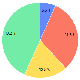

Pie chart example.
The main axes in the pie chart are the Color axis and the Sector size axis in the legend.
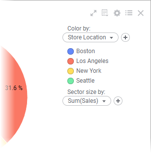
Pie chart axes in the legend.
You use the Color axis to divide the pie into sectors, and the Sector size axis to specify what data the sectors' relative sizes should reflect.

Procedure

  1. On the authoring bar, click Visualization types to open the flyout.
  2. Drag the Pie chart visualization type to the wanted position on the analysis page.
    A suggestion of a pie chart is presented.
  3. On the Color axis in the legend, select the column containing the categories that you want to present as pie sectors.
  4. On the Sector size axis, select the column containing the data that the sizes of the sectors should reflect.
  5. For the selected column on the Sector size axis, make sure that the aggregation type is set to Sum.

    There are times, though, when Count or UniqueCount are useful aggregation types.

Example

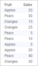
The data table lists the sales of different fruits.
Example data table.
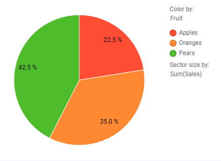
The pie chart below displays the different fruits' contributions to the total sales. Note the settings on the Color and Sector size axes.
Pie chart showing the contribution of different categories to the total sales.