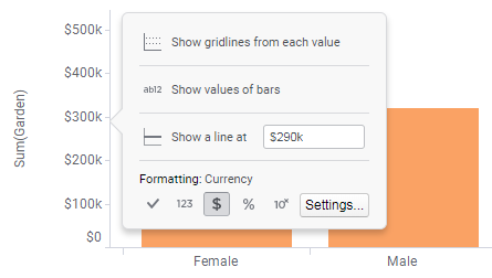
Showing gridlines
You can add gridlines to the visualization background to make it easier to get a reading of the value for an item. Gridlines are dotted lines that are drawn horizontally or vertically from the tick marks on numerical axes.
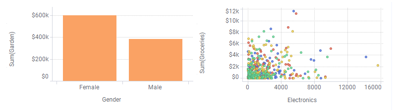
The visualizations are by default drawn without gridlines. Gridlines can be added on the value and category axes in bar charts, and the X- and Y- axes in line charts, combination charts, and scatter plots provided that the axes represent numerical values. Examples of visualizations with gridlines are shown below.
Procedure
Copyright © Cloud Software Group, Inc. All rights reserved.