Creating a parallel coordinate plot

A parallel coordinate plot is used to compare data values which are of completely different types or magnitudes within a single visualization. The values are normalized and then presented as points on a line with one point per data column. The visualization is useful also for examining patterns.

The normalized values are expressed as a percentage. The lowest value in a data column is always set to 0%, and the highest value is set to 100%. Values in between are recalculated accordingly. The normalization makes it possible to visualize columns containing values of completely different magnitudes. For example, a column with values between 0 and 1 and a column with values between 0 and 10000 can be visualized at the same time in the parallel coordinate plot.
Parallell coordinate plot example.
The values can represent aggregated data or non-aggregated data for the particular data point. An aggregated value could be, for example, a sum, an average or the first value in a data column.

Important axes are the Line by axis and the Color by axis in the legend. These axes are used to select the columns whose values you want to represent as lines.


Line and Color axis in the legend.

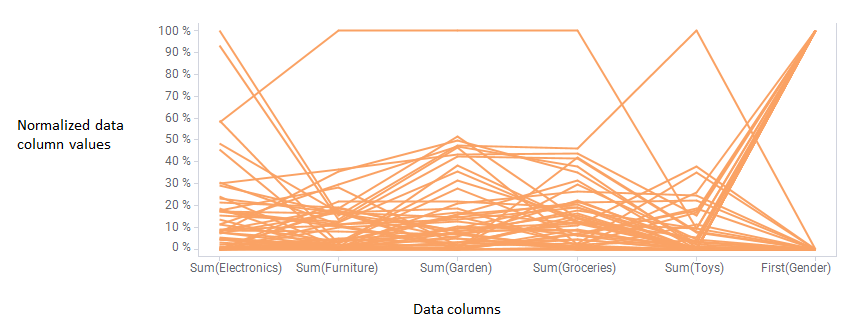
For example, the parallel coordinate plot above is based on customers' total purchase amounts at different store departments. Each customer is represented by a line, so buying patterns can be examined. To illustrate, see the line below. This customer seems to be a high spender in the first place at the furniture, garden and groceries departments, but also at the electronics department. The toys purchases are relatively low though.
Parallel coordninate plot showing customer purchase patterns.

Note: The scale of the various columns is totally separate, so do not compare the height of the line in one column to the height of the line in another column. For example, the actual amount the customer spent on the toys department above may be higher than the amount spent at any other department.

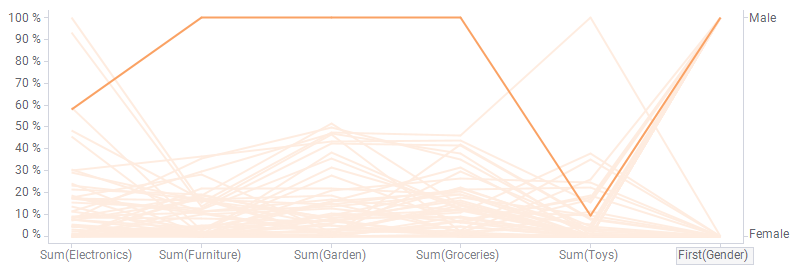
Also categorical column values are possible to visualize. Note the gender column furthest to the right where male and female customers are split into different values on the percentage scale.

Procedure

  1. On the authoring bar, click Visualization types to open the flyout.
  2. Drag the Parallel coordinate plot visualization type to the wanted position on the analysis page.
    A suggestion of a parallel coordinate plot is presented.
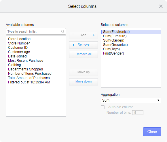
  3. Select the data columns you wish to include in the visualization.
    1. Click the horizontal axis.
      The Select columns... button appears.
      Select columns button.
    2. Click it to open the Select columns dialog.
      An example of the dialog is shown below.
      Select columns dialog.
    3. In the dialog, specify the columns of interest, and in which order they should appear by using the buttons in the middle.
  4. Select which aggregation to apply for each of the columns to display.
    1. Select the column in the Selected columns list.
    2. In the Aggregation drop-down list, select the wanted aggregation type.
    3. Click Close.
  5. On the Line or Color axis, select the columns whose values you want to represent as lines.

Example

In the data table below details about hotels at a tourist resort are listed. The values in the columns are of completely different types and incomparable to each other.
Data table showing details about hotels.
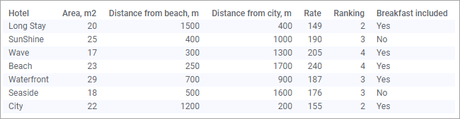
By creating the parallel coordinate plot below with one line per hotel, it is possible to compare the hotels and find a hotel that suits you. Here the Color axis is used to split the data per hotel.
Parallel Coordinate Plot with one line per hotel.
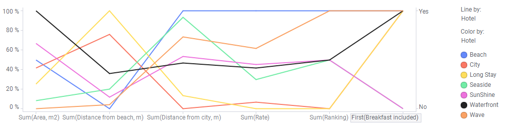
Perhaps Waterfront is a good choice, since you get a large room for a fair rate, and it is located not too far away from neither the beach nor the city. In addition breakfast is included in the price, and the ranking is OK.
Note: The actual values in a column can be displayed along the right-hand side of the visualization. Simply click the X-axis label for the column you are interested in.