Using marker appearance to add more information
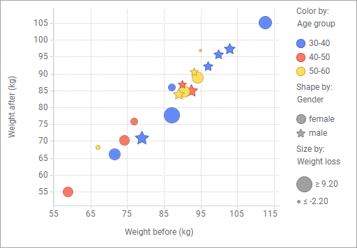
The markers in a scatter plot provide an overview of how the data is distributed across two dimensions, the X-axis and the Y-axis. If you use colors, shapes, and sizes of the markers, further information about your data can be displayed.
A scatter plot, where all these three marker attributes are used, is shown below.
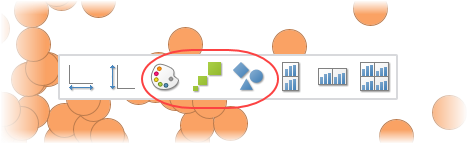
To make use of these attributes, you simply drag the column you want to visualize from the Data in analysis flyout to any of the color, size, or shape drop targets in the scatter plot, alternatively use the scatter plot properties popover.
Example
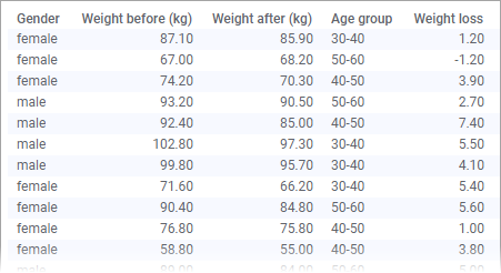
The data table below contains weights of people, who participate in a weight loss program.
See also Using tiled markers.
Copyright © Cloud Software Group, Inc. All rights reserved.