Data in analysis
The Data in analysis flyout shows a structured list of all data columns in a data table, that is , it gives you an overview of your data. From this flyout, you can use drag-and-drop operations to specify which data columns to use on the axes of the visualizations, you can filter to certain values (because each column in the panel is associated with a filter) and you can get recommendations about suitable visualizations.
The
Data in analysis flyout is automatically shown when you create a new analysis. On the authoring bar, you can also click
Data in analysis
 , when the analysis is in
Editing mode.
, when the analysis is in
Editing mode.
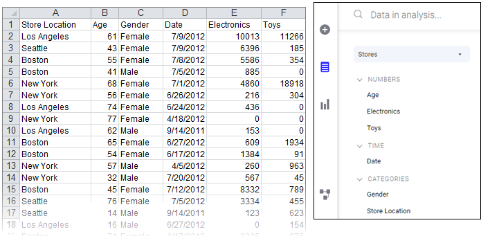
The columns are by default organized into categories to make them easy to locate. For example, loading the Excel file below results in the Data in analysis flyout to the right. Columns containing numerical data suitable to aggregate are gathered in the Numbers section, columns related to time are in the Time section, and columns useful for splitting data in the Categories section.
If the suggested category for a column is not the desired category, you can
change the categorization.
The
Data in analysis flyout can be expanded to get more details about a column. It expands automatically when you select columns in the flyout, but you can also expand the flyout yourself by clicking
Expand for details and recommendations
 , at the upper-right side of the flyout.
You can easily change what is shown in a visualization by dragging a column from the flyout and dropping it onto a column selector or on a drop target within the visualizations. Moreover, you can use the flyout to filter to certain values in which you are particularly interested.