JavaScript must be enabled in order to use this site.Please enable JavaScript in your browser and refresh the page. Changing color of visualization items The Color by axis specifies how to color items in a visualization. The colors can easily be changed. The Color by axis setting is available in the legend of the visualization. Procedure In the legend beneath the Color by column selector, click the circle for the color you want to change. Note: In combination charts, the coloring is specified on the Series by axis. A color palette is displayed. Select another color on the palette. You can click for more color options. Note: The color palette is available also in the Color section of the visualization Properties. Copyright © Cloud Software Group, Inc. All rights reserved.
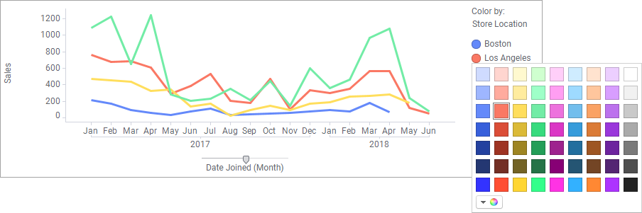
 for more color options.