Specifying time hierarchies
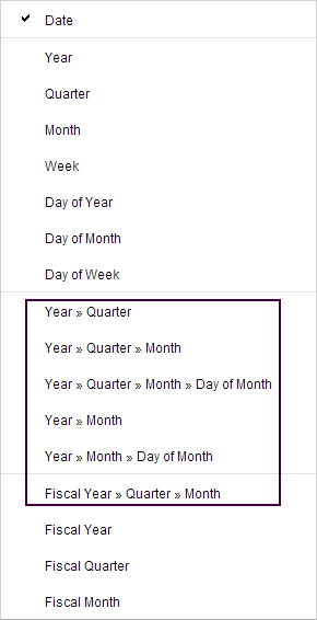
Time data is by nature structured hierarchically. When specifying a column with dates and times in a column selector, you have the option to change the default linear series of dates to a hierarchical view of dates in form of years, quarters, months, weeks, and days.
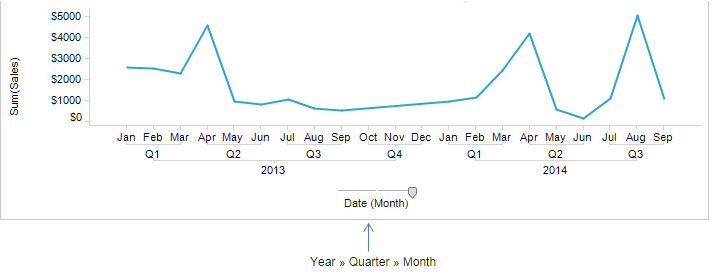
In the hierarchy, dragging a slider lets you change the level of detail.
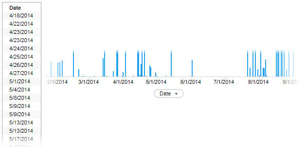
If you select a column with time data on an axis, a linear series of the data is displayed.
Procedure
Example
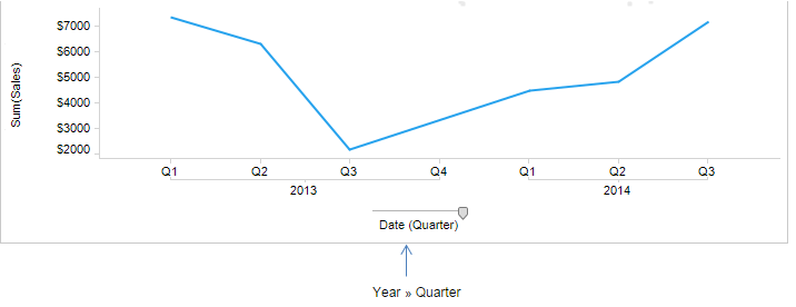
The line chart illustrates a time hierarchy with two levels: year and quarter. You can switch between the two levels by dragging the slider handle to the end points.
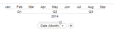
You get a more detailed view of the same data by selecting a hierarchy with more levels, for example, year, quarter and month. This slider also offers a middle hierarchy level.
You get a more detailed view of the same data by selecting a hierarchy with more levels, for example, year, quarter and month. This slider also offers a middle hierarchy level.
Copyright © Cloud Software Group, Inc. All rights reserved.