Aggregating data

Visualizing data involves presenting aggregated values of the data you have loaded. Examples of aggregated values are sums, averages, counts of occurrences, or results from various statistical calculations. That is, they represent collections of data as single values. In most cases, the data to aggregate is numerical, but also non-numerical data can be aggregated.

Note: Some visualizations, like the table visualization, do not support aggregation of values, and sometimes values can be aggregated only on certain axes.

The resulting values of an aggregation reflect the current data. That is, when you filter the data, a re-calculation takes place instantly, and the visualization updates.

You specify which aggregation to display on the axis' column selector .

Prerequisites

The data column of interest has been specified in the axis' column selector.

Procedure

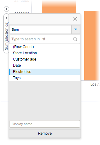
  1. Click the arrow next to the column name in the column selector.
    A popover listing all columns in the data table opens. The selected column is colored.

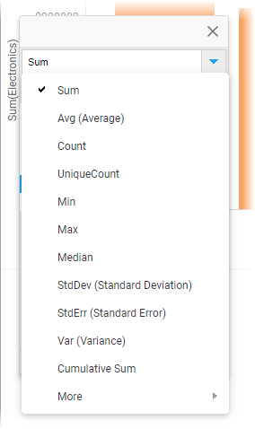
  2. Click the blue arrow.
    A list of available aggregations opens.

    You can click the arrow at the bottom to display more aggregations.
  3. Select the aggregation to display on the axis.
    Tip: In the field at the bottom of the first popover, you can specify your own display name for the axis.
  4. Click anywhere outside the popover to close it.

Examples of aggregations

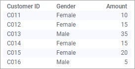
To illustrate some aggregations, this simple data table is used.

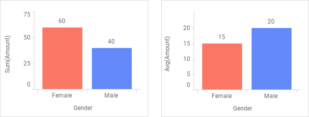
First, data in the numerical column 'Amount' is aggregated using Sum and Avg (average), respectively.

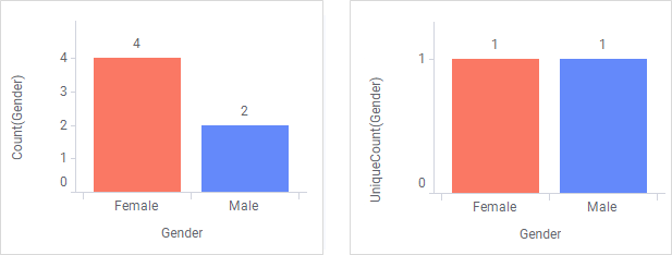
Second, data in the non-numerical column 'Gender' is aggregated using Count and UniqueCount, respectively.