Example 1: Descriptive Statistics, t-Tests, and Correlations
This example is based on the Adstudy.sta example data file that is included with Statistica. The data file contains 25 variables and 50 cases. These (fictitious) data were collected in an advertising study where male and female respondents evaluated two advertisements. Respondents' gender was coded in variable 1 (Gender: 1=MALE, 2=FEMALE). Each respondent was randomly assigned to view one of the two ads (Advert: 1=COKE®, 2=PEPSI®). They were then asked to rate the appeal of the respective ad on 23 different scales (Measure01 to Measure23). On each of these scales, the respondents could give answers between 0 and 9.
Open the Adstudy.sta data file, and start the Basic Statistics and Tables module.
Ribbon bar. Select the Home tab. In the File group, click the Open arrow and on the menu, select Open Examples. The Open a Statistica Data File dialog box is displayed. Adstudy.sta is located in the Datasets folder. Select the Statistics tab. In the Base group, click Basic Statistics to display the Basic Statistics and Tables dialog box.
Classic menus. From the File menu, select Open Examples to display the Open a Statistica Data File dialog box; Adstudy.sta is located in the Datasets folder. From the Statistics menu, select Basic Statistics/Tables to display the Basic Statistics and Tables dialog box.

Correlations. First, we will check whether ratings on individual scales are correlated (i.e., whether some scales measured the same thing). In the Basic Statistics and Tables dialog box, select Correlation matrices and then click the OK button (or double-click Correlation matrices). The Product-Moment and Partial Correlations dialog box is displayed.
You can select variables either in one list (i.e., a square matrix) or in two lists (rectangular matrix). For this example, click the One variable list button; a variable selection dialog box is displayed. Ensure that the Show appropriate variables only check box is cleared, select all variables (click the Select all button), and click the OK button.
Since the analysis expects continuous variables, but text variables were selected, the Variables contain text values/text labels dialog box is displayed.

For this example we want to retain the text variables. Click the Continue with current selection button.
In the Product-Moment and Partial Correlations dialog box, click the Summary button.
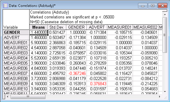
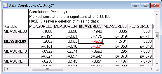
Highlighting significant correlations. By default, the spreadsheet shows all correlation coefficients that are significant at p<.05 (two-tailed) in a different color (highlighted in red in the image above). You can specify the significance (alpha) level used to highlight significant correlation coefficients in the spreadsheet. To change the alpha level, display the Product-Moment and Partial Correlations dialog box again (click the Product-Moment and... button on the Analysis Bar at the lower-left of the application window). Select the Options tab, and change the p-value for highlighting option to, for example, .001.
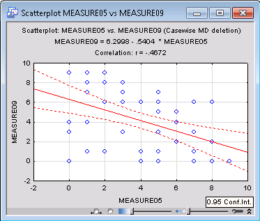
Click the Summary button again to display the updated results spreadsheet in which all correlations that meet this significance criterion will be highlighted. It is very easy to spot these high correlations (for example in this spreadsheet, the correlation between Measure05 and Measure09 is -.47). This high correlation indicates that those two rating scales may measure similar aspects of the viewers' perception of the advertisement (although one is a decreasing and the other an increasing measure of that aspect).
Two options in the Product-Moment and Partial Correlations dialog box are used to produce results spreadsheets with the correlation coefficients and also more detailed statistics (e.g., p-value, pairwise N, r2 t-value, etc.). When you select the Display r, p-values, and N's option button on the Options tab, the p-value and pairwise N will also be displayed along with the correlation coefficients (if you chose pairwise deletion of missing data in the Product-Moment and Partial Correlations dialog box; otherwise the casewise N will be displayed in the title of the spreadsheet).
The Display detailed table of results option button on the Options tab of the Product-Moment and Partial Correlations dialog box is only available if 20 or fewer variables have been selected for the analysis because a large amount of information is produced for each correlation. Since 25 variables were selected, this option is disabled.
Click the One variable list button. Select variables 6 through 25 and click OK. Now, select the Display detailed table of results option button on the Options tab.
Click the Summary button to display the spreadsheet containing relevant descriptive statistics, the correlation coefficient, p-value and pairwise N, as well as the slopes and intercepts of the regression equations for each variable in the correlation.
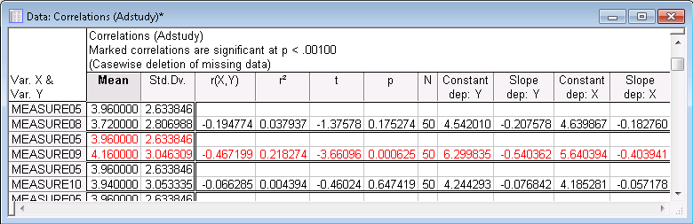
This option should be used to examine only specific correlations (and not for exploratory data analysis) because 22 spreadsheet cells are occupied for each correlation coefficient in this format; thus, a 20x20 correlation matrix produces a spreadsheet with 8,800 cells. As you can see above, the correlation for Measure05 and Measure09 is highly significant (p=.0006), which means that the error associated with accepting this result is only 6 in 10,000. Technically speaking, if we were to draw samples of the current sample size at random from a population in which those two variables are not correlated, then only six times in every 10,000 drawings would a sample be obtained in which the correlation was -.47 or stronger (i.e., in this case, more negative, see Elementary Concepts).
Producing a scatterplot. In order to visualize the correlation between variables, display the Product-Moment and Partial Correlations dialog box again, select the Advanced tab, and click the 2D scatterplots button. Select a scatterplot of variables Measure05 by Measure09 in the variable selection dialog box, and click OK. A scatterplot of the selected correlation coefficient with regression line, 95% confidence bands, and the regression equation in the title is produced.
Scatterplots produced via the analysis, scatterplots produced via Graphs tab options. Note that the scatterplot is produced using the current specifications selected in the Product-Moment and Partial Correlations dialog box; i.e., the data points that will be included in the computations will satisfy any current case selection conditions specified for this analysis and the current method of deletion of missing data (e.g., casewise, pairwise, mean substitution). So for example, if you produce a plot for variables Measure05 and Measure09, and also include other variables in the overall analysis (e.g., Measure01), and, if casewise deletion of missing data is selected, cases will be excluded from the analysis if they have missing data for any of the variables in the current analysis (e.g., for Measure01), even if all data are valid for the two variables in the scatterplot. Thus, when there are many missing data values in different variables and for different cases, the plots produced via the analysis options (e.g., the 2D scatterplots button in the Product-Moment and Partial Correlations dialog box) may be different from those computed via the respective Graphs tab options.
Differences between Means (t-Test). In the next step of this analysis, the possibility of differences in response patterns between males and females are examined. Specifically, males may use some rating scales in a different way, resulting in higher or lower ratings on some scales. The t-test for independent samples will be used to identify such potential differences. The sample of males and females will be compared regarding their average ratings on each scale.
Return to the Basic Statistics and Tables dialog box (click the Cancel button in the Product-Moment and Partial Correlations dialog box). Double-click t-test, independent, by groups to display the T-Test for Independent Samples by Groups dialog box.
Click the Variables button to display a variable selection dialog box. Here, you can select both the independent (grouping) and dependent variables for the analysis. For this example, select (highlight) variables 3 through 25 (the variables containing the responses) as the Dependent variables, select variable Gender as the Grouping variable, and click OK.
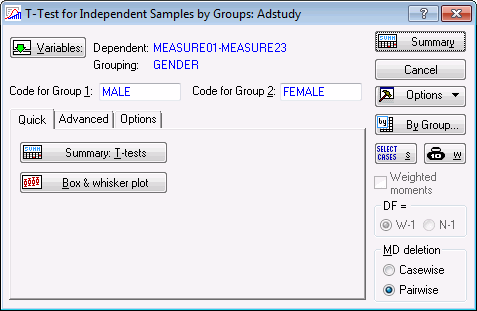
Once you have made the grouping variable selection, Statistica will automatically propose the codes used in that variable to identify the groups to be compared (in this case, the codes are Male and Female). You can double-click on either the Code for Group 1 or Code for Group 2 fields to display the Variable Codes dialog box in which you can review and select the codes for each group.
Many other procedures are available on the Advanced tab in the T-Test for Independent Samples by Groups dialog box. Before performing the analysis, you can graphically view the distribution of the variables via the graphics options on this tab. For example, click the Box & whisker plot button to produce box and whisker plots categorized by the grouping variable, one plot for each of the dependent variables (when the Box-Whisker Type dialog box is displayed, select the Mean/SE/1.96*SE option button and click OK). Similarly, click the Categorized histograms button to produce categorized (by the grouping variable) histograms. If your current output (see Output Manager) is directed to workbooks (default), all graphs can quickly be reviewed.
Categorized normal probability plots, detrended normal probability plots, and scatterplots are also available to review the distribution of the variable within each group.
In the T-Test for Independent Samples by Groups dialog box, select the Options tab. Set the p-value for highlighting to .05. Click the Summary button to produce the spreadsheet of t-test results.

Reviewing the t-test output. The quickest way to explore the table is to examine the fifth column and look for p-values that are less than the conventional significance level of .05 (see Elementary Concepts). For the vast majority of dependent variables, the means in the two groups (Males and Females) are very similar. The only variable for which the t-test meets the conventional significance level of .05 is Measure07 for which the p-value is equal to .0087. A look at the columns containing the means (see the first two columns) reveals that males used much higher ratings on that scale (5.46) than females (3.63). The possibility that this difference was obtained by chance cannot be entirely excluded, although assuming that the test is valid (see below), it appears unlikely, because a difference at that significance level is expected to occur by chance (approximately) 9 times per 1,000 (thus, less than only 1 time per 100). This result will be examined further, but first, look at the box and whisker plot for this variable.
Go back to the box-whisker plots that you previously produced, or produce these graphs once more by clicking the Box & whisker plot button. Then select the graph for variable Measure07; double-click on the graph to display the Graph Options dialog box, select the Plot: Box/Whisker tab, and set the Middle point to Mean and the Whisker value to Std Dev (standard deviations).
Click the OK button to produce the updated graph:
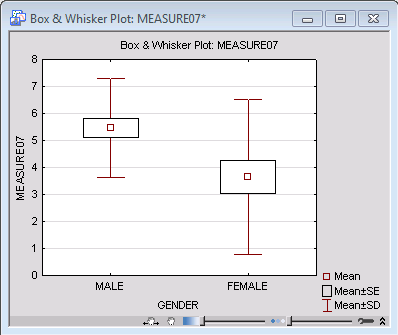
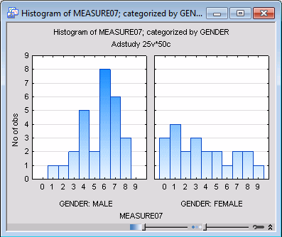
The graph shows something unexpected: The variation in the group of females appears much larger than in males. If the variation of scores within the two groups is in fact reliably different, then one of the theoretical assumptions of the t-test is not met (see the Introductory Overview), and you should treat the difference between the means with particular caution. Also, differences in variation are typically correlated with the means, that is, variation is usually higher in groups with higher means. However, something opposite appears to be happening in the current case. In situations like this one, experienced researchers would suspect that the distribution of Measure07 might not be normal (in males, females, or both). However, first look at the test of variances to see whether the difference visible on the graph is reliable.
Test of difference between variances. Return to the results spreadsheet and scroll to the right until the F-test results are visible. The F-test does in fact meet the conventional significance level of .05, which suggests that the variances of Measure07 in Males and Females are reliably different. However, the difference between the variances is relatively close to the borderline significance level (the obtained p-value is .029). Most researchers would not consider this fact alone to be sufficient to entirely discard the validity of the t-test for the difference between the means, given the relatively high significance level of that difference (p = .0087). Now, look at the distribution of Measure07 as categorized by the independent variable Gender.
Categorized histogram. Right-click on the results spreadsheet and select Graphs of Input Data - 2D Histogram by from the shortcut menu.

First, the Select Variables for Histogram dialog box is displayed. Select MEASURE07 for the X variable. Select Gender for the Category variable, and click OK. The Category Codes dialog box is displayed, in which the categorization variable for the histogram is selected, and you can specify the codes used in that variable to denote the different groups or categories (choose All codes). Then click the OK button to produce the graph.
Examining distributions (Descriptive statistics). Now, return to the Basic Statistics and Tables dialog box (click the Cancel button in the T-Test for Independent Samples by Groups dialog box). Double-click Descriptive statistics to display the Descriptive Statistics dialog box. Click the Variables button, select all variables, and click OK.
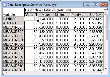
By default, the Descriptive Statistics spreadsheets will contain the mean, valid N, standard deviation, and minimum and maximum values of the selected variables. Select the Advanced tab to select the types of statistics to be calculated.
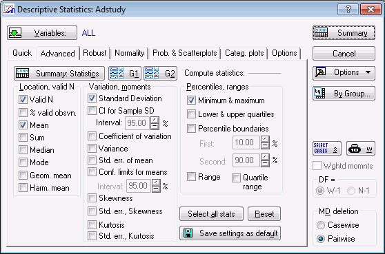
For this example, accept the default selection of statistics and click the Summary button to produce the spreadsheet of results.
Graphics options. The Descriptive Statistics dialog box offers many graphics options to visualize the distributions of, or correlations between, variables. While almost all types of graphs available in this dialog box can also be produced via the Graphs menu commands, the graphs produced from this dialog box will be based on the current case selection conditions and current selections for handling missing data. So, for example, any histograms produced via the options on the Normality tab will only include cases that are selected into the current analysis.
See also, the Basic Statistics and Tables Index and Overviews.