Conceptual Overviews - Raw Data Plots
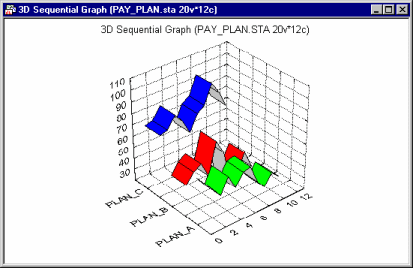
Raw Data graphs are used to plot sequences of raw data (observations) for one or more selected variables in a 3-dimensional display. The selected variables are represented on the y-axis, the consecutive cases on the x-axis, and the values are plotted against the z-axis as illustrated below:

Three-dimensional raw data plots are used to visualize sequences of values. The nature of this graph is analogous to the multiple line graph, except that in the 3D Raw Data Graphs, the ribbons, lines, boxes, or other 3D representations of values of each variable are not overlaid (as in the 2D graph), but "spaced" from each other in 3D perspective.
Applications
The 3D Raw Data Plots have both presentation and analytic applications. The most common application of 3D Raw Data Plots is to present and communicate data (e.g., price quotes, population growth, sales vs. earnings). These graphs provide a simple and often attractive way to visually present sequences of observations, such as various types of time series.

The major advantage of such 3D representations over 2D multiple line plots is that for some data sets, in 3D displays, the individual sequences of values can easily be identified; if a proper viewpoint is selected (e.g., via interactive rotation), then the lines may never overlap or "run into each other" as is often the case in multiple line 2D graphs.

Three-dimensional raw data plots are also used for analytic purposes, when the input data are in a matrix format and the pattern of the matrix data is to be analyzed (as shown above).