Example 2: Sign Test
In this exercise, you will specify the variables for a sign test, review the results of the summary spreadsheet, and create a box-whisker type graph. The example data file Synchron.sta is used. The Sign test is a nonparametric alternative to the t-test for dependent samples (see Basic Statistics and Tables). For a discussion of the logic and assumptions of this test, see Nonparametric Statistics Notes - Sign Test.
- Reviewing the data
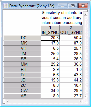
- This example is based on a study by Dodd (1979). When processing speech, one actually pays a lot of attention to visual cues as well; specifically, one can understand (encode) spoken words much more readily when the face of the person talking can be seen. In a sense, all people are "lip readers," at least to some extent. Dodd tried to find out whether infants as young as only 10 to 16 weeks old are already aware of the relationship between spoken words and the corresponding movements of the lips (of the speaker). For that purpose, Dodd placed the infants in a room so that they could watch a person behind a window reading normal speech. This speech was either delivered directly into the room (synchronous condition) or it was delayed by 400 milliseconds (asynchronous condition). The dependent variable was the amount of time that the infant watched the face behind the window. No hypotheses were formulated regarding the specific condition that should elicit the most attention (the asynchronous speech could be more interesting because it is novel, or it could draw attention away from the face because the face does not seem to be the source of the speech). Illustrated below is the Synchron.sta data file. Note that a two-letter identifier for each subject was entered as the case name.
- Specifying the analysis
- The sign test is a nonparametric alternative to the t-test for dependent samples. Since the same infants are listening to speech under two different conditions, this test is appropriate here.
Ribbon bar. Select the Home tab. In the File group, click the Open arrow and select Open Examples to display the Open a STATISTICA Data File dialog box. Open the data file, which is located in the Datasets folder. Then, select the Statistics tab. In the Base group, click Nonparametrics to display the Nonparametric Statistics Startup Panel.
Classic menus. From the File menu, select Open Examples to display the Open a STATISTICA Data File dialog box. Open the data file, which is located in the Datasets folder. Then, from the Statistics menu, select Nonparametrics to display the Nonparametric Statistics Startup Panel.
On the Quick tab, select Comparing two dependent samples (variables), and click the OK button to display the Comparing two variables dialog box.
You can simultaneously perform this test on lists of variables (i.e., lists of pairs); however, there are only two variables of interest in this example. Click the Variables button to display the standard variable selection dialog box. In the First variable list, select variable In_Sync; from the Second variable list, select Out_Sync, and then click the OK button.
- Reviewing the spreadsheet
- On the
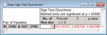
Quick tab of the Comparing two variables dialog box, click the Sign test button to begin the analysis. Below is the spreadsheet of the results.
The p-value for the sign test is significant at the .05 level (refer to Elementary Concepts for a discussion of "statistical significance"). Thus, you can conclude that even at this early age, infants can already discriminate between speech that is synchronized with the movement of lips and unsynchronized speech; the term "read my lips" seems to capture a lot of truth about how one learns to understand language.
- Producing a Box & Whisker graph
- The default graph for this test is the Box Plot. To create the graph, in the
Comparing two variables dialog box, click the Box & whisker plots for all variables button.
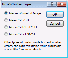
In the variable selection dialog box, select both variables, and click the OK button. Then, in the Box-Whisker Type dialog box (shown below), select the type of statistics to be plotted. For this example, select the Median/Quart./Range option button.
Click the OK button to produce the graph.
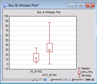
The box plot will indicate, for each variable, the median, quartile range (25th and 75th percentile), and range (minimum and maximum).
This plot indicates that, apparently, the out-of-sync speech resulted in higher median attention as well as in greater variability for this variable.
See also, Nonparametric Statistics - Index.