Boosted Trees Results - Classification Tab
| Element Name | Description |
|---|---|
| Sample | Select an option button in the Sample group box to specify for which type of sample to compute the predicted and residual statistics (classifications). |
| Analysis | Only those observations that were used to compute the current results (i.e., build the current set of trees). |
| Prediction | All cases that have valid data for the predictor variables, but missing data for the dependent variable. |
| Test set | All observations that were not used to compute the current results, but have valid data for all predictor and dependent variables. |
| All samples | Display and plot classifications statistics for all observations. |
| Predicted vs. observed by classes | This option is only available for classification-type problems (see the description of the Boosted Trees Startup Panel - Quick tab). Click the Predicted vs. observed by classes button to produce a spreadsheet and a 3D histogram of the predicted by observed classification frequencies. |
| Prior probabilities | Click this button to display the spreadsheet containing the prior probabilities and the corresponding n for each class (group) in the dependent variable. The prior probabilities will be combined with the prediction probabilities and misclassification costs to compute the final classification probabilities and classifications (see also, Computational Details). |
| Adjusted prior probabilities | Click this button to display the spreadsheet containing a priori probabilities for each class of the dependent variable, adjusted for the User-specified misclassification costs (see the description of the Boosted Trees Specifications dialog box - Classification tab) and the corresponding class n's. |
| Misclassification cost matrix | Click the Misclassification cost matrix button to display a spreadsheet containing the (user-specified or default) costs of misclassifying cases or objects in each observed class of the dependent variable (columns) as another class (rows; all cost values will be 1 by default, i.e., if not altered by the user; see also the Boosted Trees Specifications dialog box - Classification tab). The misclassification costs are combined with the prior probabilities when computing the final classification probabilities (see also Computational Details). |
| Lift Chart Options | The options described below are used to create lift charts and gains charts for the categories of the dependent variables and for the current model. Use these charts to evaluate and compare the utility of the model for predicting the different categories or classes for the categorical dependent variable. |
| Lift chart type | Select the option button in this group box that specifies the type of chart and the scaling for the chart you want to compute. |
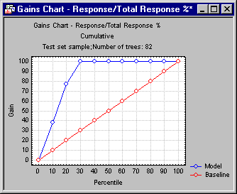
| Gains chart | Select this option button to compute a gains chart. This chart shows the percent of observations correctly classified into the chosen category (see Category of response below) when taking the top x percent of cases from the sorted (by classification probabilities) data file.
For example, this chart can show you that by taking the top 20 percent (shown on the x axis) of cases classified into the respective category with the greatest certainty (classification probability), you would correctly classify almost 80 percent of all cases (as shown on the vertical y axis of the plot) belonging to that category in the population. In this plot, the baseline random classification (selection of cases) would yield a straight line (from the lower-left to the upper-right corner), which can serve as a comparison to gauge the utility of the respective models for classification. |
| Lift chart (response %) | Select this option button to compute a lift chart where the vertical (y) axis is scaled in terms of the percent of all cases belonging to the respective category. As in the gains chart, the x axis denotes the respective top x percent of cases from the sorted (by classification probabilities) data file. |
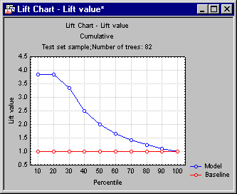
| Lift chart (lift value) | Select this option button to compute a lift chart where the vertical (y) axis is scaled in terms of the lift value, expressed as the multiple of the baseline random selection model.
For example, this chart can show you that by taking the top 20 percent (shown on the x axis) of cases classified into the respective category with the greatest certainty (classification probability), you would end up with a sample that had almost 4 times as many cases belong to the respective category when compared to the baseline random selection (classification) model. |
| Category of response | Select here the response category for which to compute the gains and/or lift charts. |
| Cumulative | Select this check box to show in the chosen lift and gains charts the cumulative percentages, lift values, etc. Clear this check box to show the simple (noncumulative) values. |
| Lift chart | Click this button to create the chart as specified via the Lift chart type and Cumulative lift chart options. |