Related to Plot
This dialog box is displayed in various places, typically to establish the relationship between the scale values shown on a particular axis, and the values for a particular plot (variable) that are shown in the graph. For example, it is displayed when you click the Related to plot button in the Graph Options dialog box - Axis: Scale Values tab.
- Related to plot
- From the Related to plot drop-down box, select the specific plot that you want to "relate" to or assign to, the respective axis (note that when you have several plots in one graph, you can assign specific names to each plot using the Name option in the General tab of the Graph Options dialog box).
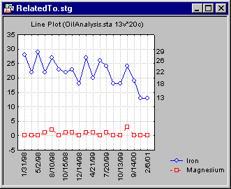
For example, suppose you create a multiple line plot of some sequential measurements. The standard axis labels (values) are shown at equal intervals on the left y-axis.
Now suppose you want to display the actual observed values for variable Iron in this plot, on the right y-axis. Using the Graph Options dialog box - Axis: Scale Values tab, select Y right in the Axis drop-down box, and then select the Data values check box. Next click the Related to plot button to display the Related to plot dialog and select the plot for Iron. When you update the graph (by clicking OK in the Graph Options dialog box), the actual observed (plotted) values for Iron will be used to label the right y-axis.