Rapid Deployment of Predictive Models - Lift Chart Tab
Select the Lift chart tab of the Rapid Deployment of Predictive Models dialog box to access the options described here. These options are available (applicable) only when the currently loaded (PMML) model(s) can be used to compute predicted classifications and classification probabilities (for each class). In this case, you can compute lift and gains charts to evaluate and compare the utility of each model (in overlaid lift or gains charts, summarizing the utilities for several models).
| Element Name | Description |
|---|---|
| Lift chart type | Specify in this group box the type of chart and the scaling for the respective (gains or lift chart) you want to compute. |
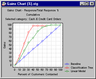
| Gains chart | Select this option button to compute a gains chart. This chart shows the percent of observations correctly classified into the respective chosen category (see Category of response below) when taking the top x percent of cases from the sorted (by classification probabilities) data file.
For example, this chart can show you that by taking the top 30 percent (shown on the x axis) of cases classified into the respective category with the greatest certainty (classification probability), you would correctly classify better than 80 percent of all cases (as shown on the vertical y axis of the plot) belonging to that category in the population. In this plot, the baseline random classification (selection of cases) would yield a straight line (from the lower-left to the upper-right corner), which can serve as a comparison to gauge the utility of the respective models for classification. |
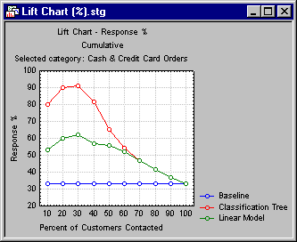
| Lift chart (response %) | Select this option button to compute a lift chart where the vertical (y) axis is scaled in terms of the percent of all cases belonging to the respective category; as in the gains chart, the x axis denotes the respective top x percent of cases from the sorted (by classification probabilities) data file.
For example, this chart can show you that by taking the top 30 percent (shown on the x axis) of cases classified into the respective category with the greatest certainty (classification probability), you would end up with a sample where more than 90 percent of the cases belong to the respective category. In this plot, the baseline random classification (selection of cases) would yield a straight horizontal line, which can serve as a comparison to gauge the utility of the respective models for classification. |
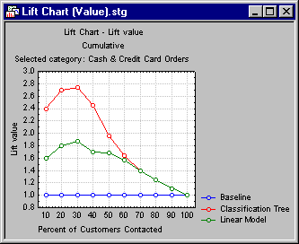
| Lift chart (Lift value) | Select this option button to compute a lift chart where the vertical (y) axis is scaled in terms of the lift value, expressed as the multiple of the baseline random selection model.
For example, this chart can show you that by taking the top 30 percent (shown on the x axis) of cases classified into the respective category with the greatest certainty (classification probability), you would end up with a sample that had almost 2.8 times as many cases belong to the respective category, when compared to the baseline random selection (classification) model. |
| Category of response | Select here the response category for which to compute the gains and/or lift charts. |
| Cumulative lift chart | Select this check box to show in the chosen lift and gains charts the cumulative percentages, lift values, etc. Clear this check box to show the simple (non-cumulative) values. |
| Lift chart | Click this button to create the chart as specified via the Lift chart type and Cumulative lift chart options. If more than one model is specified, an overlaid chart, summarizing all current models, will be displayed. |
| All | Click this button to create the specified Lift chart type for each of the response categories. If more than one model is specified, an overlaid chart, summarizing all current models, will be displayed. |
| Lift table for all types | Click this button to generate the Gains table for each category of the dependent variable. These tables provide information about the gains and the cumulative gains of the model, and the columns in each table measure the model's performance. |