Conceptual Overviews - Icon Plots
Icon plots provide a selection of plots that represent cases or units of observation as multidimensional symbols.
The basic idea of icon plots is to represent individual units of observation as particular graphical objects where values of variables are assigned to specific features or dimensions of the objects (usually one case = one object). The assignment is such that the overall appearance of the object changes as a function of the configuration of values.
Thus, the objects are given visual "identities" that are unique for configurations of values and that can be identified by the observer. Examining such icons may help to discover specific clusters of both simple relations and interactions between variables.
Analyzing Icon Plots
The "ideal" design of the analysis of icon plots consists of five phases:
- Select the order of variables to be analyzed. In many cases a random starting sequence is the best solution. You can also try to enter variables based on the order in a multiple regression equation, factor loadings on an interpretable factor, or a similar multivariate technique. That method can simplify and "homogenize" the general appearance of the icons, which would facilitate the identification of non-salient patterns. It can also, however, make some interactive patterns more difficult to find. No universal recommendations can be given at this point, other than to try the quicker (random order) method before getting involved in the more time-consuming method.
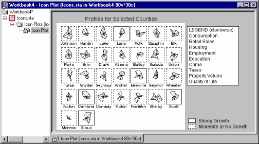
- Look for any potential regularities, such as similarities between groups of icons, outliers, or specific relations between aspects of icons (e.g., "if the first two rays of the star icon are long, then one or two rays on the other side of the icon are usually short"). The circular type of icon plots (see Taxonomy of Icon Plots, below) is recommended for this phase.
- If any regularities are found, try to identify them in terms of the specific variables involved.
- Reassign variables to features of icons (or switch to one of the sequential icon plots, see Taxonomy of Icon Plots, below) to verify the identified structure of relations (e.g., try to move the related aspects of the icon closer together to facilitate further comparisons). In some cases, at the end of this phase it is recommended to drop the variables that appear not to contribute to the identified pattern.
- Finally, use a quantitative method (such as a regression method, nonlinear estimation, discriminant function analysis, or cluster analysis) to test and quantify the identified pattern or at least some aspects of the pattern.
Taxonomy of Icon Plots
Most icon plots can be assigned to one of two categories: circular and sequential.
- Circular icons
- Circular icon plots (Star plots, Sun Ray plots, Polygon icons) follow a "spoked wheel" format where values of variables are represented by distances between the center ("hub") of the icon and its edges.

Those icons may help to identify interactive relations between variables because the overall shape of the icon may assume distinctive and identifiable overall patterns depending on multivariate configurations of values of input variables.
In order to translate such "overall patterns" into specific models (in terms of relations between variables) or verify specific observations about the pattern, it is helpful to switch to one of the sequential icon plots (see the next paragraph), which may prove more efficient when you already know what to look for.
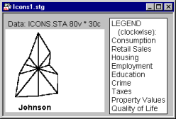
- Sequential icons
- Sequential icon plots (Column icons, Profile icons, Line icons) follow a simpler format where individual symbols are represented by small sequence plots (of different types).

The values of consecutive variables are represented in those plots by distances between the base of the icon and the consecutive break points of the sequence (e.g., the height of the columns shown above). Those plots may be less efficient as a tool for the initial exploratory phase of icon analysis because the icons may look alike. However, as mentioned before, they may be helpful in the phase when some hypothetical pattern has already been revealed and you need to verify it or articulate it in terms of relations between individual variables.
- Pie icons
- Pie icon plots fall somewhere in between the previous two categories; all icons have the same shape (pie) but are sequentially divided in a different way according to the values of consecutive variables.
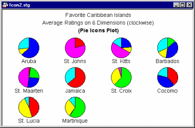
From a functional point of view, they belong rather to the sequential than circular category, although they can be used for both types of applications.
- Chernoff faces
- This type of icon is a category by itself. Cases are visualized by schematic faces such that relative values of variables selected for the graph are represented by variations of specific facial features.
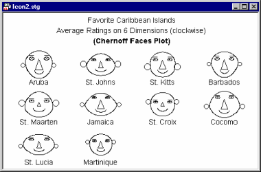
Due to its unique features, it is considered by some researchers as an ultimate exploratory multivariate technique that is capable of revealing hidden patterns of interrelations between variables that cannot be uncovered by any other technique. This statement may be an exaggeration, however. Also, it must be admitted that Chernoff Faces is a method that is difficult to use, and it requires a great deal of experimentation with the assignment of variables to facial features.
Standardization of Values
Except for unusual cases when you intend for the icons to reflect the global differences in ranges of values between the selected variables, the values of the variables should be standardized once to assure within-icon compatibility of value ranges. For example, because the largest value sets the global scaling reference point for the icons, then if there are variables that are in a range of much smaller order, they may not appear in the icon at all, e.g., in a star plot, the rays that represent them will be too short to be visible. See the Icon Plots dialog for more information on the standardization options available for this type of graph.
Applications
Icon plots are generally applicable 1) to situations where you want to find systematic patterns or clusters of observations, and 2) when you want to explore possible complex relationships between several variables. The first type of application is similar to cluster analysis; that is, it can be used to classify observations.
For example, suppose you studied the personalities of artists, and you recorded the scores for several artists on a number of personality questionnaires. The icon plot may help you determine whether there are natural clusters of artists distinguished by particular patterns of scores on different questionnaires (e.g., you may find that some artists are very creative, undisciplined, and independent, while a second group is particularly intelligent, disciplined, and concerned with publicly acknowledged success).
The second type of application (the exploration of relationships between several variables) is more similar to factor analysis; that is, it can be used to detect which variables tend to "go together." For example, suppose you were studying the structure of people's perception of cars. Several subjects completed detailed questionnaires rating different cars on numerous dimensions. In the data file, the average ratings on each dimension (entered as the variables) for each car (entered as cases or observations) are recorded.
When you now study the Chernoff faces (each face representing the perceptions for one car), it may occur to you that smiling faces tend to have big ears; if price was assigned to the amount of smile and acceleration to the size of ears, then this "discovery" means that fast cars are more expensive. This, of course, is only a simple example; in real-life exploratory data analyses, non-obvious complex relationships between variables may become apparent.