Conceptual Overviews - 2D Box (and Means with Error) Plots
In box plots (this term was first used by Tukey, 1970), ranges of values of a selected variable (or variables) are plotted separately for groups of cases defined by values of a categorical (grouping) variable. The central tendency (e.g., median or mean) and range or variation statistics (e.g., quartiles, standard errors, or standard deviations) are computed for each group of observations, and the selected values are presented in the style specified in the Graph Type. Outlier data points can also be plotted (see Outliers and Extremes, below).
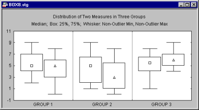
More than one dependent variable can be represented in one graph to allow for comparisons of distributions of scores of the respective measures across groups.
Range plots differ from box plots in that for range plots, the ranges to be plotted are defined by (i.e., represent) the values of the selected variables (e.g., one variable contains the minimum range values and another variable contains the maximum range values), while for box plots the ranges are calculated from raw values of the variable (e.g., standard deviations, standard errors, or ranges).
There are two typical applications for box plots: (a) comparing ranges of values for individual samples or categories of cases (e.g., a typical MIN-MAX plot for stocks or commodities or aggregated sequence data plots with ranges); and (b) comparing distributions or variations of scores in individual groups or samples (e.g., box and whisker plots presenting the mean for each sample as a point inside the box, standard errors as the box, and standard deviations around the mean as a narrower box or a pair of "whiskers").
The box plots, showing variation of scores, allows one to visualize and quickly evaluate the strength of the relation between the grouping and dependent variable(s). Specifically, assuming that the dependent variable is normally distributed, and knowing what proportion of observations fall within, for example, ±1 or ±2 standard deviations from the mean (see Elementary Concepts), one can easily evaluate the results of an experiment and say that (for example) the scores in about 95% of cases in experimental group 1 belong to a different range than scores in about 95% of cases in group 3.
- Analysis of outliers and extreme values
- Another specific application of
box plots is in the analysis of the distribution of values that deviate from central tendencies for their respective groups (so-called outlier and extreme values, see below). The implementation of box plots in STATISTICA offers comprehensive facilities to detect such values and to display them in a variety of ways; options are also provided to "trim the distributions" and display the respective statistical summaries based on values that fall only within requested ranges of the distributions.
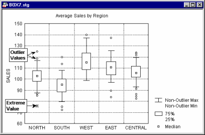
Outliers and Extremes
Values that are "far" from the middle of the distribution are referred to as outliers and extreme values if they meet the conditions specified in the next three paragraphs.
- Outliers
- For Graphs menu graphs box plots, a data point is deemed to be an outlier if the following conditions hold:
data point value > UBV + o.c.*(UBV - LBV)
or
data point value < LBV - o.c.*(UBV - LBV)
where
UBV is the upper value of the box in the box plot (e.g., the mean + standard error or the 75th percentile).
LBV is the lower value of the box in the box plot (e.g., the mean - standard error or the 25th percentile).
o.c. is the outlier coefficient specified in the Outliers group of the box plot dialog (by default, the outlier coefficient is 1.5).
- Non-outlier range
- In a box plot (2D Box Plots,
3D Sequential Graphs - Box Plots, or
Categorized Box Plots) the 'whiskers' signify the range of the non-outlier data points. Data that plot outside of the range defined by the whiskers are considered outlier data points.
The whiskers represent the range of the data, unless there are outliers. If there are outliers, the whiskers represent the range of the non-outlier data.
You can think of outliers as fringe data and non-outliers as the core data. Keep in mind that these benchmarks for delineating outliers are arbitrarily chosen, similar to how p<.05 is arbitrarily chosen.
- Extremes
- For Graphs menu graphs box plots, a data point is deemed to be an extreme value if the following conditions hold:
data point value > UBV + 2*o.c.*(UBV - LBV)
or
data point value < LBV - 2*o.c.*(UBV - LBV)
where
UBV is the upper value of the box in the box plot (e.g., the mean + standard error or the 75th percentile).
LBV is the lower value of the box in the box plot (e.g., the mean - standard error or the 25th percentile).
o.c. is the outlier coefficient specified in the Outliers group of the box plot dialog (by default, the outlier coefficient is 1.5, thus, the extreme values are those which are outside the 3 box length range from the upper and lower value of the box).
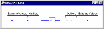
For example, the following diagram illustrates the ranges of outliers and extremes in the "classic" box and whisker plot (for more information about box plots, see Tukey, 1977).
In this plot, the upper box value (UBV) is in the 75th percentile, the lower box value (LBV) is in the 25th percentile, and the outlier coefficient is equal to 1.5.