Conceptual Overviews - Normal Probability Plots
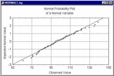
The options in the Normal Probability Plots dialog can be used to produce three types of probability plots: Normal, Half-Normal, and Detrended. Normal probability plots provide a quick way to visually inspect to what extent the pattern of data follows a normal distribution.
zj = F-1[(3*j-1)/(3*n+1)]
where F-1 is the inverse normal cumulative distribution function (converting the normal probability p into the normal value Z).
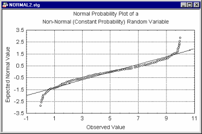
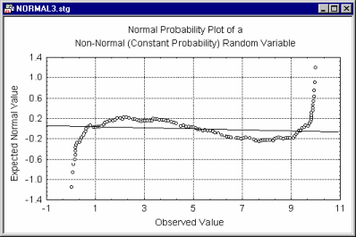
These Z values are plotted on the y-axis in the plot. If the observed values (plotted on the x-axis) are normally distributed, then all values should fall onto a straight line in the plot. If the values are not normally distributed, they will deviate from the line.
Outliers may also become evident in this plot. If there is a general lack of fit, and the data seem to form a clear pattern (e.g., an S shape) around the line, then the variable may have to be transformed in some way before it can be used in a procedure that assumes normality (e.g., a log transformation is often used to "pull in" the tail of the distribution; see Neter, Wasserman, and Kutner, 1985, page 134, for a discussion of such remedies for non-normality).
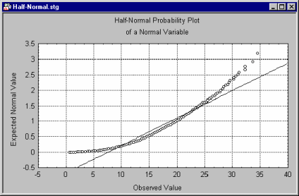
zj = F-1[(3*n+3*j-1)/(6*n+1)]
where F-1 is again the inverse normal cumulative distribution function.
This plot is often used for examining the distribution of residuals (e.g., in Multiple Regression), when one wants to ignore the sign of the residual, that is, when one is mostly interested in the distribution of absolute residuals, regardless of sign.
Specifically, in this plot each value (Xj) is standardized by subtracting the mean and dividing by the respective standard deviation (s). The detrended normal probability value zj for the j'th ordered value (rank) in a variable with n observations is computed as:
zj = F-1[(3*j-1)/(3*n+1)] - (xj-mean)/s
where F-1 is again the inverse normal cumulative distribution function. This often "spreads out" the plot, thereby allowing you to detect patterns of deviations more easily.


