Example 1: Evaluating the Reliability of Items in a Questionnaire
To continue the example described in the Introductory Overview, suppose you wanted to design a questionnaire to measure people's prejudices against foreign-made cars. You have already gone through several rounds of designing and selecting questionnaire items (as explained in the Introductory Overview), and the current study represents one of the final steps. The ten final items under consideration are displayed in the Variables Specifications Editor spreadsheet (select All Variable Specs from the Data menu).
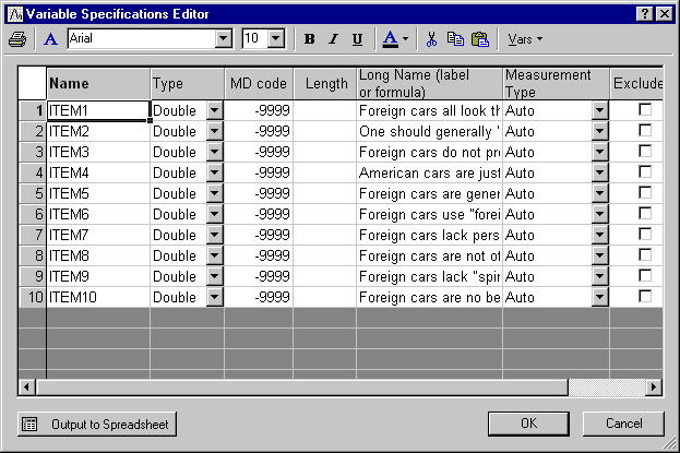
These items were accompanied by 9-point scales, with the anchors 1 = disagree and 9 = agree at the two ends of each scale. The questionnaire containing the items was administered to a sample of 100 individuals.
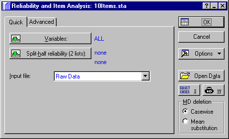
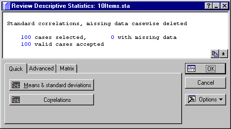
Now, click the OK button on the Startup Panel to display the Review Descriptive Statistics dialog, which is used for reviewing descriptive statistics and the correlation matrix of items.
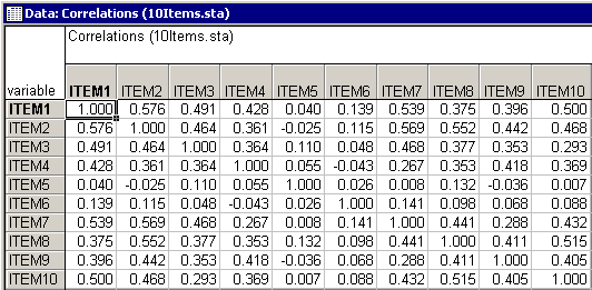
By and large, most of the correlations between items seem to be positive and substantial. A few exceptions seem to exist in the columns for Item5 and Item6.
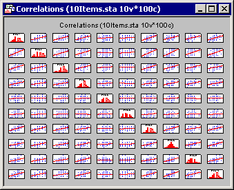
The matrix scatterplot will display the individual scatterplots for the correlations on the off-diagonal with histograms of the selected variables on the diagonal of the matrix plot. This plot is useful in determining which sets of correlations may contain outliers. After reviewing the matrix of scatterplots, one may wish to examine a few of those scatterplots in order to get a closer view and detect specific outliers among the cases. Such outliers may greatly bias the computation of the correlation coefficient, and hence the estimation of the scale's reliability.
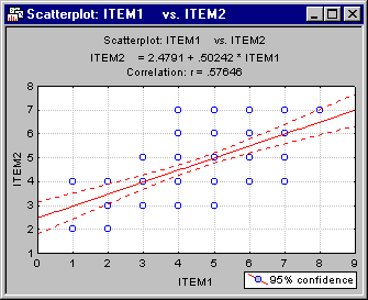
To obtain the scatterplot depicting the correlation between Item1 and Item2, select Basic Statistics/Tables from the Statistics menu to display the Basic Statistics and Tables Startup Panel. Double-click the Descriptive statistics option to display the Descriptive Statistics dialog. Click the Variables button and select Item1 and Item2 in the standard variable selection dialog; then click the OK button. Now, on the Prob. & Scatterplots tab, click the 2D scatterplot button to display another standard variable selection dialog. Here, select Item1 in the First variable list and Item2 in the Second variable list and then click the OK button to produce the scatterplot. Note that in this case, no outliers are evident.
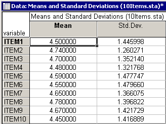
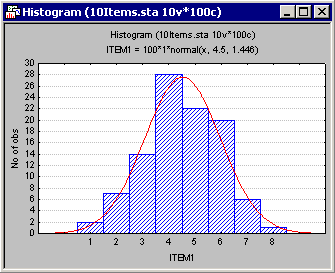
You can create a histogram of the frequency distribution for a variable directly from the Means and Standard Deviations spreadsheet. For example, to produce this graph for Item1, right-click on the Mean (4.5) or Std. Dev. (1.45) of Item1 and then select Graphs of Input Data - Histogram ITEM1 - Normal Fit in the resulting shortcut menu. In addition to the histogram for Item1, the graph will display the expected normal distribution.
One should routinely examine such histograms (with normal fit) in order to make sure that the variable of interest is normally distributed. In particular, it may happen that the distribution of responses is multi-modal, that is, that there are, for example, two "peaks" in the observed distribution. Such peaks may indicate that the population is not homogeneous with regard to the concept that you are trying to measure. Under these conditions, the correlations between items may become inflated, and consequently the reliability estimate for the scale may become inflated. As a result, you could end up with a scale that distinguishes well between, for example, two groups of people (the two "peaks"), but not at all between people in each group.
Now, click the Box & whisker plot button on the Review Descriptive Statistics - Advanced tab to display the standard variable selection dialog. Select all of the variables in the data set and click the OK button to display the Box-Whisker Type dialog. Here, select the Median/Quart./Range option button and then click the OK button to produce the box and whisker plot.
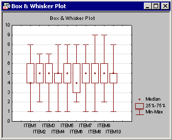
These plots display the central tendency (e.g., median) and variability (e.g., quartile and range) of the selected variables. Box and whisker plots are useful to confirm if the distribution of a variable is symmetrical. If the distribution is not symmetrical, then you may want to view the histogram for the respective variable.
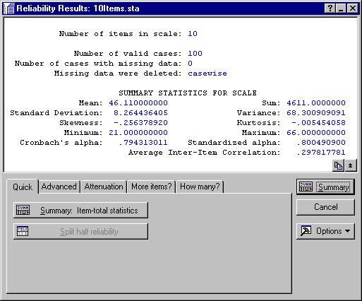
The summary box of the Reliability Results dialog shows that, overall, the internal consistency reliability (Cronbach's alpha) for the sum is estimated at .79. The Standardized alpha reported here is the reliability that would result if you were to use the standardized (z-transformed) values for the items in the computation of Cronbach's alpha (see also the Technical Notes section). The magnitude of the Cronbach's alpha value is "not bad" for a sum scale of only 10 items. As described in the Introductory Overview section, you can interpret this value to indicate that about 79% of the variability in the sum score is true score variability, that is, true variability between respondents concerning the (prejudice) concept common in all items.
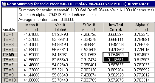
As described in the Introductory Overview, the two right-most columns in this spreadsheet are of particular importance. The correlations between the items and the sums score (without the item) are shown in the next-to-the-last column (Itm-Totl Correl.). The last column (Alpha if deleted) shows the resultant Cronbach's alpha value if the respective item were to be deleted.
It seems that both Item5 ("Foreign cars are generally too expensive") and Item6 ("Foreign cars use foreign technology") show a lower correlation with the sum scale than any of the other items. Deleting either one of the items would result in a reliability of .82.

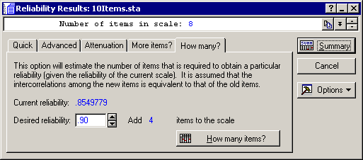
"What if..." analyses. How can the scale be further improved? Click on the Reliability Results - How Many? tab to specify a desired target reliability. For example, if you enter .9 in the Desired reliability edit field and click the How many items? button, the number 4 will be displayed after Add, meaning that in order to obtain a reliability for the sum scale that is equal to .9, you would have to add 4 items of the same average "quality" (reliability) as the other items in the scale.
Now click on the More items? tab.
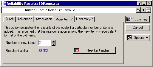
Here, you can enter the number of items that you are considering to add; Statistica will then compute the expected reliability. For example, enter 5 in the Number of new items edit field and click the Resultant alpha button.
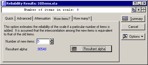
As you can see, if you were to add 5 more items (of the same "quality" as the other items) to the scale, the resultant reliability for the sum scale would increase to about .91.
The attenuation correction is generally useful for estimating the true similarity of, or correlation between, two concepts, which are both measured with imperfect scales. Thus, it is often computed in the course of validation studies (where a scale is correlated with other scales measuring similar concepts).
Click on the Attenuation tab and specify .4 in the Correlation between current scale and other measure edit field and .7 in the Reliability of other measure edit field. After clicking the Corrected correlation button you will see that the correlation between these two concepts, corrected for attenuation due to unreliability, is approximately equal to .52.
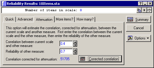
This is the correlation that one could expect if both scales were perfectly reliable, that is, if they would only measure the true scores of the respective concepts.