PCA Example
Open the data file:
Ribbon bar. Select the Home tab. In the File group, click the Open arrow, and select Open Examples to display the Open a Statistica Data File dialog. IndustrialEvaporator.sta is located in the Datasets folder.
Classic menus. From the File menu, select Open Examples to display the Open a Statistica Data File dialog. IndustrialEvaporator.sta is located in the Datasets folder.
Start PCA:
Ribbon bar. Select the Statistics tab. Click Advanced Models, and from the menu, select NIPALS to display the PCA/PLS dialog.
Classic menus. From the Statistics - Advanced Linear/Nonlinear Models submenu, select NIPALS Algorithm (PCA/PLS) to display the PCA/PLS dialog.
Note that, alternatively, you can:
Ribbon bar. Select the
Statistics tab. In the
Advanced/Multivariate group, click
PLS, PCA to display the
Multivariate Statistical Process Control
Classic menus. From the Statistics menu, select PLS, PCA Multivariate/Batch SPC to display the Multivariate Statistical Process Control dialog.
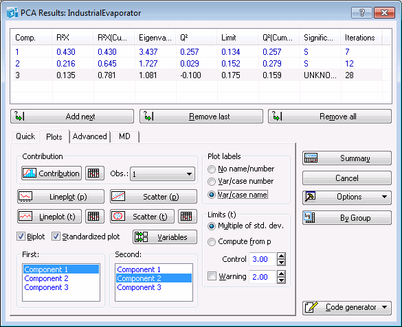
On the Quick tab of either dialog, select Principal component analysis (PCA) and click the OK button to display the PCA dialog. You can also double-click Principal component analysis (PCA) to display the dialog.
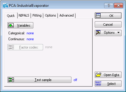
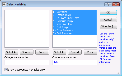
On the Quick tab, click the Variables button to display a variable selection dialog. Select variables 1 through 8 as the Continuous variables for the PCA analysis.
Click the OK button to close the variable selection dialog and return to the PCA dialog.
At this point you may want to check the analysis configuration, which is determined by the option settings on the Quick, NIPALS, Fitting, Options, and Advanced tabs. These tabs provide various options that may need to be reconfigured to suit your individual analysis.
For example, on the
NIPALS
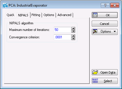
On the
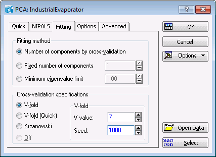
Fitting
Although the seed for the cross-validation random number generator is determined by time on your computer, for this example, set its value to 1000 via the Seed option on the Fitting tab. This ensures that you reproduce the same results shown in the spreadsheets and graphs of this step-by-step example.
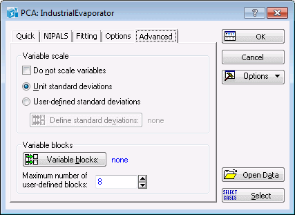
One of the important features of Statistica PCA is its preprocessing functionality, which enables you to scale data for better model building. The default setting is
Unit standard deviations (this option is located on the
Advanced
The settings discussed above determine not only the results, but also the quality of your model, i.e., its ability to predict unseen examples and detect important features that might be present in the data set such as outliers. Detecting abnormalities (outliers) is one of the primary goals of process monitoring in quality control. Note that each analysis is unique, and care should be taken in configuring its settings.
Click the
OK button in the
PCA dialog. This will initiate the NIPALS algorithm (see
NIPALS Overview and
NIPALS Technical Notes). When complete, the
PCA
Results
Multivariate Statistical Process Control
dialog, the PCA Results dialog contains five tabs: Quick, Quality, Plots, Advanced, and MD. When the PCA analysis is accessed via thePCA/PLS
dialog, the PCA Results dialog contains four tabs: Quick, Plots, Advanced, and MD.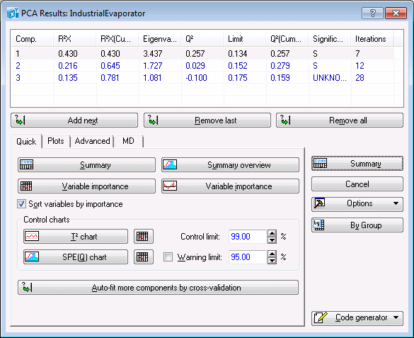
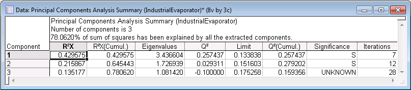
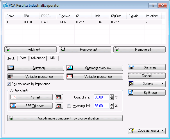
The Summary box is located at the top of the PCA Results dialog and contains information about the PC model such as R2X, Eigenvalues, Q2, Limit, Significance, and number of Iterations for each component. The same information can be displayed in a spreadsheet by clicking the Summary button.
To generate histogram plots of the cumulative R2X and Q2, click the
Summary overview button on the
Quick
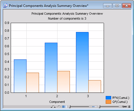
A study of the graph shows that cumulative R2X improves, i.e., tends to become unity, as more and more components are added to the PC model.
In this particular example, we used the cross-validation method for determining the optimal number of principal components (i.e., model complexity), which happens to be 3 in this case. This means that, on this occasion, the cross-validation algorithm found a PC model with 3 components to best represent the data set. See PCA and PLS Technical Notes for more details on cross-validation.
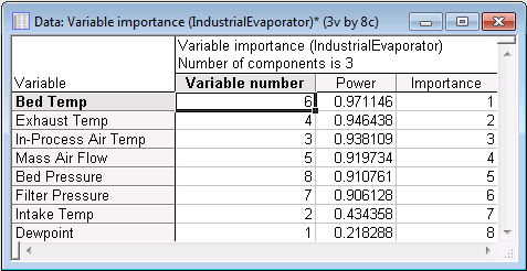
In order to display the variables in descending order in the spreadsheet, select the Sort variables by importance check box. Click the Variable importance button on the Quick tab to generate the variable importance spreadsheet.
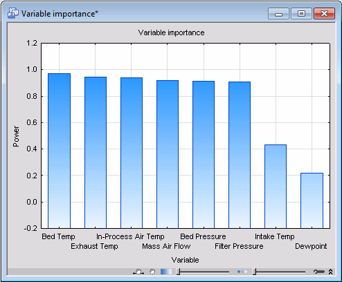
Also, you can review the modeling power of the variables in histogram format by clicking the Variable importance button with the graph icon.
 .
.
The add and remove components feature can be used to monitor changes in importance of a variable with the increase in the number of principal components.
To do this, first click the Remove all button to remove all the components. Next, click (once) on the Add next button to add the first principal component.
Click the Variable importance graph button to generate a variable importance histogram.
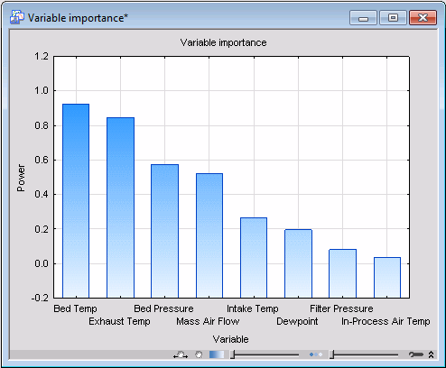
Examination of this graph shows that for this over-simplified model, i.e., a model lacking a sufficient number of principal components, most variables appear to be insignificant. This is because the model does not have enough components to sufficiently model the variables according to their true significance.
Keep adding more and more components to the model and print the corresponding importance histogram each time you add a dimension to the model.
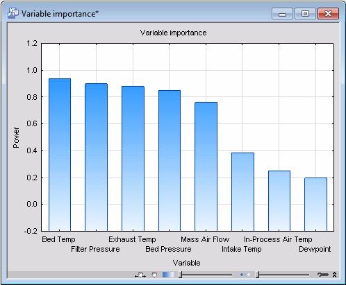
Now examine the sequence of histograms you have generated. The first thing you should note is that the more components in the model, the larger the modeling power of the individual variables. In particular, note that variables Exhaust Temp and Bed Temp are predominantly modeled by PC1, while Filter Pressure is almost exclusively captured by PC2. This suggests that individual components model different individual variables (provided they are relevant).
Again, remove all the extracted components, and then click the Auto-fit more components by cross-validation button. This will recreate the initial PCA model that was built by clicking the OK button in the PCA dialog. In other words, it will take you back to that stage of the analysis before you manually removed and added components from and to the model.
One important chart to review is the so-called Hotelling T2, which can be used to detect moderate (by comparison) outliers. Produce this chart by clicking the T2 chart button on the Quick tab.
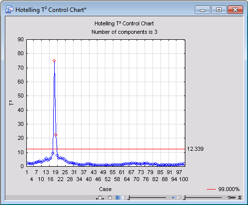
For this analysis, you can see that case 18 possesses a particularly a high value of T2 as compared to the rest of the observations. Case 19 also seems to be an outlier, although not as severe. Thus, we can conclude that at time intervals 18 and 19, the evaporation process was falling outside the scope of normality. The process, however, went back to normal after the elapse of those two time intervals, as values of T2 for the rest of the observations would indicate.
Another chart used to detect outliers is distance-to-model. This functionality is provided on the
Advanced
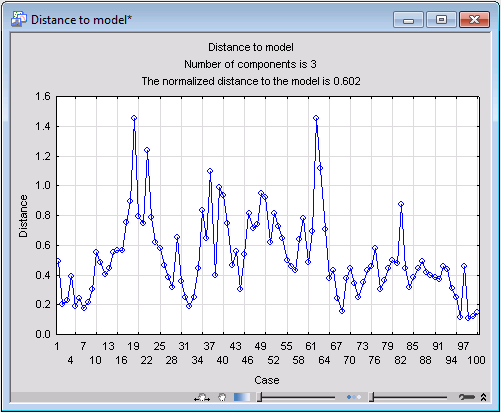
Case 62 shows up as an outlier in this graph, mostly likely because it has an outlying value on the variable Dewpoint (which is a weak predictor in terms of modeling power) of less than three standard deviations below the mean.
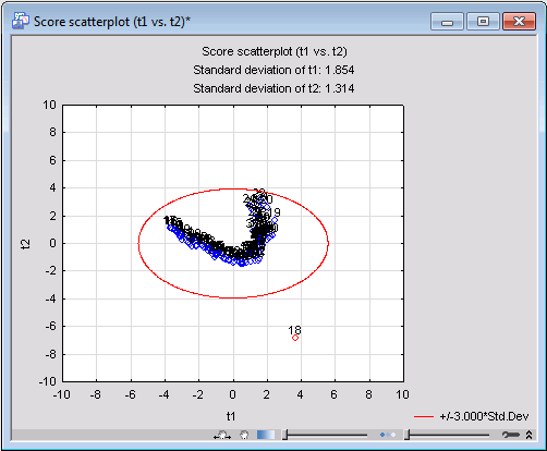
Further casewise data diagnostics can be carried out using the scatterplot of the x-scores. The x-scores are the transformed values of the X observations in the principal component system. An x-score with too high a value (i.e., one that deviates substantially from the point of origin) can again be regarded as an outlier or abnormal. To generate an x-scores scatterplot, select the
Plots
Clear the Biplot check box, and click the Scatter (t) button to create a scatterplot of the x-scores for PC1 against the x-scores of PC2.
For the next step, we will generate a line plot of the x-loadings for PC1. Ensure that Component 1 is still selected in the First components list, and click the Lineplot (p) button to generate the line plot of the variables against the loadings of the first component.
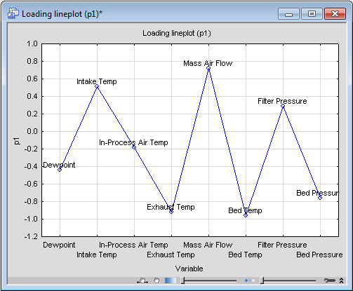
An examination of the plot shows that variable In-Process Air Temp is the least influential in determining the first principal component while Bed Temp plays the most significant important role. This conclusion is confirmed by the spreadsheet and histogram plots of the variables' importance (Variable importance button on the
Quick Plots
Next, we will use scatterplots of the loading factors between various principal components to analyze the relation between the variables and identify the most influential ones in determining the PCA model.
Ensure that Component 1 and Component 2 are selected in the First and Second lists, respectively, on the Plots tab, and click the Scatter (p) button to create the scatterplot of the loading factors.
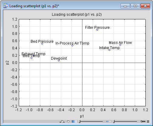
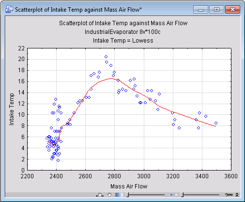
Study of this graph shows a noticeable amount of clustering among the variables. Variables placed close to each other influence the PCA model in similar ways, which also indicates they are correlated. Mass Air Flow and Intake Temp are examples of such variables with a substantial degree of correlation. In fact, the scatterplot of these two variables (which you can generate by clicking Scatterplot on the Statistica Graphs tab) show a nonlinear trend between the two.
Other useful information in the loading scatterplot is the distance of its points from the origin. The further away a variable from the origin, the more influential the variable is in determining the PCA model.
On the
Advanced
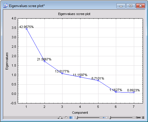
One of the fundamental quantities in PCA is the eigenvalues of the principal components, from which almost all properties of a PCA model can be derived. To generate the line plot of the principal eigenvalues, first select the number of the most significant components you want to display in the graph by adjusting the value of the
Number of eigenvalues option on the
Advanced
PCA Results
dialog, PMML for this example. This will output the model PMML code in a Statistica Report. Save the output with the extension .XML. Now your model is ready for deployment (see the PCA Deployment Example for more details).