|
How to: |
You can use report templates in conjunction with different combinations of fields in each bucket to quickly change the structure of a report into a number of common report layouts. These provide the ability to visualize the same set of data in a number of different ways, depending on the intended purpose, output type, or audience of the report.
You can select a report template from the report picker, which appears to the right of the canvas area, as shown in the following image.

Three options are available:
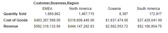
- Standard Report. The default option. Sort values that occupy multiple consecutive rows do not repeat, and measure fields are organized as columns.
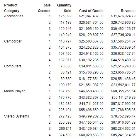
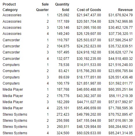
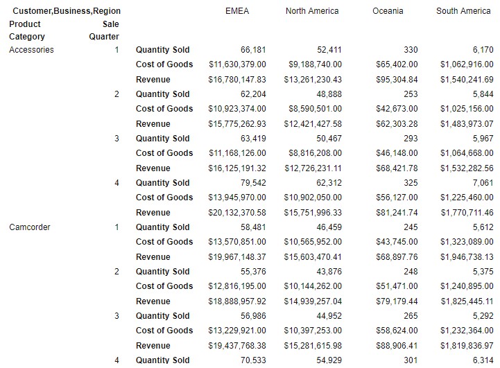
- Grid. Sort values that occupy multiple consecutive rows are repeated, and measure fields are organized as columns.
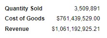
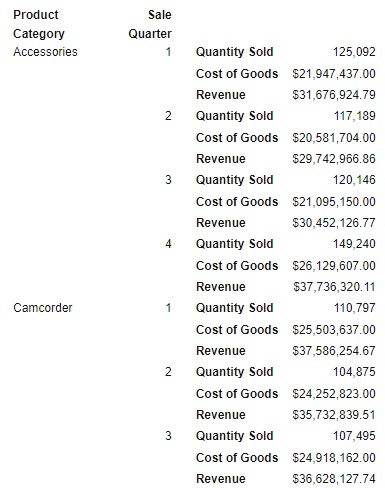
- Stacked Measures. Sort values that occupy multiple consecutive rows do not repeat, and measure fields are organized as rows.
 next to the Rows bucket and click