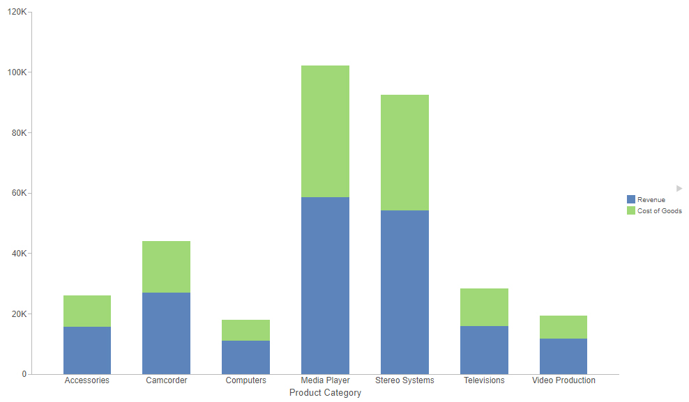
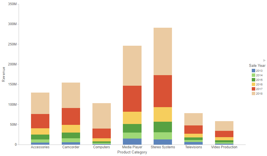
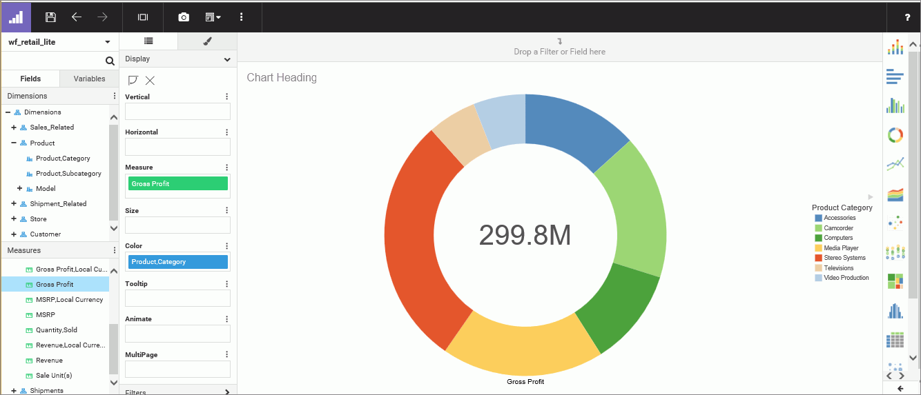
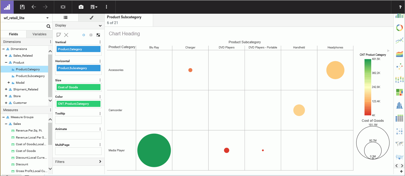
Using WebFOCUS Designer, you can create charts, grids, and maps, which enable you to convey information visually. You can save and share charts, add saved charts to pages, or edit existing charts should a scenario change. For example, you might want to create a line chart that compares two numeric measures or a ring pie chart that shows the intersections of your data as parts of a whole. You can also create a matrix chart, which allows you to identify hot spots and areas of concentration in your data. Because of its flexibility, WebFOCUS Designer provides you with the platform and tools you need to create charts that communicate.
Many charts show contrasting intersections of data, giving you the opportunity to share useful information that conveys patterns in your data. WebFOCUS Designer provides you with access to different types of simple and complex charts in a suite of charting options. You can also add your saved charts to pages or use them as standalone components that you can share with others in your organization, allowing for collaboration, which a centerpiece for business communication.
Creating a chart begins with the selection of a data source, which contains the underlying data that is used to create your chart. You can select a Master file (.mas) or a Reporting Object (.ro) as your data source. You can also upload a spreadsheet or connect to an existing data source.
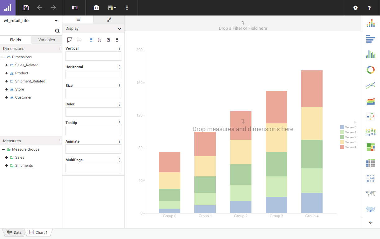
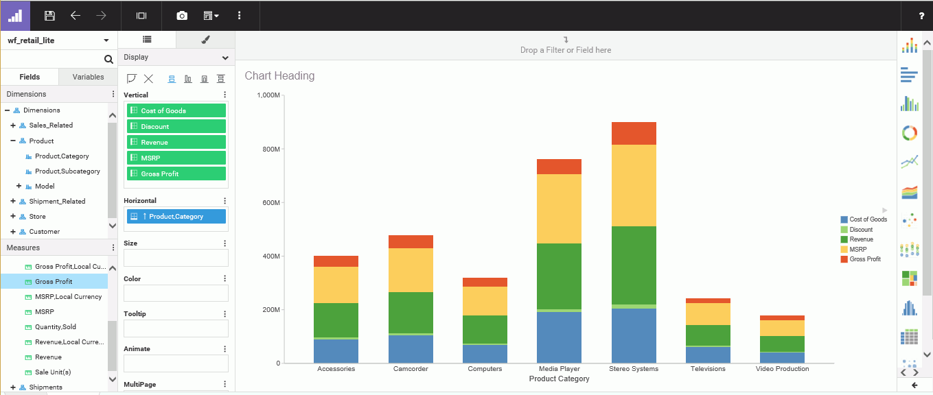
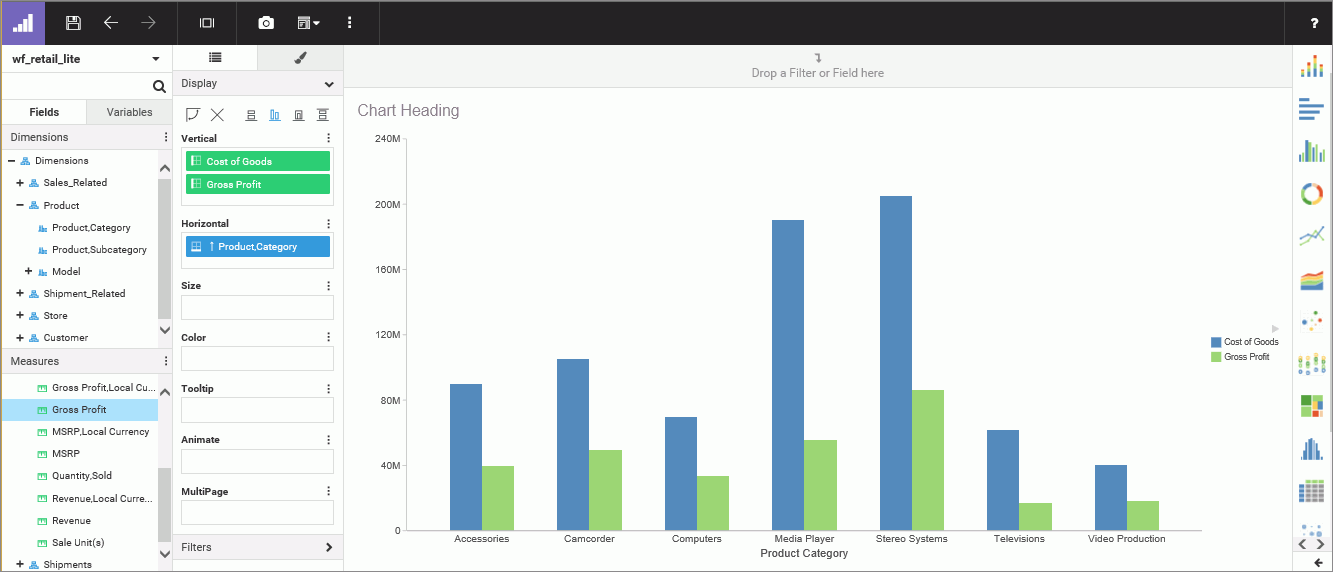
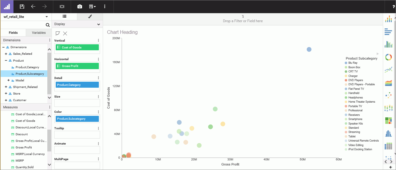
You select your data from the Open dialog box, which has two tabs: Server and Repository. These tabs list data files based on where they are stored. Once you have selected a data source, you are ready to begin creating a chart. The following image shows the default WebFOCUS Designer interface when you create a chart.
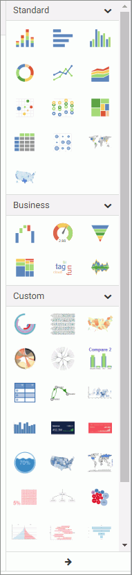
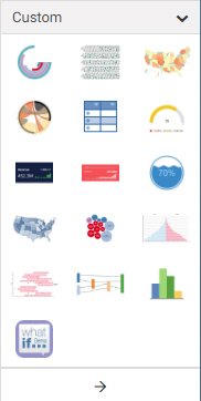
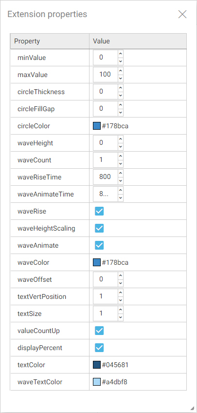
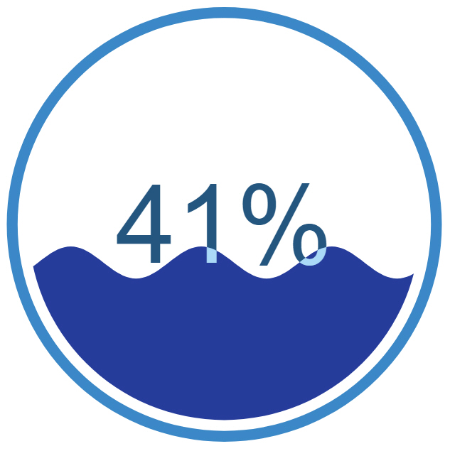
When you begin creating a chart in WebFOCUS Designer, you start with a vertical stacked bar chart type, which is a frequently used type of chart. You can change this by choosing a different chart type from the chart picker, which is located to the right of your canvas. When you choose between the different chart types in the chart picker, you can hover over each chart type to display the name of the chart and the minimum data requirements to run the chart (for example, one measure and one dimension). You also have access to a number of chart extensions from the chart picker, which are specialized charts that are installed by your administrator. You can view these by expanding the chart picker. Chart extensions display in a double-column list, as shown in the following image.
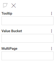
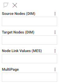
You select measures and dimensions from the Fields tab, which holds the fields that were populated from your data source. You can add fields to your chart in the following ways: drag a field to the canvas, double-click a field, or drag a field into one of the buckets.
Once you have created a chart, you can format it to enhance the appearance or style of the chart. For example, you might want to add a header and footer to identify your chart and prepare it for distribution. Depending on the chart type, you can access targeted formatting options that allow you to customize the Legend, Series, and Axis in a chart. Additional options display when working with a specific chart type (for example, Map or Matrix chart types).

 or a matrix row
  .
.
 or matrix column
  .
.
 or matrix row
  or a matrix column
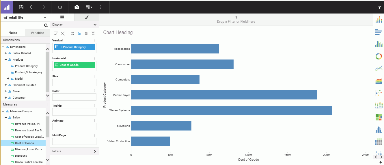
 .
.