Formatting Charts

In this section:

Charts allow you to present information graphically, using such visual cues as color, size, and position to convey relationships between measures (numeric fields to be aggregated) and dimensions (categories) and to identify trends and outliers. You can create a wide variety of charts. For example, you can review your data (Gross Profit and Product Category) using different chart types (for example, bar chart, area chart, or line chart). The chart options give you an edge in deciding which chart to use.

Once you have created a chart, you can enhance it using various formatting tools. For example, bolding a legend, changing the color of an axis, or underlining a header to add emphasis. The chart formatting options allow you to specify how components display, enabling you to format your chart to suit your needs.

The formatting capabilities of WebFOCUS Designer let you indicate which aspects will display, how fonts are utilized, and which additional options will enable you to create an effective, styled chart. This allows you to control the display of your chart information, giving you every opportunity to create a chart that you can share, distribute, and reuse on pages.

Customizing Charts

As you work with your chart, you can make modifications that improve the display of your chart, highlighting the layout and presentation of the chart components. Some of the formatting options include:
  • Controlling font display
  • Customizing headers and footers
  • Changing the format of your legend
  • Formatting the axes of your chart
  • Formatting the series of your chart
  • Customizing the format of your matrix chart
  • Enhancing your grid
  • Adding a theme
  • Adding color to your chart

You can access the formatting options from the Style tab, as shown in the following image.

General options display, by default, as shown in the following image.

You can use the General menu to select a different aspect of your chart, for example, Legend, Axis, Series, or Matrix options, as shown in the following image.

Once you select an area of your chart to modify (for example, Axis), you can use the intuitive options and menus to make selections, as shown in the following image.

Note: If you are working with a map, reference lines, or data grids, additional tabs will display, enabling you to make formatting changes to these components. These tabs do not display, by default.

By streamlining formatting options in one place, you can quickly format charts to enhance the display of your data. Whether it be color-coding a series in a chart or changing the font size of your data labels, a customized, formatted chart is just a click away.

Controlling Font Display in a Chart

How to:

You can use the font formatter in WebFOCUS Designer to control how fonts are displayed in your chart. This is a quick way to apply styling, colors, or a specific font type for any text within your chart. The font formatter displays in different areas of the Style tab (for example, Legend, Axis, Series, and Matrix options). Depending on the chart type and what you want to format, you can use these options to enhance the fonts in your charts. The font formatter is shown in the following image.

You can also change the font of a header or footer in your chart. This allows you to control how a chart is labeled or highlighted, which is useful when the chart will be distributed. For headers and footers, you can:

  • Change the font type and font size.
  • Add bold, italic, and underline emphasis to your text.
  • Set the justification of text in your header or footer. For example, left-aligned, centered, or right-aligned.
  • Change the font color or background color.
These options are available along the top of the canvas, as shown in the following image.

When reviewing text that displays in your chart, you might want to increase the font size of the header text to enhance its visibility. Editing the font types and styles in your chart gives you more control over how information is displayed and presented.

Procedure: How to Changing the Font Type in Your Chart

Changing the type, size, and emphasis of a font improves the impact for the user that is analyzing this chart. To change the font of a chart header:

  1. On the WebFOCUS Home Page, click the Designer tab.
  2. Click Chart.
  3. Choose a data source and click Select.
  4. Add one or more measures and dimensions to your chart.
  5. Double-click Chart Heading to enable it for formatting, and change this text to Discount by Product Category.

    The font formatting toolbar displays along the top of the screen, as shown in the following image.

  6. Ensure the header Discount by Product Category is selected or highlighted.
  7. From the font formatting toolbar, change the font type to Bookman, size 24, Bold.

    The revised chart header displays and reflects the new font type and styling, as shown in the following image.

    Note: You must select the text you want to modify in your chart before you apply any changes to the font.

Adding Headings and Footings to a Chart

How to:

You can use headers and footers to add key information, such as purpose of the chart and the audience. For example, if you have gross profit for different product categories, you can add a header to highlight this information in your chart.

You can add multiple lines of information into the heading and footing areas in a chart. This accommodates thorough explanations and additional information while offering the most readable presentation.

You add a new line in the heading and footing by pressing the Enter key. The number of lines of heading and footing you can add to a chart is only limited by the available real estate on the chart. The chart body will adjust to fit within the available space with the heading/footing lines inserted. You can change the font size or other presentation aspects using the editing toolbar that display. When you are finished editing the heading and footing and edit mode is closed, the chart canvas adjusts to ensure that all lines of the heading or footing are visible, as shown in the following image.

Headers and footers can contain the same type of information. Footers are not enabled, by default, but can be enabled on the Quick Access Toolbar, as shown in the following image.

You can make styling changes to the information in your headers and footers, which allows you to interactively style the text according to your preferences. Using a WYSIWYG canvas, it delivers formatting changes instantly, allowing you to see the results of your selections as you make them. When editing your header or footer, you can find the options at the top of the canvas, as shown in the following image.

You can change the font and font size using the drop-down lists. You can add bold, italic, and underline accents to your text. In addition, you can change the positioning of your text (left, center, and right). You can also customize the color of the text, as well as the background of the header or footer text area. When your formatting is complete, you can close the toolbar and continue working with your chart.

Note: You can double-click the heading or footing to resume modifications at any time.

Procedure: How to Add Headings and Footings to a Chart

You can add and style headings and footings in a chart.

  1. On the WebFOCUS Home Page, click the Designer tab.
  2. Click Chart.
  3. Choose a data source and click Select.
  4. Add one or more measures and dimensions.
  5. On the Quick Access Toolbar, click Show option and select Footing, as shown in the following image.

    The headers and footers display, as shown in the following image.

  6. Double-click the heading and change it to Gross Profit by Category.

    The access options to edit the header and footer text are shown in the following image.

  7. Change the font color to grey and change the font size to 20, as shown in the following image.

  8. Change the footer to read October, 2018.
  9. Change the font size to 8 and right-justify it, as shown in the following image.

    Using headers and footers, you can add the finishing touches on your charts, identifying them with useful information for your audience. For example, when sharing and distributing your charts, headers and footers can help identify and streamline your communication.

Formatting Legends in a Chart

In a chart, the legend identifies values according to the color-coded data values that display. The legend typically displays on the right side of the chart, but you can change the location using the formatting options available for legends. You can format a legend in any of the following ways:
  • Turn the Legend On, Off, or set it to Auto
  • Change the font features of the legend (for example, bold or a larger font size)
  • Change the format of the title of the legend
  • Access options to change background options, including setting the background color and setting the border line width, size, and color
  • Set the display options for the legend.

To access the legend formatting options, click the Style tab. From the quick access list at the top of the tab, select Legend. The Legend formatting options display in the following image.

Legend Formatting Options

Use the On, Off, and Auto buttons to control how the Legend appears on your chart. You can optionally select On or Off, depending on whether you want to display the legend in your chart. The legend display setting is set to Auto, by default.

Note: Occasionally, charts are large and require additional real estate. Hiding the legend, or turning it off, enables you to preserve additional room as required by the chart.

Under Labels, you can choose format the font used in your legend. These include Font type, Style, Size, and Color.

Depending on the type of chart you use, adding data to a specific field automatically generates a title for the chart legend. For example, the following image displays a Circle Plot chart that allows you to compare the differences between values by circle size. Since the measure Gross Profit has been added to the Size bucket, the legend title for this chart shows as Gross Profit, which is highlighted in the following image.

A Circle Plot chart measuring Gross Profit Per Year

Under Titles on the Style tab, you can choose to show or hide the legend title with the Show Titles check box. You can also choose the font style and formatting of the legend title.

Under Other on the Style tab, you can perform tasks such as changing the position, setting the background color, and setting the border line width, size, and color. You also have options to display the legend options in reverse order and set it as collapsible.

Using Axis Options in a Chart

How to:

Depending on the chart type (for example, bar chart), you can format the axes to customize the display of the information. This includes items such as labels, titles, and font formatting. For example, you can choose to hide the labels in your chart or format the font to add clarity to your chart. You can easily customize the X and Y axis with options that suit your needs.

You can rotate the labels in your axes as well as stagger them. This allows you to shift the display of information, which is particularly useful when your chart is very dense. You can also modify the lines for individual axes, enhancing the frame of the axis on the chart. You can also show ticks, which allows you to view milestones in your data. You can also change the position of an axis, enabling you to dictate where your axis information will display (for example, right). The options for formatting an axis are shown in the following image.

Procedure: How to Format Axes

You can format the axes of your chart to customize the display of information, including labels (rotated and staggered), titles, and axis-specific fonts.

  1. Create a chart using WebFOCUS Designer, or open an existing WebFOCUS Designer chart.
  2. On the Style tab, click General and then click Axis.

    The options for editing your axes display.

  3. Optionally, select the Y-axis or accept the X-axis.

    Note: The axis selection determines where changes are applied.

  4. On the X-axis, perform the following formatting tasks:
    1. Change the font format of the label to bold.
    2. Change the size of the font for the Title to 16. Change this to bold as well.
  5. Select the Y-axis option and perform the following formatting tasks:
    1. Change the font format of the label to italic.
    2. Change the size of the font for the Title to 16. Change this to bold as well.

    Information on the axes has been modified, giving you a custom look and feel for your chart, as shown in the following image.

    Stacked Bar Chart
  6. You can rotate the labels on the X-axis. In the Labels group, use the Rotation option to rotate the labels by 45 degrees, as shown in the following image.
    Stacked Bar Chart - Rotation of X-axis entries
  7. You can also modify the line size of the axes. In the Lines group, use the Axis lines option to change the line size for both axes to 5. Making the axes lines bigger creates a more definitive frame, as shown in the following image.
    Stacked Bar Chart with thicker lines along both axes

    With the axes of your chart formatted, you can continue making modifications or apply similar formatting to the axes in other chart types.

Formatting Series in a Chart

How to:

A series, which is a set of data, represents the set of values for one field in the request (for example, a measure). These numbers are plotted in a chart. You can format the series in your chart, which includes font formatting, display options for labels, and other options, including the ability to hide overlapping labels. Using the Series options, you can select a specific series in a chart to which to apply changes, or you can select All Series, which applies changes to all series in the chart.

Having the ability to format by series gives you control over your content and allows you to customize display options at the series level. For example, you might want to color code a chart based on a range of values. You can also specify options for the data labels of the series. These are enabled by default, but can be turned on or off. You also have the standard suite of font options, as shown in the following image.

When working with series in a chart, you can also set an option to control the display of content in your chart. The default is Auto. This gives you the ability to specify how your data will be presented (for example, by Value or Percentage), which is particularly useful in cases where you want to save real estate when using data labels in your chart. You can click the drop down to access a full list of content options, as shown in the following image.

You can use the following terms to decide the best way to display your content.

You can also Wrap Data labels, which allows you to truncate available chart space or show your data on multiple lines. The following examples show how the wrapping option works.

Example of WrapDataLabel=True:

"France

$123.4

23.4%"

Example of WrapDataLabel=False:

"France, $123.4, 23.4%"

Specifically, the data label options allow you to determine what is shown when Show label is ON. For example, Label,Value,Percentage. If the option is set to Auto, the chart engine decides what it thinks is the best content to show. Typically, this is the value of the riser or slice. For example, on a basic pie chart, the Auto setting produces the following result.

You have additional content choices. For example, you can choose Label, which corresponds to the series label that is shown in the legend. When you select the Label option, you also have the option of turning the legend off, so as not to duplicate the information that is displaying in your chart. The Label option is shown in the following image.

You can also choose Percent, which shows the percentage of the whole for each riser or slice. This is very useful for a pie or stacked bar chart, as these are the charts that are best used to visualize the concept of percentage-related content, as shown in the following image.

You can also display the Value, which is the riser/slice value. This is often the same thing you will get if you choose Auto.

There are also options for you to combine three choices, such as Value, Label, and Percent. This allows you to display all three items, as shown in the following image.

By default, these items display on a single line. They are separated by a comma. If you want to display them in a word-wrapped format, click Wrap Data Labels to display the content on three separate, unique lines, as shown in the following image.

Procedure: How to Format a Series

  1. On the WebFOCUS Home Page, click the Designer tab.
  2. Click Chart.
  3. Choose a data source and click Select.
  4. Create a Vertical Stacked Area chart.
  5. Specify three measures and one dimension, as shown in the following image.
  6. On the Style tab, click General and then click Series.
  7. In the Data labels section, in the Show label group, turn data labels on.
  8. Format the labels with 10 point, red font.

    The values in the chart reflect your custom formatting, giving you a better view of your data, as shown in the following image.

Formatting Matrix Charts

How to:

If you are working with a chart type that supports a matrix format (for example, Matrix Marker), WebFOCUS Designer provides a selection of formatting options that you can use to customize and enhance the styling of your chart. A matrix format is a grid that contains values based on the intersecting data points, which is useful for reviewing changes and trends over time. Available formatting options for matrix charts include Headers and labels, and Lines, as shown in the following image.

You can customize the row and column headers and their corresponding values in a matrix chart. Specifically, you can change the font type, font size, and color. You can also change the emphasis of the font using bold or italic styling. You can also change the alignment of row values text.

When working with lines in your matrix chart, you can change the line style (for example, solid or dotted) and the thickness. These formatting options allow you to make visible enhancements that will improve the appearance and presentation of your matrix charts.

Procedure: How to Format a Matrix Chart

To format a matrix chart:

  1. On the WebFOCUS Home Page, click the Designer tab.
  2. Click Chart.
  3. Choose a data source and click Select.
  4. From the chart picker, select the Matrix Marker chart type.
  5. Add two measures and two dimensions to the chart. These data fields should be placed in the Vertical, Horizontal, Size, and Color buckets.

    Note: A Matrix Marker chart requires at least two measures and two dimensions.

  6. On the Style tab, click General and then click Matrix options from the drop-down list, as shown in the following image.
  7. Apply formatting changes for the matrix chart, including:
    1. Headers and labels, which allow you to customize the font options for row and column headers and values. Font options include font type, bold, italic, font size, and font color.
    2. Line style, which allows to adjust the type and size of the line for the matrix chart.
  8. Change the font being used for row and column headers to bold, red, and size 16 font.

    The updated matrix chart now displays customized row and column headers, as shown in the following image.

Formatting Data Grids in a Chart

How to:

A data grid is a type of chart that displays a tabular representation of your data, similar in structure to a tabular report. A data grid allows you to review data in a row and column format, similar to a printed report. Data grids are easy to create, and provide features such as a tooltip for each cell of the grid. WebFOCUS Designer provides numerous options to style and format a data grid.

Values in a data grid can be sorted, and data grids can be shared or saved for use on a page. A data grid is shown in the following image.

You can format a data grid using the options on the Style tab . The Style tab contains two sets of options, General and Datagrid options, which you can access using the Quick Access menu, as shown in the following image.


Data grid Quick Access menu

The General section provides a set of options that are common to all chart types. These options are divided into three sections: Theme, Frame and background, and Other.

The Theme section provides a menu that allows you to select a StyleSheet to automatically format the data grid. You can select from a list of themes available with WebFOCUS, or click Custom to select a StyleSheet from the legacy templates or your repository.

The Frame and background section includes the following options:

The Other section includes the following options:

You can also select styling options that are specific to data grids. These are listed when Datagrid options is selected from the Quick Access menu on the Style tab. These options are divided into three sections: Headers and values, Background and padding, and Other.

The Headers and values section allows you to define the styling properties of the item selected from the Headers and values menu. You can set these properties for the row headers, column headers, cell values, and column totals. The Headers and values section contains the following options for each area of the data grid.

The Background and padding section allows you to style the cells in the data grid by adding bands and increasing the cell padding. Options in this section include the following:

The Other section allows you to add column totals to the data grid and freeze column and row headers. The options in this section are as follows:

Procedure: How to Format Data Grids

You use the options on the Style tab to customize a data grid. These options allow you to style the data grid to match your preferences while maintaining the simplicity and clarity of the data grid chart format.

  1. On the WebFOCUS Home Page, click the Designer tab.
  2. Click Chart.
  3. Select a the wf_retail_lite.mas data source and click Select.

    WebFOCUS Designer opens in Chart mode.

  4. From the chart picker, select the data grid chart type .
  5. Add fields to the data grid.
    1. In the Dimensions pane, expand Product and drag Product,Category to the Row field container.
    2. In the Measures pane, expand Sales and drag Cost of Goods and Revenue to the Measure field container.
    3. In the Dimensions pane, expand Customer and drag Customer,Business,Region to the Column field container.

    A basic data grid has been created, showing Cost of Goods and Revenue sorted by Product Category across Customer Business Region.

  6. Add a header to the grid.
    1. Double-click the Chart Heading text.

      The text is highlighted and Rich Text Editor displays.

    2. Type Regional Sales into the chart heading area and press the Enter key.

      The chart header is changed to Regional Sales.

  7. Open the Style tab .
  8. Change the background color of the cells to sea foam green.
    1. In the Frame and background section of the Font Formatter, click the color sample under Frame.

      The color picker opens.

    2. Click More to access the color wheel. Select sea foam green by clicking on the wheel in a location between cyan and green, and then using the brightness slider to select a light sea foam green color. Alternatively, type a hex code value into the text box. For example, #adebcc.
    3. Click OK.

      The data cells in the data grid now have a sea foam green fill.

  9. Access additional styling options for the data grid. Open the Quick Access menu and select Datagrid options.
  10. Make the across column headers bold.
    1. From the Headers and values drop-down menu, select Column headers.
    2. Click the Bold button to make the text bold.
  11. Add pink bands to the grid.
    1. Expand the Background and padding section.
    2. Select the Alternate row color check box.

      The rows now alternate between the sea foam green background and the default gray bands.

    3. Click the color sample under the Alternate row color check box.

      The color picker opens.

    4. Select the pink color from the palette.

      Now the data grid shows alternating sea foam green and pink rows.

  12. Add column totals to the grid.
    1. Expand the Other section.
    2. Select the Show column total check box.

      The column total row appears on the data grid.

  13. Style the column row total by changing the text and border color to purple.
    1. From the Headers and values drop-down menu, select Totals.
    2. In the Format subsection, click the color sample to change the text color for the column totals.
    3. Click More to access the color wheel, then select a shade of purple.
    4. Click OK.

      The column totals now show in purple text.

    5. Add a purple border to the columns total row.

      In the Border style subsection, click the color sample to open the color picker. From the Custom Colors palette, select the same purple color that you used for the text. This color was automatically saved and added to the Custom Colors palette.

    6. Click OK.

      The text and border for the column totals now use the same shade of purple.

  14. Run the data grid to see how it looks at run time.

    An example of what the grid may look like is shown in the following image.


    Data grid with styling

Adding a Theme to a Chart

How to:

A theme is used to determine the coloring and hues that display in the charts you configure using WebFOCUS Designer. For example, the default border color and chart colors are determined by the theme.

The default theme is called Warm, but you can select a different theme as required. For example, you may want to apply a corporate standard theme to your chart. You can add and change themes to suit your requirements (for example, branding).

Available themes that are called by WebFOCUS Designer are located in the Global Resources domain, as shown in the following image.

Note: This folder structure is present when adding a theme to your chart.

Supported formats for themes include .css and .sty. You can develop your own theme using a text editor such as Notepad and then upload it for use in WebFOCUS Designer.

Tip: You can use the code from an existing theme as a model when creating a new theme.

Procedure: How to Adding a Theme to a Chart

You can add a theme to a chart to color the background and components of your chart. The default theme is called Warm. This theme uses blue to identify measures and dimensions, and standard coloring for chart components.

  1. On the WebFOCUS Home Page, click the Designer tab.
  2. Click Chart.
  3. Choose a data source and click Select.

    The default theme is displayed in the canvas, as shown in the following image.

  4. On the Style tab, under Theme, click Warm.

    A list of available themes is displayed in a drop-down list, as shown in the following image.

  5. Select another theme from the list (for example, Dark) to change the theme.

    The color of the background and chart components changes based on the selected theme, as shown in the following image.

Adding Color to Charts

How to:

By adding color to your chart components, you can change the way information is perceived and plays a large role in the effectiveness of your chart.

Color adds contrast to your charts, giving you an advantage in presenting unique, well-balanced content. You can use color to highlight a specific aspect or outcome on your chart. WebFOCUS Designer provides a color picker to add color and style your chart.

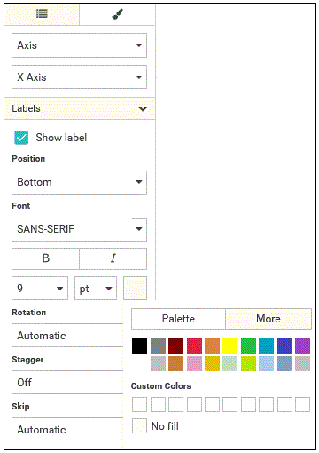
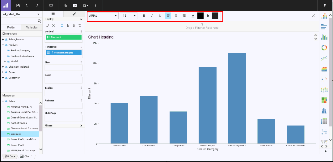
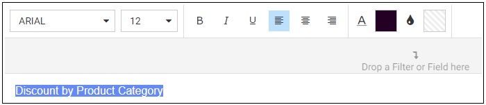
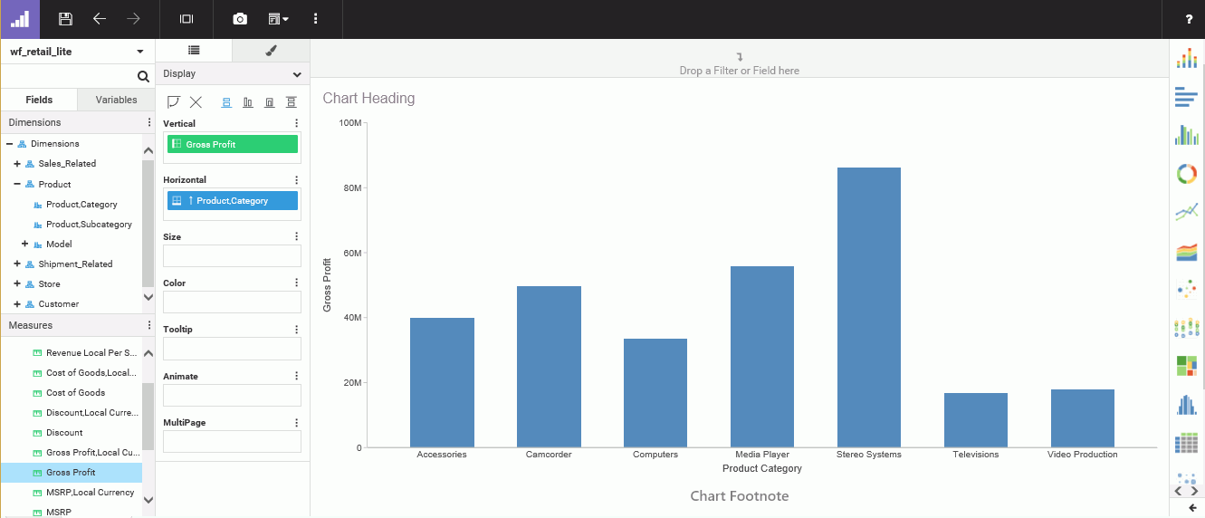
You can access the color picker in two primary ways: on the Style tab and at the top of the canvas when formatting headers and footers. Using these options, you can style with color and make other color-based decisions. You can indicate color values and ranges to highlight data. You can color a chart component (for example, a header or axis), text, or even add colored lines to accentuate the background grid of your data. You can also change the theme, which changes the color palette and background of your chart.

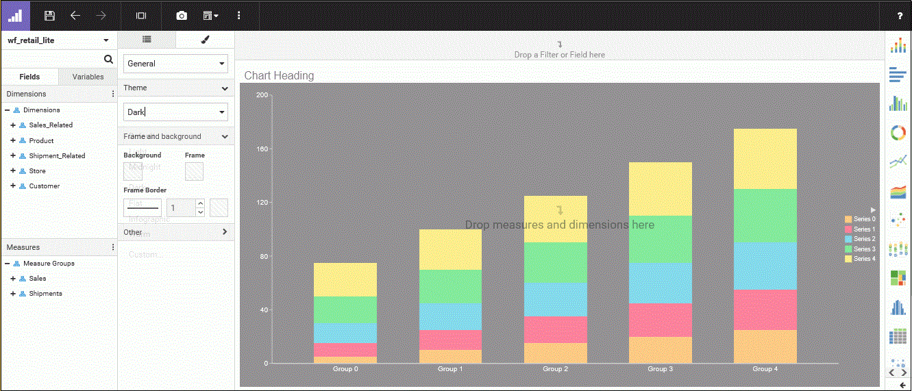
The following image shows an example of color options that display on the Style tab (with the palette exposed), which you will also see in other areas where color formatting is supported:

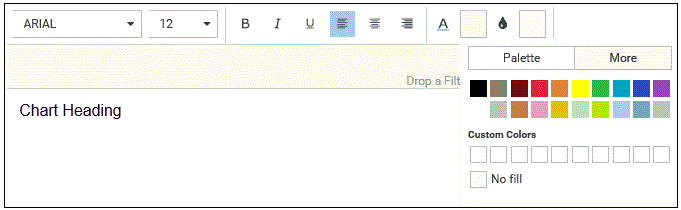
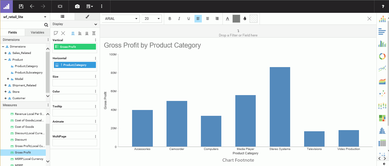
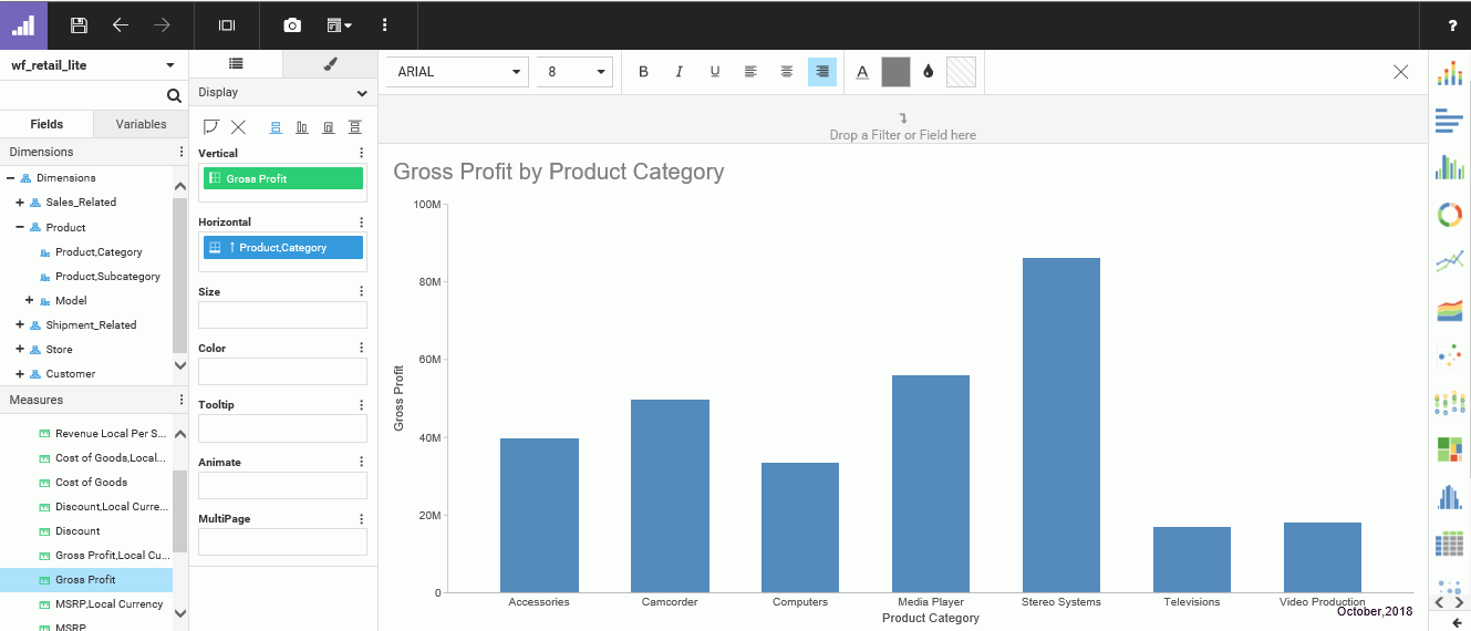
The following image shows the options that display at the top of the canvas (with the palette exposed) when working with headers and footers.

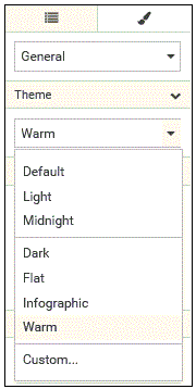
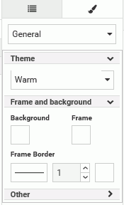
Note: When specifying a theme, you can use the default or specify another one. The colors stored for the theme are part of the underlying .css or .sty file, which contains the color schemes.

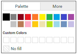
In WebFOCUS Designer, the color picker supports a colorspace and a palette-based approach, as shown in the following image.

You can access the color picker from any of the sections on the Style tab. You can also access the color picker when working 
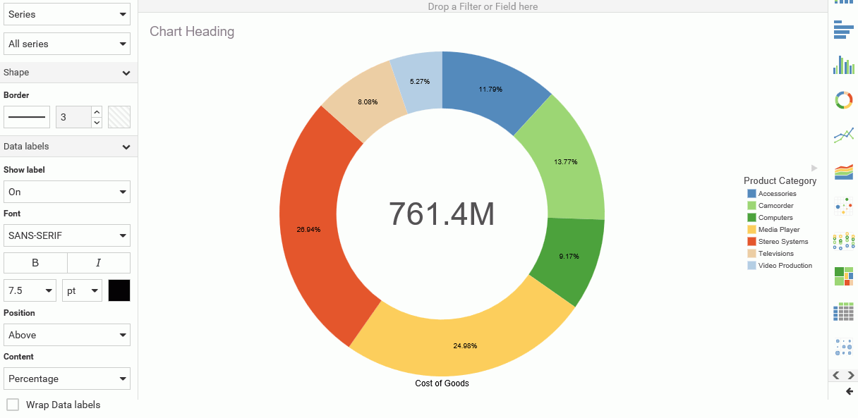
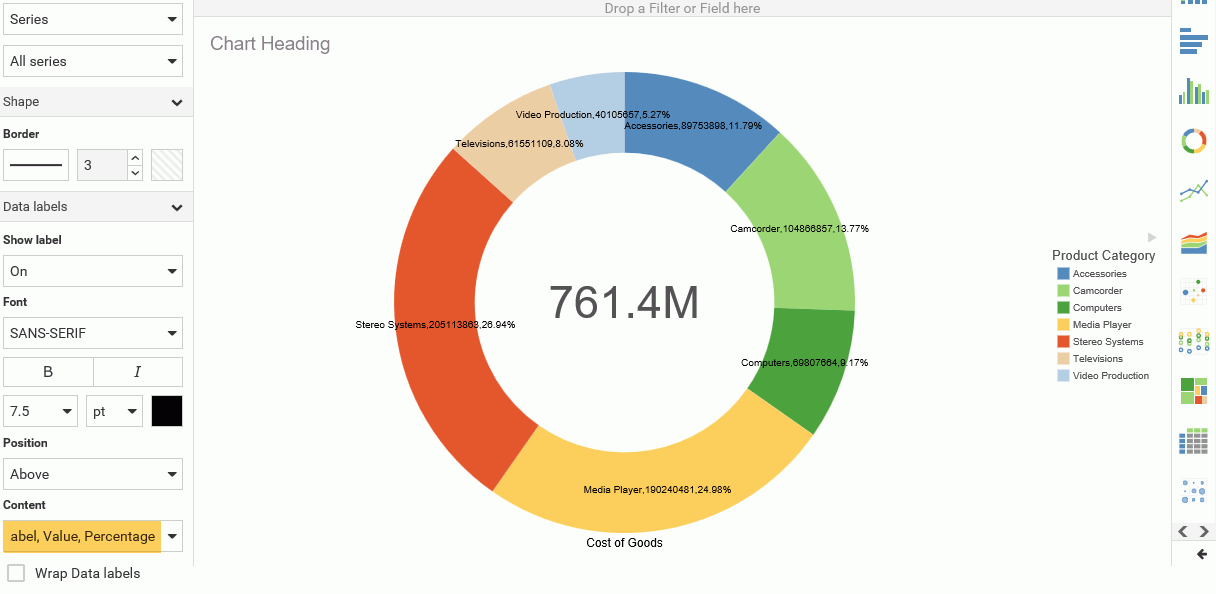
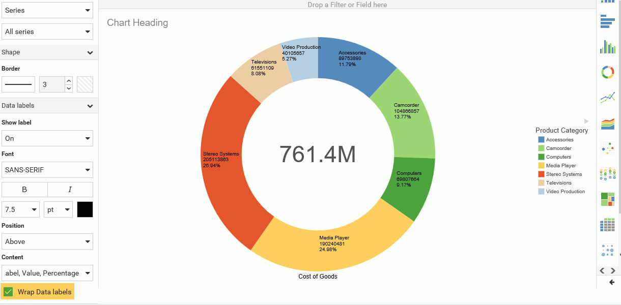
with headers and footers. When you access the color picker, the color picker displays the Palette tab, by default. From this tab, you can select from up to 20 pre-defined color options. You can also select the No Fill option, which displays the selected content as transparent. This is particularly useful in cases where you might want to prevent (or hide) the display of information.

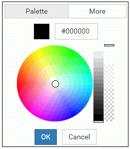
The More tab allows you to choose a custom color by interacting with a hue wheel and the color value field, as shown in the following image.

You can specify an exact color code (hexadecimal or HTML) by entering it in the color value field located at the top of this tab, and also specify transparency by using the transparency slider.

Note: When a custom color is selected and you click OK, the color is automatically added to the Custom Colors section in the Palette tab.

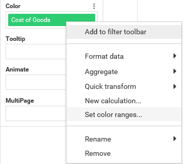
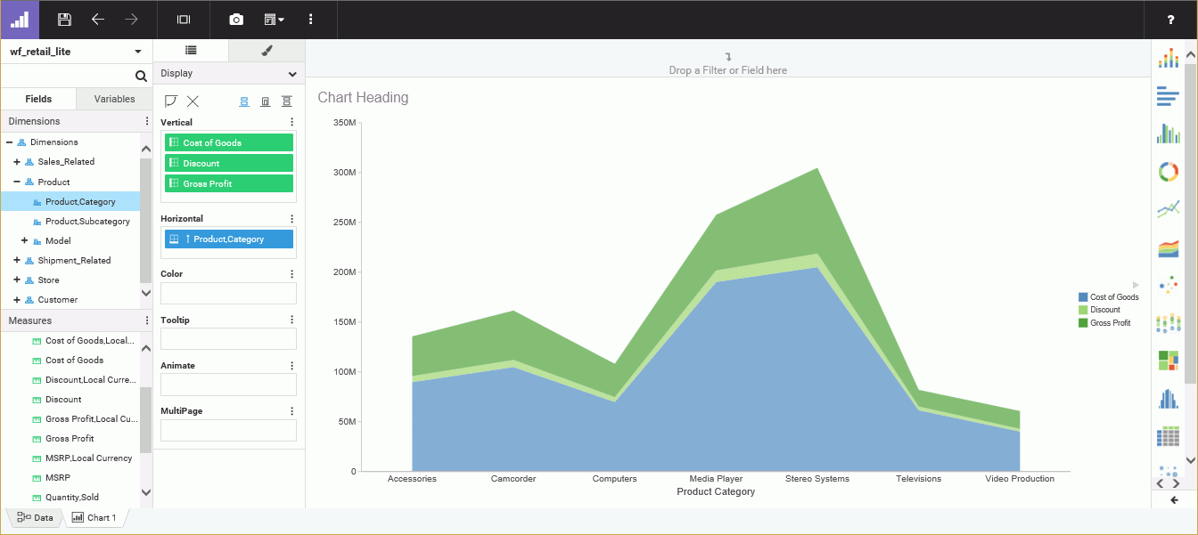
You can also set a color range for a measure in your chart. This allows you to specify hues or ranges of color for use in your chart. In cases where Theme is not selected, the color specification overrides what is available in the theme. The color that you select dictates the legend, which in turn displays the various chart components, based on the colors and measurements specified.

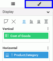
To change the color scale options, right-click a measure in the Color bucket and select 
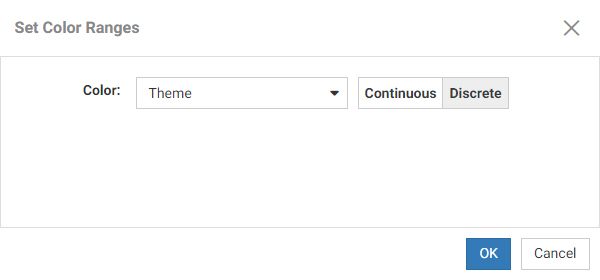
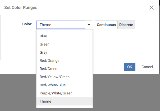
Set color ranges, as shown in the following image.

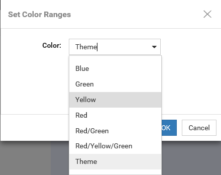
This invokes a new dialog box, Set Color Ranges, where you can select a color range for your chart, as shown in the following image.

When you make a selection, you can override the color schemes that are available from the theme of your chart. Theme is selected, by default. You can select a different color range, such as Green or Red/Orange, from the list of options, which gives you more control over how color is used in your chart to create contrasts between various aspects. For example, if your chart displays different temperature values using a measure in the Color bucket, you may wish to use the Red/White/Blue option to intuitively show higher temperature values in red and lower ones in blue

If you change the color range to something other than Theme, it is written as inline styling in the .fex file. Inline styling always overrides what is in the StyleSheet because it is listed after it in the .fex file. In this case, the last setting indicates which styling takes precedence. When the color range is set back to Theme, the inline styling is removed so the behavior returns to the theme's settings.

This behavior does not affect your ability to change themes on the Style tab. However, if you change the theme with an inline setting in place, the settings of the Theme will still be overridden by the inline settings and the color scale in the legend will not be affected. The current procedure only respects the current theme's settings if the color range setting is set to Theme.

In the Set Color Ranges dialog box, you can also select Continuous or Discrete to determine how the color scale is generated. When Continuous is selected, the color scale is a gradient, and each color in the color scale represents a different value. When Discrete is selected, the color scale is divided into segments. Each color in the color scale represents a range of values.

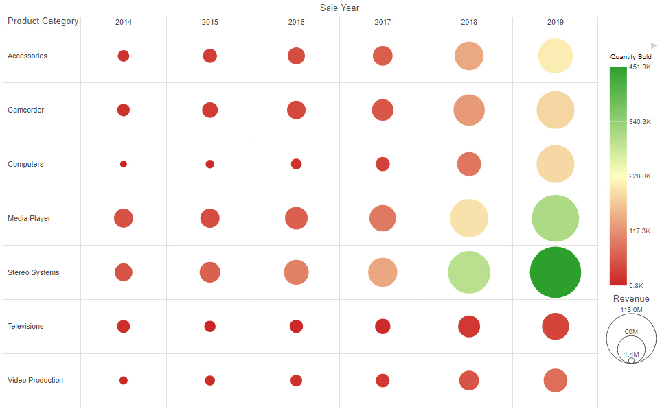
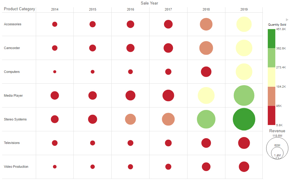
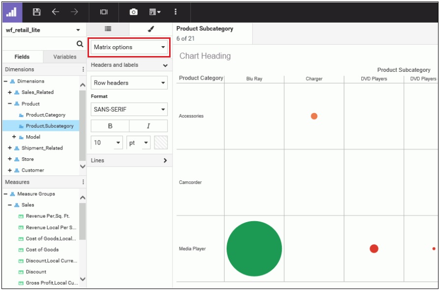
The following image shows a matrix marker chart that uses the Red/Yellow/Green color scale with the Continuous option selected.


Matrix marker chart with continuous color scale

The Continuous option creates a more granular color scale, allowing you to see slight differences between similarly colored chart components.

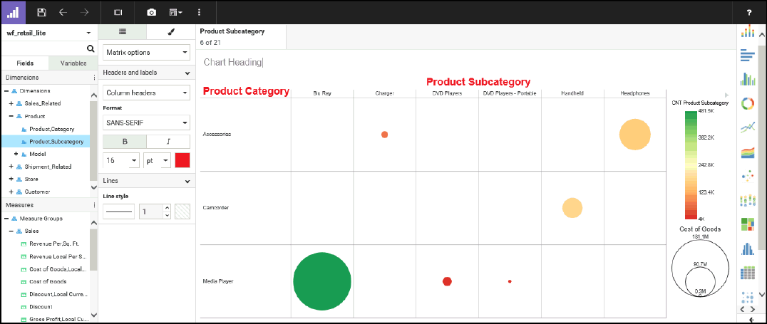
The following image shows the same chart, with the Discrete option selected.

Matrix marker chart with discrete color scale

The Discrete option creates identifiable groups based on sections of the color scale.

When using the Theme color scale option, the default color scale type and number of segments in discrete mode are dependent on the values of the colorScale property in the theme that you are using. For example, if 5 colors are listed for the colorScale property in StyleSheet being used as your theme, then 5 colors display in the color scale when the discrete option is used.
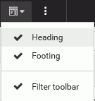
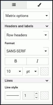
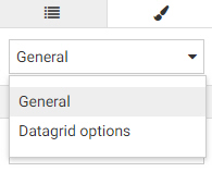
Procedure: How to Adding Color to Your Chart

To add color to your chart:

  1. On the WebFOCUS Home Page, click the Designer tab.
  2. Click Chart.
  3. Choose a data source and click Select.
  4. Add one or more measures and dimensions to your chart.
  5. On the Style tab, click General and then click Axis from the drop-down list, as shown in the following image.
  6. In the Font section, click Choose a color for your text.

    The color picker displays, as shown in the following image.

    The text color you select is displayed for the values on the specified axis (for example, x-axis), as shown in the following image.

Procedure: How to Change the Color Scale in a Chart

  1. On the WebFOCUS Home Page, click the Designer tab.
  2. Click Chart.
  3. Choose a data source and click Select.
  4. Add one or more measures and dimensions to your chart.
  5. Add a measure to the Color bucket.
  6. Right-click the measure field in the Color bucket and click Set color ranges.
    The Set Color Ranges dialog box displays, as shown in the following image.

    Set Color Ranges dialog box
  7. From the list of colors, select a color range, as shown in the following image.

    List of color ranges in the Set Color Ranges dialog box
  8. Optionally, select Continuous or Descrete to determine how the color scale is generated.

    When Continuous is selected, the color scale is a gradient, and each color in the color scale represents a different value.

    When Discrete is selected, the color scale is divided into segments. Each color in the color scale represents a range of values.

  9. Click OK.
    Note the change in the color and hues in your chart.

WebFOCUS