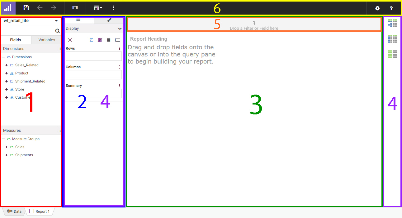
A report is a tabular display of data, in which quantitative measure values are displayed in rows and columns based on categorical
dimension values. As a Technical Preview feature, WebFOCUS Designer provides tools to expand on this basic structure through
organization, filtering, and formatting options, among others.
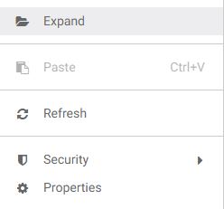
To enable the Technical Preview so that you can create reports using WebFOCUS Designer, on the WebFOCUS Home Page, expand
the User menu, point to Administration and click Administration Console. In the Administration Console, from the navigation pane on the Configuration tab, click Other. On the Other page, type ALL in the Technical Preview Features field, and then click Save.
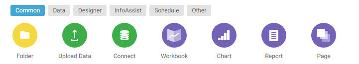
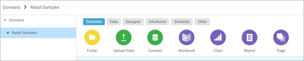
To create a report, on the WebFOCUS Home Page, select the domain or folder in which you want to save your content, clickDesigner on the Action bar, and then click Report. You are then prompted to select a data source, which defines the fields that you can use to build the report. Once you have
selected a data source, WebFOCUS Designer opens in report mode.
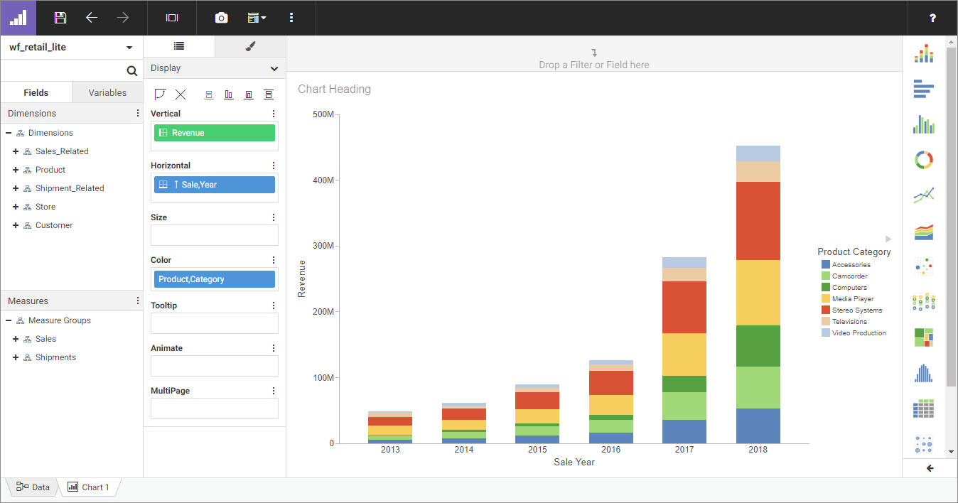
When creating a report, the WebFOCUS Designer toolbar provides access to general content-creation functionality, as well
as report-specific features to help you explore and contextualize your content and provide run-time enhancements. The WebFOCUS
Designer toolbar when creating a report is shown in the following image.
The following table lists and describes the controls that you can access from the WebFOCUS Designer toolbar when creating
a report.
|
Icon
|
Description
|
|
|
Application Menu. Opens a menu that includes the following options:
- Open. Opens an existing report. When creating a workbook, this option allows you to open another workbook.
- New. Creates new content in WebFOCUS Designer. This option is not available when the report is part of a workbook.
- Save. Saves the current report.
- Save as. Saves the current report as a new file.
- Export data. Downloads a spreadsheet containing the data in the report.
- View Source. Allows you to view the underlying source code of a report. This enables you to see how the report is built by exposing the
code that comprises it. Specially, it is used by support technicians to help you with debugging reports. Within View Source,
you can examine the contents of the procedure in a view only window. Clicking the Export button places a copy of the procedure as a .fex file into your download directory.
- Close. Close WebFOCUS Designer.
|
|
|
Save. Opens the Save dialog box, where you can save the report to a specific location in your environment. Once the report has
been saved, clicking Save overwrites the existing saved report.
|
|
|
Undo. Undoes the previous action.
|
|
|
Redo. Available when you have undone an action. Redoes the last undone action.
|
|
|
Preview. Shows the report in preview mode, allowing you to view how the page will appear when run. To exit the preview mode of the
WebFOCUS Designer, click the docked back arrow button or press the Esc key.
|
|
|
Show option. Allows you to show or hide the page header, page footer, or Filter toolbar.
|
|
|
More. Provides options to apply Auto Drill or Auto Linking to the chart, set it to be an Auto Link target, and add column and
row totals.
Note: Reports that are part of a workbook cannot be Auto Link targets or run with Insight.
|
|
|
Settings. Opens the Designer Settings dialog box, where you can change the following settings:
- Preview data. Allows you to choose to show Live data from the data source or generic Dummy data in the canvas at design time when creating
a chart.
- Record limit. When Live Data is selected, allows you to specify the number of records from the data source to display in the canvas at design time when
creating a chart.
|
|
|
Help. Launches the online Help content.
|
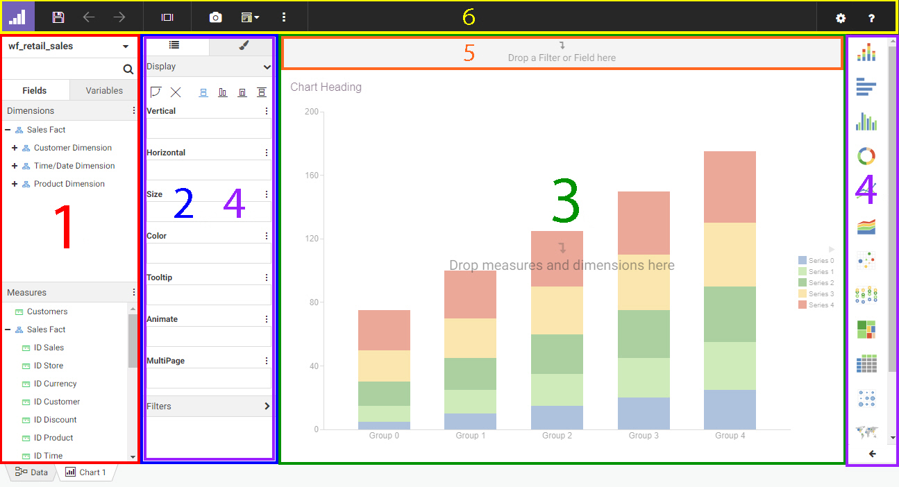
When creating a report, you use fields from a selected data source. Placing a field into the Rows, Columns, or Summary bucket
adds that field to the report to sort it into rows, sort it into columns, or display aggregated values.
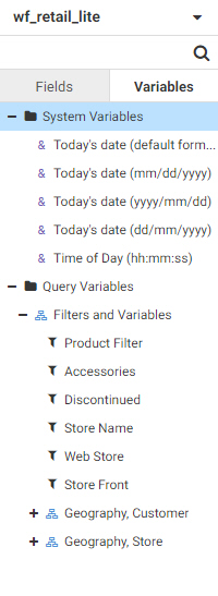
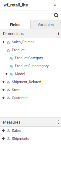
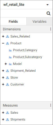
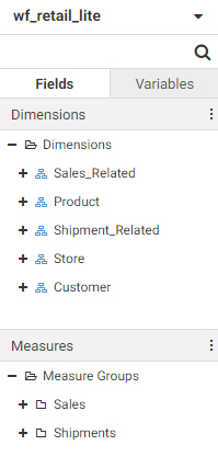
The Field panel includes the Fields tab and Variables tab.
When viewing fields, the menu at the top of the panel allows you to change how the fields are displayed. You can switch between
Folder view, which shows your fields organized into folders and hierarchies, and Flat view, which shows a single list of fields
in your data source. You can also choose whether to split dimensions and measures into separate sections of the panel and
choose whether to show the field titles, field names, or field paths. The Enforce Paths option automatically checks any joins
in your data source to ensure that all fields are connected. If a field is used whose table is not joined to another table,
Enforce Paths will not allow fields from that disconnected table to be used, ensuring that the request executes successfully.
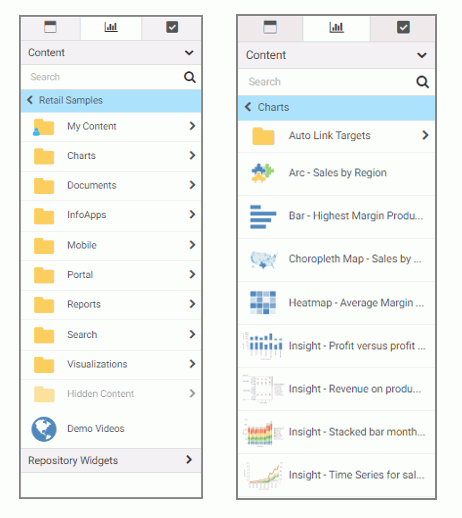
To view the selected data source and join it to additional related data sources, click the Data tab at the bottom of the Designer interface. You can return to the report by clicking the report tab.
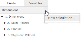
To add a field to the report, drag it into a bucket on the Display tab or onto the canvas. Right-clicking a field provides
further options, depending on the type of field. These options include the ability to add the field to the report or filter
toolbar, create bins for measure fields, or create a define field calculation using the selected field. You can also create
a define using the menu to the right of the Dimensions and Measures areas.
The Variables tab contains a list of variables and preset filters defined in your data source, as well as default system
variables. To use a variable to filter the report, drag it into the Filter toolbar.
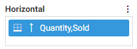
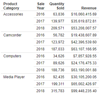
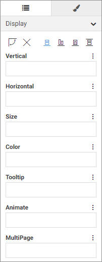
Adding fields to a bucket in the report defines how the report is structured. The Rows bucket creates a row for each unique
value in each field within it, sorting the aggregate or detail values in the report. You can use multiple fields in the Row
bucket to show more granular information in the report. In the following image, the Product Category and Sale Year fields
have both been placed in the Rows bucket, with the Quantity Sold and Revenue fields in the Summary bucket providing aggregated
values for each row.
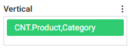
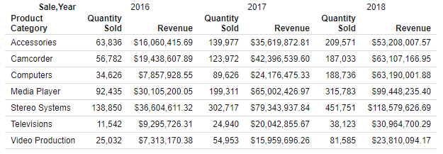
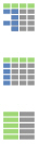
The Columns bucket creates a set of measure columns for each unique value in each Column field. Like the Rows bucket, fields
in the Columns bucket can be used to sort the aggregate or detail values in the report, and you can use multiple Column fields
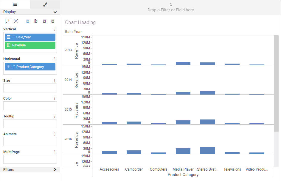
to display more granular information. In the following image, Product Category is in the Rows bucket, while Sale Year is in
the Columns bucket. Since Quantity Sold and Revenue are in the Summary bucket, they are repeated in separate columns for each
Sale Year value.
The Summary bucket aggregates measure field values for each sort value in the report. Measure values are summed, by default,
for each sort row and sort column value. You can right-click a field in the Summary bucket and point to Aggregate to aggregate measure values using a different operation, such as average or percent. Adding multiple fields to the Summary
bucket creates multiple measure columns in the report. These columns are repeated for each Column value, if any have been
added.
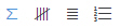
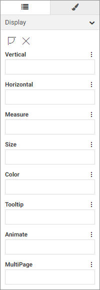
While the Summary bucket is the default measure bucket, it is not the only option for displaying measure values. You can
use the display options to change the Summary bucket to the Count, Detail, or Detail with counter bucket to display different
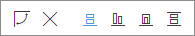
information for the fields within it. The display options can be accessed above the buckets, as shown in the following image.
The Count bucket, enabled by selecting the Count display option  , aggregates values in the report by displaying the number of records for each field within it, for each sort value. The Detail
bucket, enabled by selecting the Detail display option
, aggregates values in the report by displaying the number of records for each field within it, for each sort value. The Detail
bucket, enabled by selecting the Detail display option  , does not aggregate the values of the fields within it. Instead, it displays all values for the selected fields. The Detail
with counter bucket, enabled by selecting the Detail with counter display option
, does not aggregate the values of the fields within it. Instead, it displays all values for the selected fields. The Detail
with counter bucket, enabled by selecting the Detail with counter display option  , displays all values for the selected fields, similar to the Detail bucket, and also counts the rows for each primary sort
field.
, displays all values for the selected fields, similar to the Detail bucket, and also counts the rows for each primary sort
field.
The menu to the right of each bucket label also provides different options, depending on the bucket. On all buckets, this
menu allows you to create a new field list parameter or clear the bucket. For the Rows bucket, you can also create a new calculation,
and for the measure bucket, you can change the display option or create a new calculation.
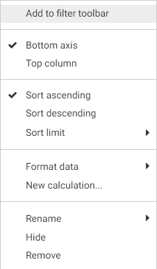
When placed into buckets, aggregate field labels appear in green while sort field labels appear in blue. Hidden fields appear
slightly dimmed. When placed in the Row and Column buckets, fields display icons indicating the sort order of the field. You
can click this icon to change the sort order from ascending to descending. You can drag fields around within a bucket to reorder
them, or click the X on a field in a bucket to remove it.
To remove all fields from the report, click the Clear buckets content icon  above the buckets.
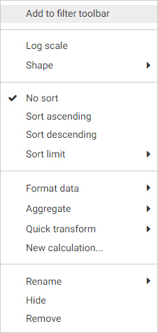
You can also right-click a field label in the Display tab to access options pertaining to that field. These options include
field format, sorting, and more.
The tabs above the buckets allow you to switch from the Display tab to the Style tab  . The Style tab contains a set of options to style and format the report. You can select a theme to provide automatic styling
to different components of the report, such as headers, column titles, and data values, based on a predefined StyleSheet.
You can also change the output format. You can use the default HTML format, which runs your report in a web browser, or you
can use the Offline Analysis option to enable a number of in-document analytic options that allow you to interact with the
report and explore the data that it was created with, even without a connection to the original data source.
. The Style tab contains a set of options to style and format the report. You can select a theme to provide automatic styling
to different components of the report, such as headers, column titles, and data values, based on a predefined StyleSheet.
You can also change the output format. You can use the default HTML format, which runs your report in a web browser, or you
can use the Offline Analysis option to enable a number of in-document analytic options that allow you to interact with the
report and explore the data that it was created with, even without a connection to the original data source.
The current state of the report appears on the canvas. When you add fields to the report, either by dragging fields to buckets
or onto the canvas itself, the report on the canvas is automatically refreshed.
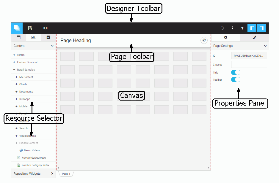
You can quickly and easily change the layout of the report by using the report picker, which is shown in the following image.
You can click a pattern in the report picker to instantly change how the field values are arranged on the report, by having
sort field values display on each row instead of showing blanks to indicate repeated values, or by using stacked measures
to organized measure fields in sets of rows instead of columns.
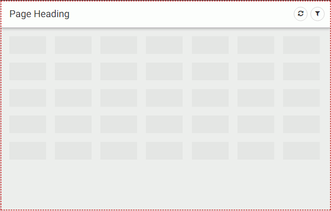
The canvas also contains, if enabled in the Show option menu, a page heading section and a page footing section. You can
double-click these sections to add and edit the header and footer text for each page of the report.
When editing the header or footer, a text toolbar appears, allowing you to make modifications to the text including font,
size, style, alignment, and color, as shown in the following image.
You can also drag a field from the Field panel into the heading or footing area to create a dynamic header or footer containing
the displayed field value. If there are page breaks in the report that affect the field added to the header or footer, a different
field value appears on each page.
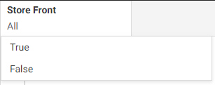
Above the canvas is the Filter toolbar. The Filter toolbar enables you to quickly filter your report with a dynamic parameter
for the selected field. To add a filter, drag a field from the Field panel to the Filter toolbar. A prompt appears, allowing
you to select filter values for the report. The selection control changes depending on whether the field is a character field,
numeric field, or date field. If no value is selected in the filter control, all values are displayed in the report, and no
filtering is applied.
If you right-click a filter, you can set it to exclude the selected values or choose whether to allow one value or multiple
selected values. If you click Require Selection, the report will not load until a value is selected to dynamically filter the report at run time.
To see a run-time view of the report, including behaviors such as Auto Drill, Auto Linking, or dynamic filtering that are
not available in the canvas, click Preview  on the WebFOCUS Designer toolbar.
 to expand or collapse the sidebar.


 . The Style tab contains a set of options to format the chart. These options include general options, as well as options specific
to each chart type. You can use the Quick Access menu to access different sets of formatting options. For example, the following
image shows the menu to access different sets of options for a bar chart.
. The Style tab contains a set of options to format the chart. These options include general options, as well as options specific
to each chart type. You can use the Quick Access menu to access different sets of formatting options. For example, the following
image shows the menu to access different sets of options for a bar chart.


 or a hierarchy
  , and whether a field is a character
  , geography
  , date
  , or numeric
  field. Calculated fields are indicated by a function symbol added to the field icon.
 when pointing to an invalid bucket. For example, when creating a vertical bar chart, you cannot drop a measure field into
the Horizontal bucket, or a dimension field into the size bucket. If you drop a dimension field into the Vertical bucket,
instead of aggregating the report like a measure field in the Vertical bucket would, matrix rows are created for each value
in the dimension field.
when pointing to an invalid bucket. For example, when creating a vertical bar chart, you cannot drop a measure field into
the Horizontal bucket, or a dimension field into the size bucket. If you drop a dimension field into the Vertical bucket,
instead of aggregating the report like a measure field in the Vertical bucket would, matrix rows are created for each value
in the dimension field.