In this section: |
How to: |
You can create charts, maps, and grids to visually represent your data. You can add multiple visuals to the canvas to create a complete visualization.
The default visual is a bar stacked chart. You can use the Change option in the Visual group on the Home tab to change the visual type.
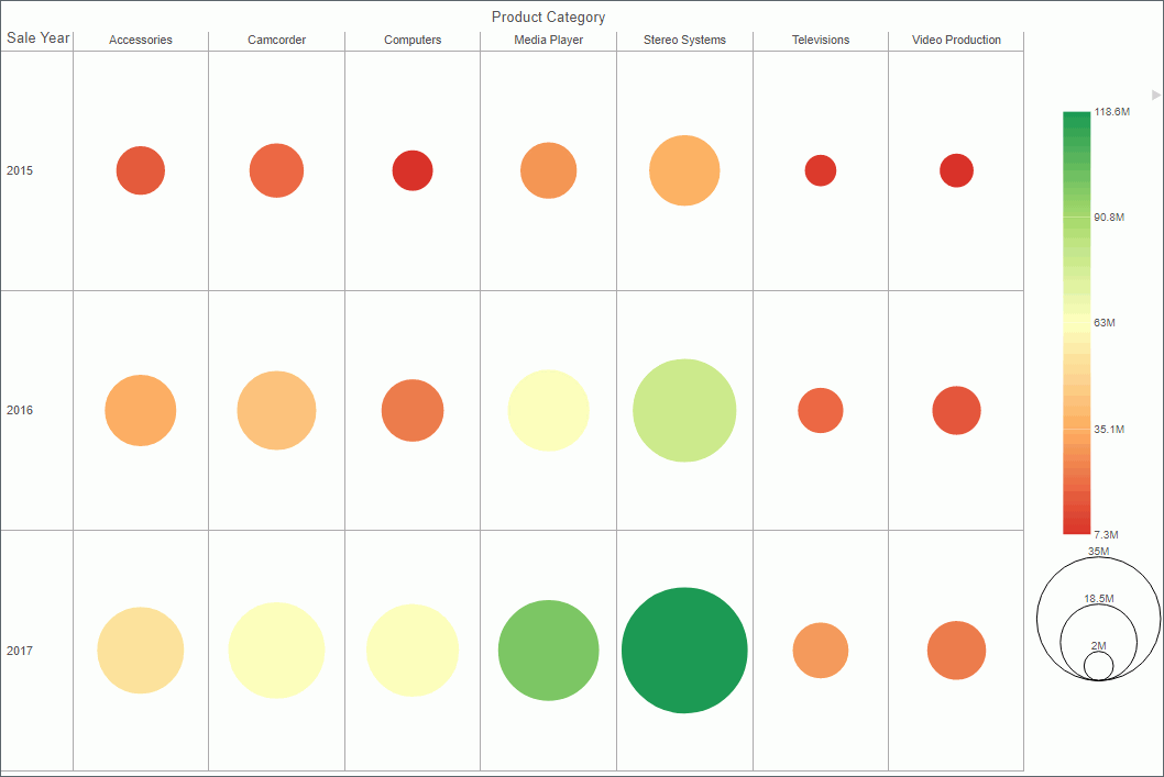
The following visual is a matrix marker chart that shows sales data for a range of electronic products.
Note: Visualization takes advantage of the feature to provide the best user experience. To display date values within the visualization, use the legacy DATE formats which are supported with rather than DATE-TIME formats.
You use this procedure to create a visualization within WebFOCUS.
You can have multiple file types opened at once. To create a visualization:
or
Click the Application Main Menu button, and click New.
The InfoAssist splash screen displays.
InfoAssist switches to Visualization mode.
How to: |
You can create a visual using the default chart type, which is a stacked bar chart. You can add your data to this chart and then change the chart type, or you can change the chart type prior to making your data selections.
Once you have started exploring your data, you can switch between the different types to obtain the graphical image that you wish to display.
You change the visual type from the Home tab.
Note: The Change icon updates depending on the chart, map, or grid that you select from the Select a Visual menu. By default, the Change icon displays a stacked bar chart.
The Select a Visual menu displays.
Your canvas refreshes and displays the visual that you selected.
Note: Depending on the type of visual that you select, you may need to select additional or different data fields.