|
In this section: |
|
How to: |
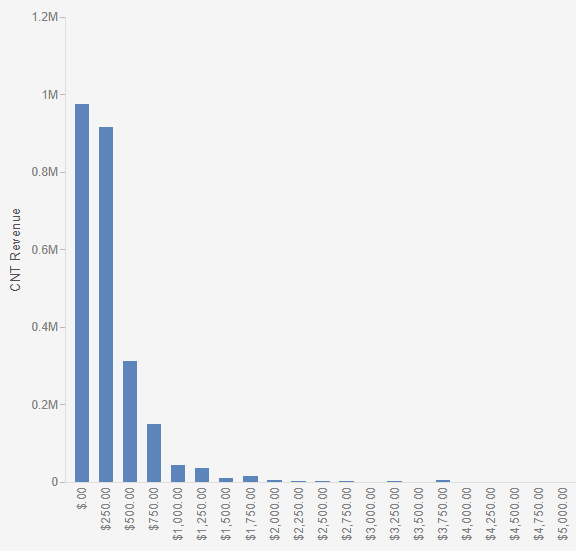
In WebFOCUS Designer, bins are used to group numeric values by the increment you specify. This allows you to view large amounts of data across measures or calculated measures, enabling you to analyze trends and identify outliers. Data binning also allows you view your data as part of a larger group, displaying ranges of that data in manageable, visible bins.
For example, you might want to analyze Cost of Goods Sold against Discount to understand how discounts impact the cost of goods. First, you add the Discount measure to the Vertical field container. These values will be used as a guide for the comparative, grouped content in the bin. If you apply a bin width value of 250 to the Cost of Goods measure, your data values will be grouped into ranges of 250 (for example, 0 - 250, 250 - 500, 500 - 750). Finally, you add the new binned dimension field (generated by the bin process) to your chart. Your chart now displays the binned values against the Discount measure, as shown in the following image.
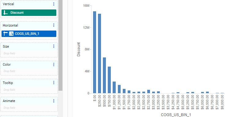
As you can see in this example, there is a direct correlation between Cost of Goods and Discount, with the smaller cost records values (0 - 250) constituting more of the discount amount. From this example, it is evident that a large portion of total discounts are given for lower cost items. In this case, binning has given you insight into the frequency distribution of values in your data.
Bins are created on a numeric measure field (for example, Gross Profit), as shown in the following image.
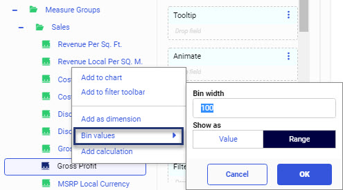
Examples of numeric measure fields include Gross Profit or Discount. Once you create a bin, a new dimension field is automatically created, allowing you to plot values based on your bin specifications.
You can create or edit bins using the same options. On the Resources panel, right-click a field and click Bin values, or right-click a binned field and click Edit bin values. This opens a shortcut menu with the following options:
- Bin width. A standard text box that accepts any number greater than 0.
- Show as. Identifies the bin label type.
- Value. Displays the alphanumeric representation of the numeric value containing the minimum value (FLOOR) of each bin. The format should be set to the data format of the source field.
- Range. Displays the alphanumeric string representing the minimum and maximum range for each bin. The format should be set to the data format of the source field.
- OK. Creates a new dimension field based on the bin options that you selected. This dimension field is automatically added under your dimensions in the Fields tab.
- Cancel. Closes the shortcut menu and cancels the changes.
The following image displays bin values and bin ranges for the DEALER_COST field, using a bin width of 1000. It also shows how the data falls into the value and range properties.
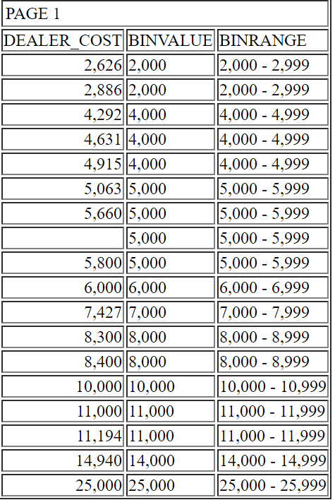
Note: Bin fields that display ranges, using the Show as Range option, use a character field format, while bin fields that display floor values, using the Show as Value option, use a numeric field format. As a result, when displaying ranges, bins with negative numbers display after bins with positive values. This is due to the sort sequence used for character fields. On the other hand, when displaying floor values, bins are sorted into numeric order, so negative value bins display before bins with positive values.
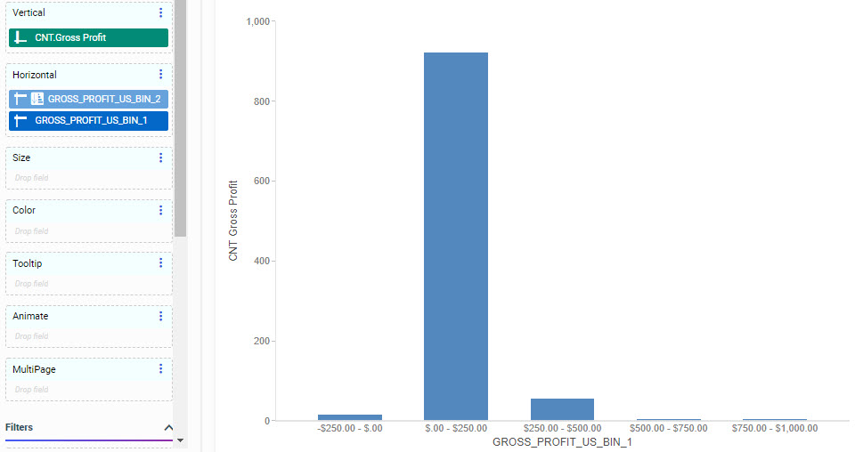
Therefore, if the measure field that you are binning includes negative values, it is recommended to select Value as the Show as option. Alternatively, you can display ranges in numeric order by using a bin with values as a hidden, higher-level sort field and adding the bin with ranges below it on the same axis. For example, if creating a vertical bar chart, create a value bin field and a range bin field, both with the same width. Add the value bin field and then the range bin field to the Horizontal bucket, then hide the value bin field. The ranges are now in the correct order, as shown in the following image.
