Charts communicate overall trends quickly with eye-catching and intuitive graphics. Charts come in many different varieties that allow you to communicate information with varying degrees of complexity and specificity. You can use simple charts to effectively communicate simple metrics, and more complex charts to clearly display relationships between different aspects of your data, making it easy to identify less obvious trends.
Different chart types utilize different kinds of data and enable different styling options. You can easily change chart types by selecting a different option from the Content picker, making it easy to ensure that you choose the chart type that best represents your data.
When creating your visualization, you can use tooltips and on-chart filtering to get the necessary information from your chart, and you can also enhance the chart with run-time capabilities such as drill-downs and In-Document Analytics to make even more information available from a single chart.
WebFOCUS Designer opens in a new browser tab.
Once you select a data source, WebFOCUS Designer loads with options to create a single content item.
Note: You can also double-click a measure to add it to the default measure bucket or drag it into an appropriate bucket of your choice.
Note: You can also double-click a dimension to add it to the default dimension bucket or drag it into an appropriate bucket of your choice.
The chart refreshes with your selections.
When you create a single chart and save it for the first time, it is saved as a stand-alone chart, which allows you to add it as external content to pages. If you click Convert to page on the Visualization toolbar, your content becomes a page to which you can add more content and containers. After this point, it is saved as a multi-content page.
You can now continue editing your chart, or add more charts to the visualization to turn it into a page.
How to: |
Use a vertical stacked bar chart when you want to view information for one dimension within another dimension. For example, when you want to see which product subcategories accounted for the most sales within each product category.
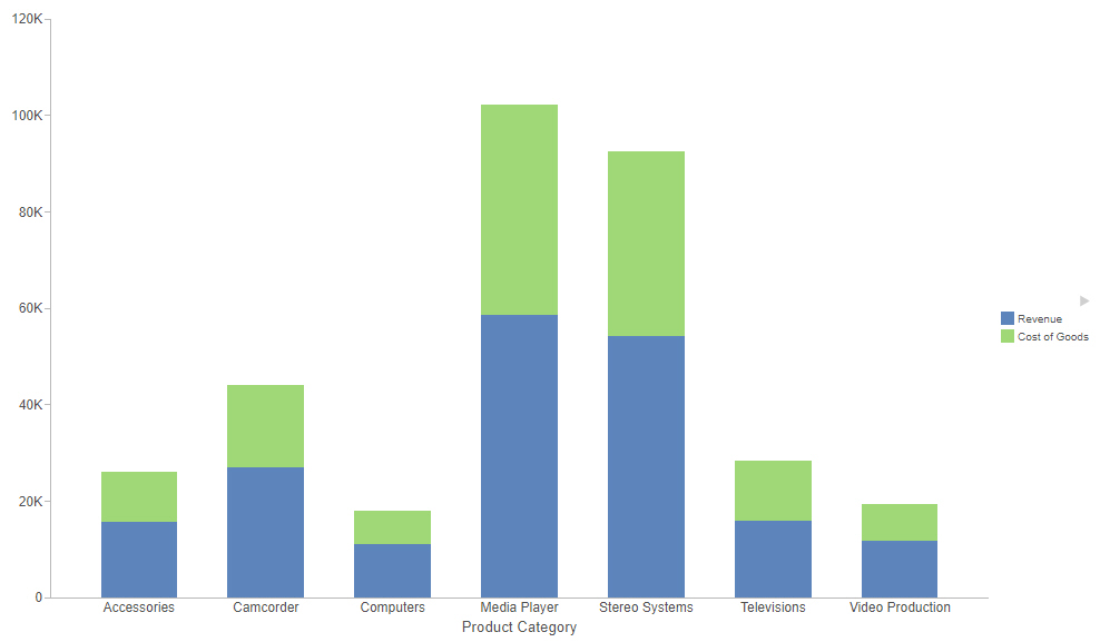
If you use one measure in the Vertical bucket and one dimension in the Horizontal bucket, a simple bar chart is created, with no stacked segments. Vertical stacked bar charts require at least one measure and one dimension. If you add a second measure to the Vertical bucket, a second series is created for the new measure and a new segment is placed on top of the first measure in each bar, as shown in the following image.
Additional measures increase the number of segments in a stack.
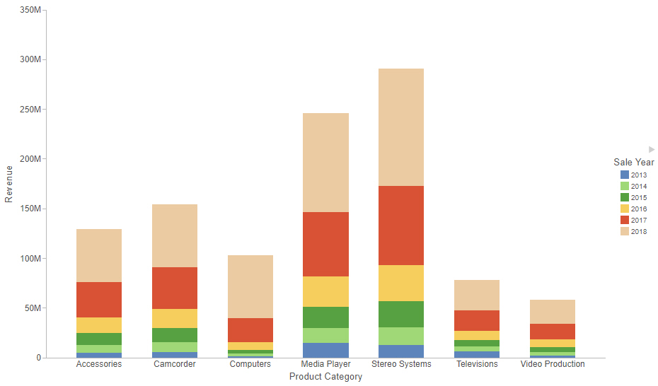
If you instead add a dimension field to the Color bucket, colored segments are created for each value in that dimension field, as shown in the following image.
Additional fields added to the color field create additional segments based on concatenated values.
The following display options are available for a vertical stacked bar chart:
You can add fields to the following buckets for a vertical stacked bar chart:
WebFOCUS Designer opens in a new browser tab.
Once you select a data source, WebFOCUS Designer loads with options to create a single content item.
Vertical stacked bar is the default chart type. If you have a different content type selected by default, select the vertical stacked bar chart option from the Content picker.
The vertical stacked bar chart refreshes with your selections.
How to: |
Use a horizontal bar chart when you want to emphasize a ranking relationship in descending order. This chart type can also be used when the x-axis label is too long to fit legibly side-by-side.
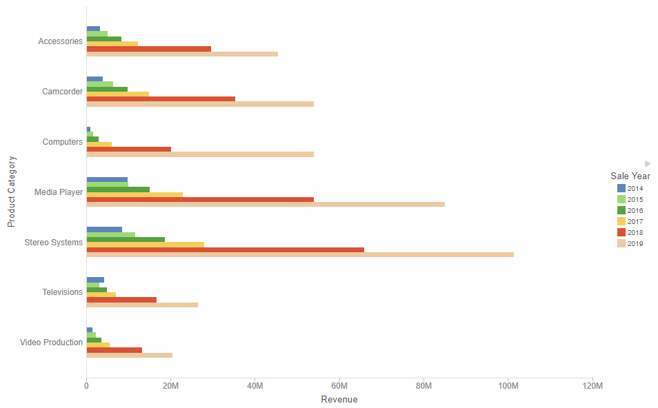
If you add additional measure fields to the Horizontal bucket or add dimension fields to the Color bucket, additional bars are placed in groups for each vertical axis value. A horizontal bar chart with multiple dimension fields is shown in the following image.
Note: Horizontal bar charts require at least one measure and one dimension. Add measures as required to compare additional values.
To sort the bars from high to low, right-click a measure value in the Horizontal bucket and click Sort descending.
The following display options are available for a horizontal bar chart:
Note: When sorting a bar chart, each series is treated as a unique bar. As a result, groups of series such as stacked bar segments, side-by-side groups, or absolute overlapping bars may be separated.
You can add fields to the following buckets for a horizontal bar chart:
WebFOCUS Designer opens in a new browser tab.
Once you select a data source, WebFOCUS Designer loads with options to create a single content item.
How to: |
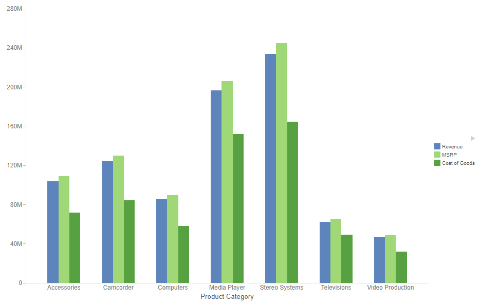
Vertical side-by-side bar charts can be used to show additional measure or dimension values for each horizontal axis value using differing identifying colors. Side-by-side bar charts are useful to directly compare the values for different measures or categories within each horizontal axis sort value. The following image shows a vertical side-by-side bar chart with one dimension field and multiple measure fields.
Note: This chart requires at least one measure and one dimension. Add measures as required to compare additional values.
The following display options are available for a vertical side-by-side bar chart:
You can add fields to the following buckets for a vertical side-by-side bar chart:
WebFOCUS Designer opens in a new browser tab.
Once you select a data source, WebFOCUS Designer loads with options to create a single content item.
How to: |
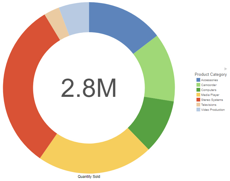
Use a ring pie chart when you want to review the value of each segment, which represents the measure value for the selected dimension, as it relates to the total for the selected measure. The total value represented by all segments displays in the middle of the ring pie chart. The following image shows a ring pie chart.
Note: Ring pie charts require at least one measure (placed in the Measure bucket) and one dimension (placed in the Color bucket). Add additional measures as required to create a separate ring pie for each measure.
The following display options are available for a ring pie chart:
You can add fields to the following buckets in a ring pie chart:
WebFOCUS Designer opens in a new browser tab.
Once you select a data source, WebFOCUS Designer loads with options to create a single content item.
The ring pie chart refreshes with your selections.
How to: |
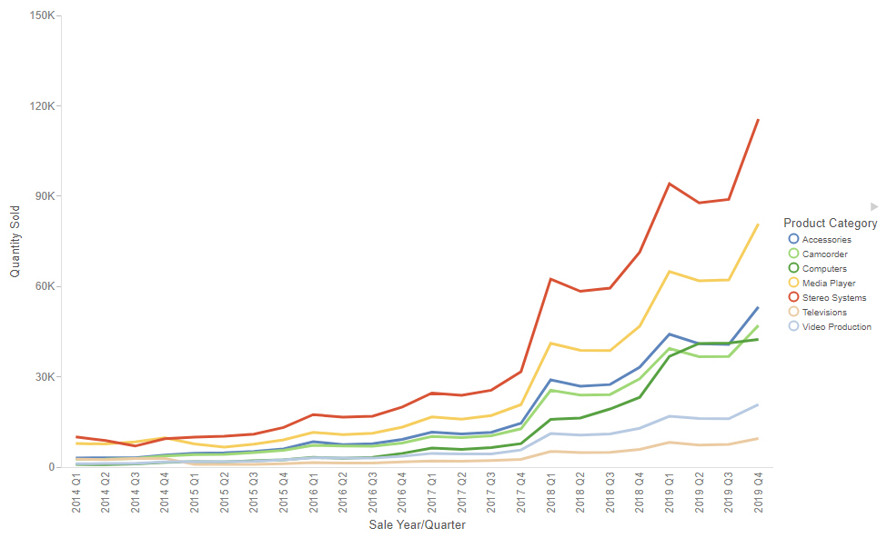
Use absolute line charts when you want to show trend data over time. For example, monthly changes in employment figures, or yearly sales of an item in your inventory.
Note: Absolute line charts require at least one measure and one dimension. Adding multiple measures or adding fields to the Color bucket will create additional lines on the chart, as shown in the following image.
The following display options are available for a line chart:
You can add fields to the following buckets for a line chart:
WebFOCUS Designer opens in a new browser tab.
Once you select a data source, WebFOCUS Designer loads with options to create a single content item.
How to: |
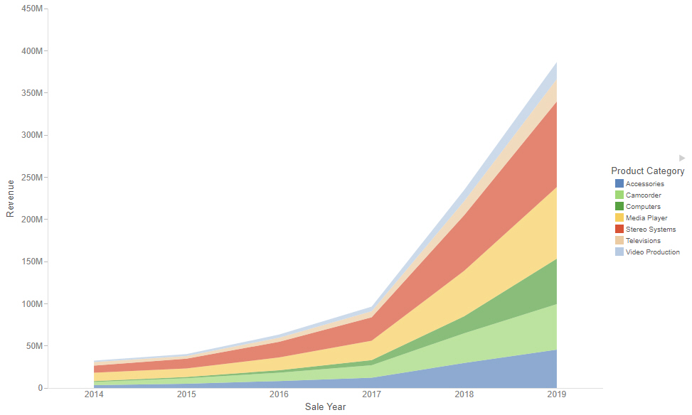
Use vertical stacked area charts when you want to distinguish your data more dramatically by highlighting volume with color. In a vertical stacked area chart, each area is stacked on top of the sections below it, as shown in the following image.
Note: Vertical stacked area charts require at least one measure and one dimension. Adding multiple measures will create additional shaded areas on the chart.
The following display options are available for an area chart:
You can add fields to the following buckets for an area chart:
WebFOCUS Designer opens in a new browser tab.
Once you select a data source, WebFOCUS Designer loads with options to create a single content item.
The vertical stacked area chart refreshes with your selections.
How to: |
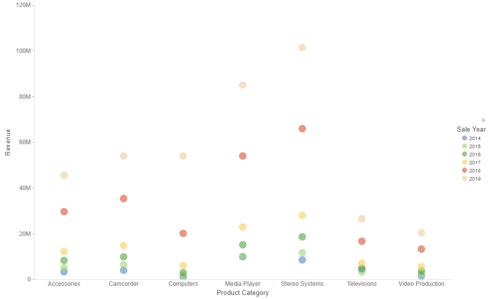
Scatter charts are used to show relationships between X and Y values. They compare two sets of numbers at once, which is useful for discovering patterns and trends.
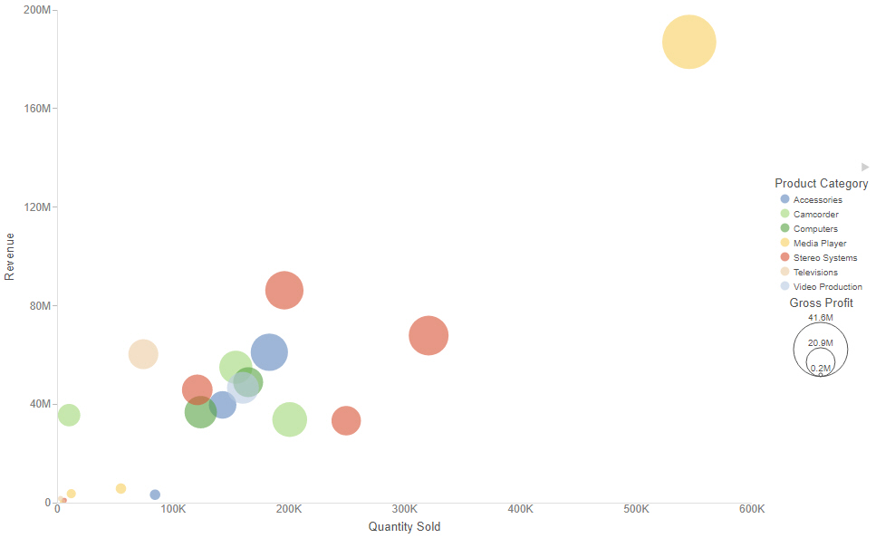
A bubble chart is a chart in which the data points are represented by bubbles. Bubble charts can have two column fields representing X and Y data values, or have three column fields representing X, Y, and Z data values, in that order. The third variable (Z) represents size. The size of each bubble is used to show the relative importance of the data. A bubble chart can be used to effectively show the relationship between three measure fields, as shown in the following image.
Note: Scatter/bubble charts require at least two measures, and one dimension, which can be a color field or detail field. Optionally, add a dimension to the Size bucket using the count aggregation to view the concentration of data.
The following display options are available for a scatter plot or bubble chart:
You can add fields to the following buckets for a scatter plot or bubble chart:
WebFOCUS Designer opens in a new browser tab.
Once you select a data source, WebFOCUS Designer loads with options to create a single content item.
The scatter/bubble chart refreshes with your selections.
How to: |
Use circle plot charts to display differing values in rows, enabling you to draw inferences as to how the values overlap. An example of a circle plot is shown in the following image.
Note: Circle plot charts require at least one measure and one dimension, as well as one for the Detail and Color buckets. Optionally, add a dimension to the Size bucket with the count aggregation to view the concentration of data.
The following display options are available for a circle plot chart:
You can add fields to the following buckets for a circle plot chart:
WebFOCUS Designer opens in a new browser tab.
Once you select a data source, WebFOCUS Designer loads with options to create a single content item.
The circle plot chart refreshes with your selections.
How to: |
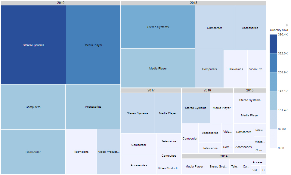
Treemap charts can be used to display large amounts of hierarchically structured data. Using a set of nested rectangles to illustrate data relationships, sections of a treemap represent branches of a tree. A treemap is shown in the following image.
Note: Treemap charts require at least one measure and one dimension, to be placed in the Size and Color buckets. Groups are determined by those fields specified in the Grouping bucket.
The following content display options are available for a treemap:
You can add fields to the following buckets for a treemap:
WebFOCUS Designer opens in a new browser tab.
Once you select a data source, WebFOCUS Designer loads with options to create a single content item.
The treemap chart refreshes with your selections.
How to: |
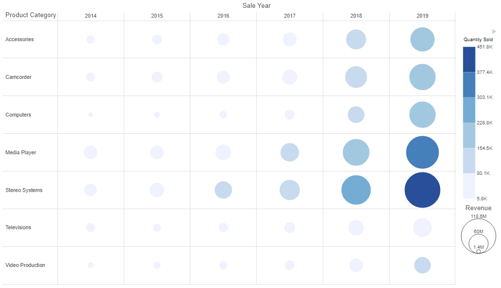
Matrix marker charts can be used to analyze one or two measures against a crosstab of two categorical dimensions. The result is a color scaled matrix chart that shows categorized trends, as shown in the following image.
Note: Matrix marker charts require at least two measures and two dimensions. It also requires a field in the Color and Size buckets, which allow you to see the concentration of data for that intersection of the chart.
The following display options are available for a matrix marker chart:
You can add fields to the following buckets for a matrix marker chart:
WebFOCUS Designer opens in a new browser tab.
Once you select a data source, WebFOCUS Designer loads with options to create a single content item.
The matrix marker chart refreshes with your selections.
How to: |
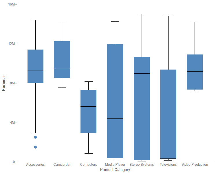
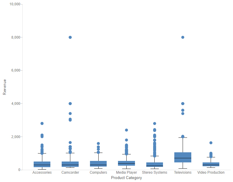
A box plot, also known as a box-and-whisker plot, is a chart type that provides distribution information about your data. The box represents the range between the upper and lower quartiles, and the line inside the box represents the median. The whiskers represent the maximum and minimum with outliers excluded, and outliers are represented by individual points. An example of a box plot is shown in the following image.
Since box plots display the distribution of points in your data, you need to provide detail values. You can do this in one of two ways. One option is to add a dimension field to the Detail bucket. This field should have a large number of distinct values in order to generate a sufficient spread of data for the box plot. For example, in the image above, a separate box plot is created for each Product Category to show the distribution of values in the Model field, which has been placed in the Detail bucket.
Another option is to incorporate your entire data set into the box plot. You can do this by changing the calculation method from Summaries to Details. In this case, you do not need a field in the Detail bucket to generate the box plot. The following image shows a box plot chart in which separate box plots are still generated for each product category, but which uses the Details calculation option instead of using Model as the Detail field. Since more data values are used in this chart, there are more outliers.
The following display options are available for a box plot:
You can add fields to the following buckets for a box plot chart:
WebFOCUS Designer opens in a new browser tab.
Once you select a data source, WebFOCUS Designer loads with options to create a single content item.
A single measure value displays as a line in each column.
A set of box plots appears on the canvas, showing indicators for outliers, maximum and minimum, median, and upper and lower quartiles.
In this section: |
How to: |
Reference: |
As an alternative to creating a map procedure in the text editor using WebFOCUS syntax, you can use the user interface in WebFOCUS Designer to create a multi-layer map from a single data source. You can then enhance your map with additional data and content layers, created directly within WebFOCUS Designer or referenced from existing map procedures or configured context layers.
To create a new map in WebFOCUS Designer, on the WebFOCUS start page, click the plus button and then click Create Visualizations. After WebFOCUS Designer opens and you select a data source, from the content picker, change the content type to a map. Once you have changed the content type to a map, you cannot change it back to another chart or report type.
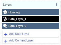
To create a map, start by adding a data layer or content layer, from the Settings tab of the Properties panel. A data layer is created directly in WebFOCUS Designer, from fields in your selected data source. A content layer can be either a single layer map that was saved to your environment, or a context layer configured on the ibi™ WebFOCUS® Reporting Server. You can add multiple data and content layers to your map, and reorder them in the Layers bucket. The layers are drawn on the map in the layer in which they are listed, so the first layer in the list appears underneath the other layers, and the last layer in the list appears on top. The Layers bucket with two data layers and a content layer is shown in the following image.
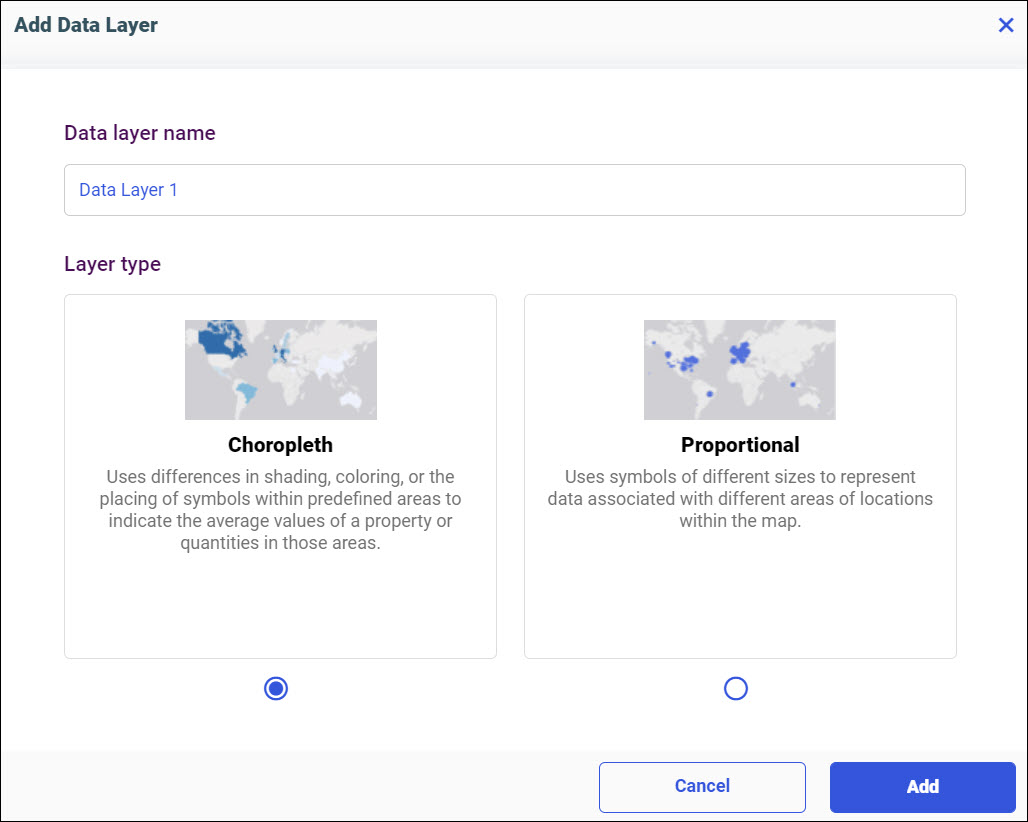
When you add a new data layer, in the Add Data Layer dialog box, you first assign a name to the layer, that will appear in the legend and layers list, and select the type of map layer that you would like to create, as shown in the following image.
A data layer can be a choropleth or a bubble map. You can then populate the map layer by adding fields to the buckets on the Properties panel. Drag a field with a defined geographic role to the Location bucket, and populate the color, tooltip, and, depending on the layer type, size buckets to provide additional information in the map. You can style the selected layer using the options on the Map Properties panel.
To add more layers, click Add Data Layer or Add Content Layer. All layers appear in the Layers bucket, where they can be reordered, hidden, or deleted.
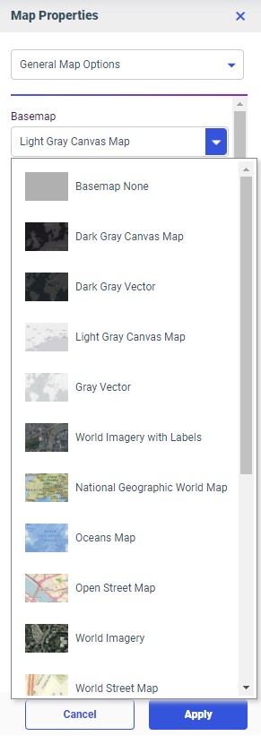
You can also style the run-time map interface from the Map Properties panel. The Map Properties panel provides options to change the basemap, interface style, viewing options, and available run-time tools and widgets. These run-time tools and widgets include the Search bar, Measurement tools, Directions widget, and Location widget. To open the Map Properties panel, click the Map Properties button on the Visualization toolbar. The Map Properties panel is shown in the following image.
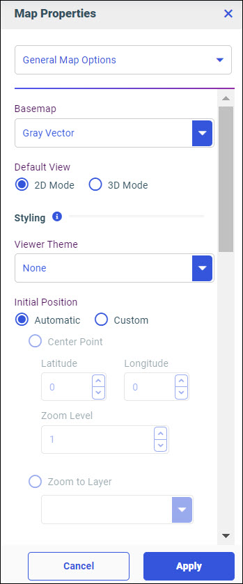
From the Map Properties panel, you can set the following properties:
Each widget can be positioned based on the corner of the map in which it should be placed, and an index value that determines its position relative to other widgets in the same corner. The widget with the lowest index value is positioned closest to the specified corner.
How to: |
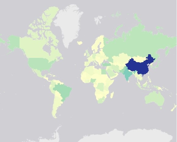
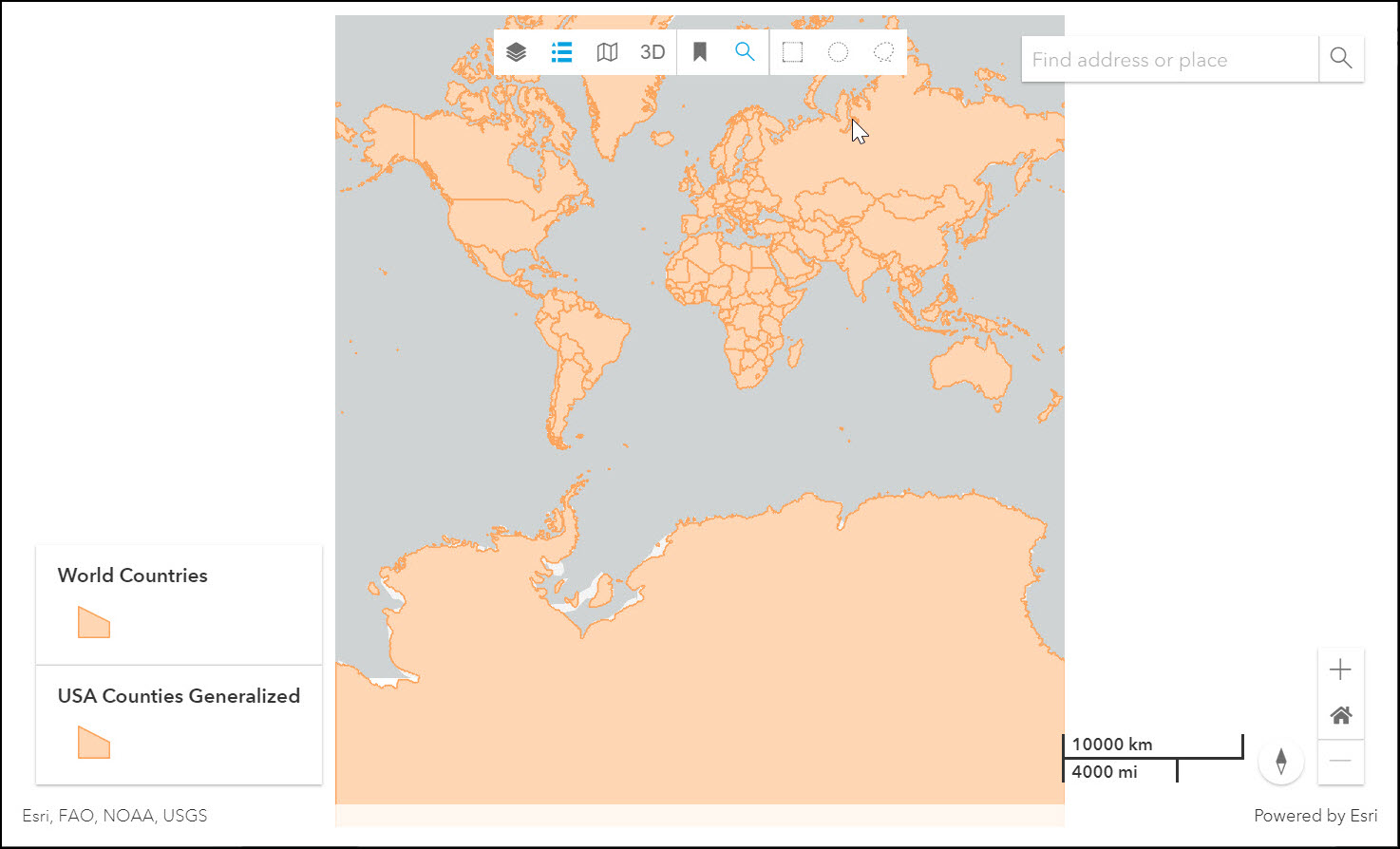
Choropleth maps can be used to create geographically-based heat maps. They are useful for visualizing location-based data, trends, and distributions across a geographic area, as shown in the following image.
Note: Choropleth maps require at least one measure and one Georole, which contains geographic location information. You can add a field to the Color bucket to color the map.
The Clear buckets content display option is available for a choropleth map. It removes the fields from all buckets.
You can add fields to the following buckets for a choropleth map:
Note: Geolocation fields must have an assigned geographic role. Values from the field are matched to values from the geographic role to plot them in the correct location. For example, if your field contains country names, use the Country Name geographic role.
WebFOCUS Designer opens in a new browser tab.
Once you select a data source, WebFOCUS Designer loads with options to create a single content item.
Note: In order to create a map, the data source that you use must have fields with assigned geographic roles.
The Add Data Layer dialog box opens.
The choropleth map refreshes to show the area of each recognized location.
Only one field can be added to the Color bucket at a time.
How to: |
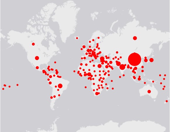
Proportional symbol maps, or bubble maps, use symbols of different sizes to represent data associated with different areas or locations within the map, as shown in the following image.
Note: Proportional symbol maps require at least one measure and one Georole, which contains geographic location information. You can add a field to the Color bucket to color the map.
The Clear buckets content display option is available for a proportional symbol map. It removes the fields from all buckets.
You can add fields to the following buckets for a proportional symbol map:
Note: If you add a dimension to the color bucket for a bubble map, each location is visualized as a pie chart when there’s more than one dimension value for the location.
Note: Geolocation fields must have an assigned geographic role. Values from the field are matched to values from the geographic role to plot them in the correct location. For example, if your field contains country names, use the Country Name geographic role.
WebFOCUS Designer opens in a new browser tab.
Once you select a data source, WebFOCUS Designer loads with options to create a single content item.
Note: In order to create a map, the data source that you use must have fields with assigned geographic roles.
The Add Data Layer dialog box opens.
The proportional symbol map refreshes to show a point at each recognized location.
Only one field can be added to the Color bucket at a time.
Note: Custom configured basemaps also appear as options.
Vector basemaps can be more detailed than default raster tile basemaps, but may not be compatible with all environments or basemap styles. For some basemaps, both default raster tile and vector options are available.
Once you make a selection, the background of the map refreshes. You can continue to change your background until it displays the desired information.
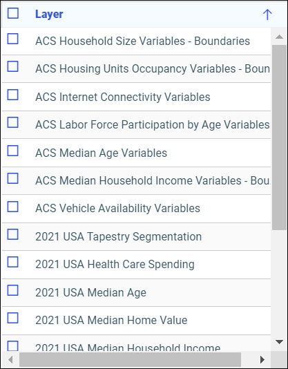
Note: These are pre-defined demographic profiles, provided by Esri ArcGIS. Esri periodically retires older demographic layers.
You can select multiple options in either category to gain additional insight into your data. Specifically, each Demographic Layer has its own profile and provides a layering option, when comparing values across different layers or profiles.
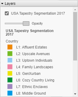
The Demographic Layers that you select are rendered on the map. The legends for each layer, if they are available, display in the Layers list at run time. The Layer list with a configured demographic layer is shown in the following image.
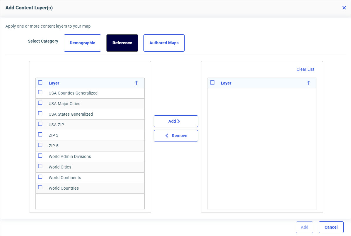
You can select and clear the check boxes to enable the display of one or more Demographic Layers to compare and contrast the different demographic scenarios.
Note: Layers that require a special layerTypeEx property in the addon_json when configured, are not supported in the com.esri.map extension. InfoAssist uses the com.esri.map extension.
Your map refreshes, and the definitions and borders of the References Layers display on the canvas. You can use the Table of Contents or Layers option, to toggle different Reference Layers in your map. These options are shown in the following image.
This section presents the Query buckets that display, by map type.
Query bucket |
Choropleth Map |
Proportional Symbol Map |
---|---|---|
Geo. One data field, specifically a field containing location data (for example, State) with an assigned geographic role. |
|
|
Color. One measure or dimension field. |
|
|
Tooltip. One or more data fields (not required). |
|
|
Multi-page. Up to one data field (not required). |
|
|
Size. One measure field. |
|
|
Geographic roles have been unified to access 58 world administrative boundaries down to the postal code level, out of the box. You can access administrative boundaries for approximately 250 countries with a second level license, which is a paid service from Esri. Enter your second level license code by clicking the License button on the ribbon.
Note: Geographic roles are only available with Esri maps.
This section contains information on the geographic roles that are supported for Esri maps.
Geographic Role |
Description |
Maps Supported |
---|---|---|
CONTINENT |
World Continents |
Choropleth, Proportional Symbol |
COUNTRY |
World Countries |
Choropleth, Proportional Symbol |
STATE |
World Admin Divisions |
Choropleth, Proportional Symbol |
CITY |
World Cities |
Choropleth, Proportional Symbol |
COUNTY |
World Counties |
Choropleth, Proportional Symbol |
POSTAL-CODE |
Postal Code |
Choropleth, Proportional Symbol |
GEOMETRY_POINT |
Geographic Coordinates |
Proportional Symbol |
Note: This is a new, simplified list of geographic roles (dimensions) that you can utilize when creating a map chart. This unified list of roles provides worldwide mapping of administrative boundaries down to the postal code level. In WebFOCUS Designer, the new roles display, by default, when assigning a geographic role.
The following table illustrates the geographic roles and their dependencies. Level 1 indicates the highest level of hierarchy and level 5 is the lowest level of hierarchy.
Region |
Hierarchy Level |
Geographic Role |
---|---|---|
World |
1 |
CONTINENT |
2 |
COUNTRY |
|
3 |
STATE |
|
4 |
CITY |
|
5 |
POSTAL CODE |
How to: |
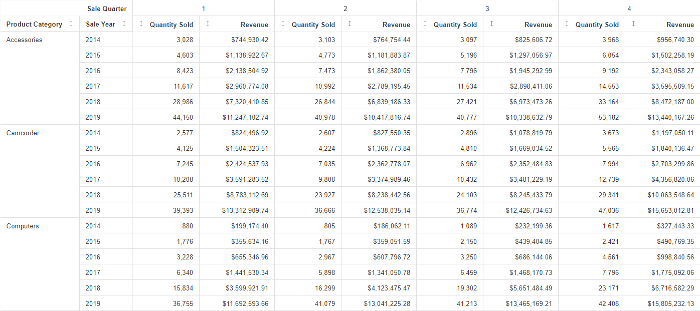
A data grid is a kind of chart that can be used to present data in tabular form. For example, you can create a grid (table) that summarizes your data. Data grids include sorting and tooltip features by default, unlike tabular reports. An example of a data grid is shown in the following image.
Note: Data grids require at least one measure and one dimension. Additional measures create unique columns. You can add multiple dimensions in the Row bucket to create customized rows based on the structure of your selection, and add dimensions to the Column bucket to create groups of measure columns based on dimension values.
The following display options are available for a data grid:
You can add fields to the following buckets for a data grid:
WebFOCUS Designer opens in a new browser tab.
Once you select a data source, WebFOCUS Designer loads with options to create a single content item.
The data grid refreshes with your selections.
How to: |
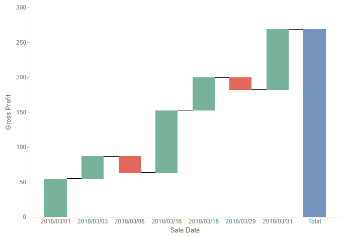
Waterfall charts allow you to see incremental positive and negative changes in your data, resulting in a rolling total. Positive and negative values are represented by different colored risers that start at the end point of the previous riser. Waterfall charts can be a good way to show change over time. An example of a waterfall chart is shown in the following image.
The following display options are available for a waterfall chart:
You can add fields to the following buckets for a waterfall chart:
WebFOCUS Designer opens in a new browser tab.
Once you select a data source, WebFOCUS Designer loads with options to create a single content item.
The waterfall chart refreshes with your selections. Any positive values display in green, and any negative values display in red, by default. There is also a Total column, which displays in blue by default.
How to: |
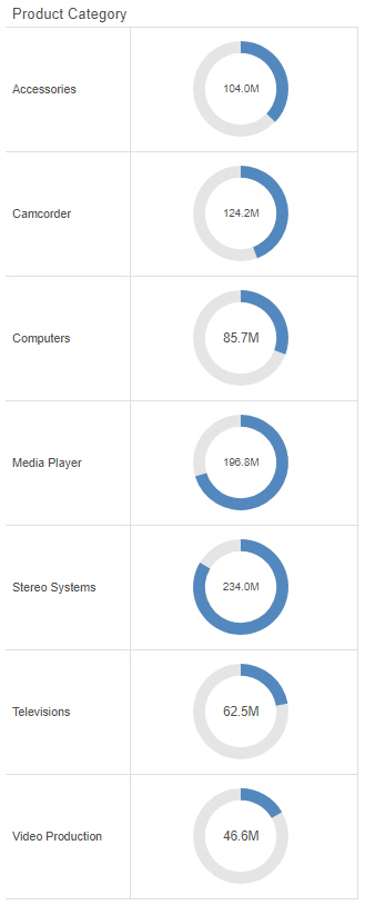
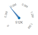
A gauge is a simple visual that shows a measure value. These can be used to create straightforward KPI graphics, or use matrix rows and columns to compare data for different sort values. The following example shows a gauge chart with matrix rows.
The following display options are available for a gauge chart:
You can add fields to the following buckets for a gauge chart:
WebFOCUS Designer opens in a new browser tab.
Once you select a data source, WebFOCUS Designer loads with options to create a single content item.
The gauge loads to display the value of the measure field.
How to: |
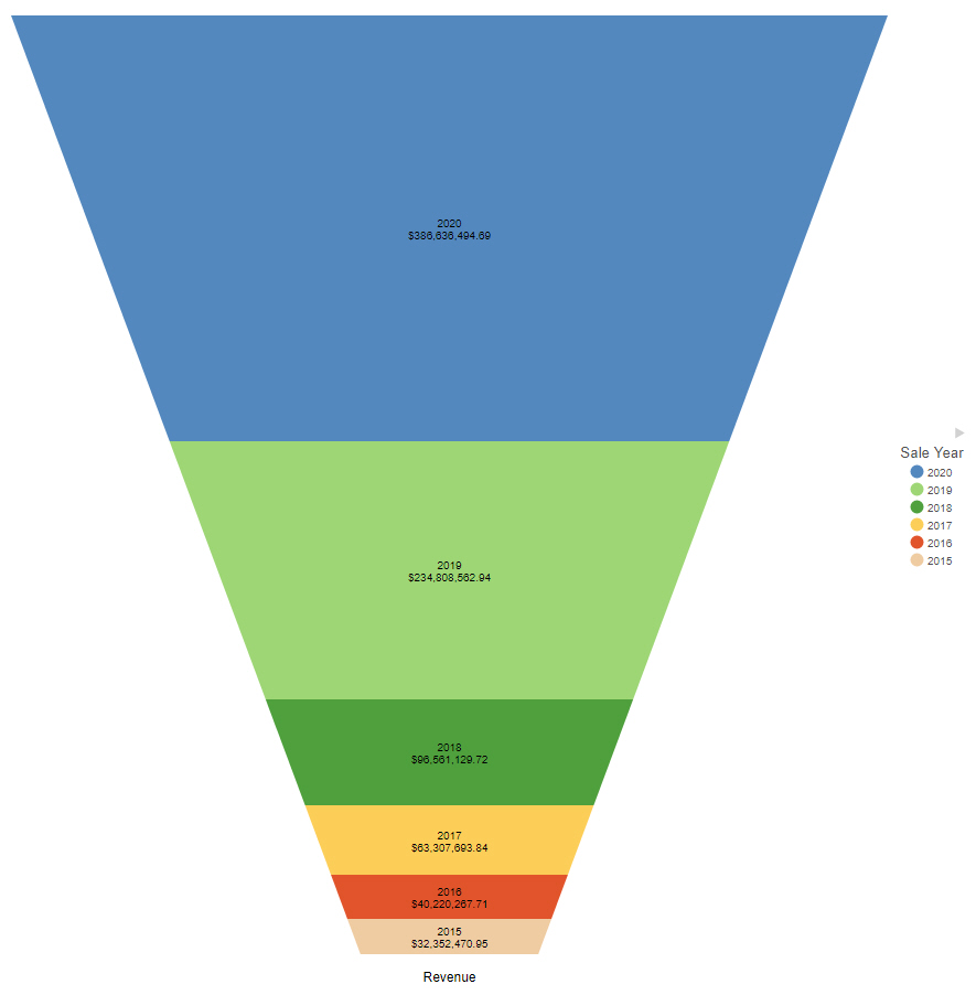
A funnel chart shows values of a dimension field as a proportion of the whole, similar to a bar in a stacked bar chart. The shape of the funnel makes it useful to show information about processes that involve cascading or narrowing down due to the hierarchy it implies. For example, the following image shows revenue by year in a funnel chart. The entire funnel can be taken to represent all sales, with the top segment representing the most recent year, the top two segments the two most recent years, and so on.
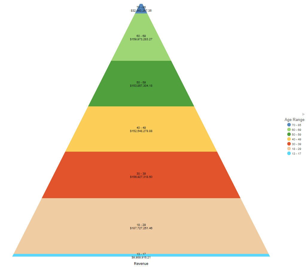
Conversely, you can use the pyramid option to show values in an implied hierarchy, as shown in the following image of a pyramid chart showing revenue by age range. The oldest range, 70-85 is at the top, and the youngest range, 13-17, is at the bottom.
The following display options are available for a funnel chart:
You can add fields to the following buckets for a funnel chart:
WebFOCUS Designer opens in a new browser tab.
Once you select a data source, WebFOCUS Designer loads with options to create a single content item.
The funnel chart loads, showing each dimension field as a layer with height based on the value of the measure field.
How to: |
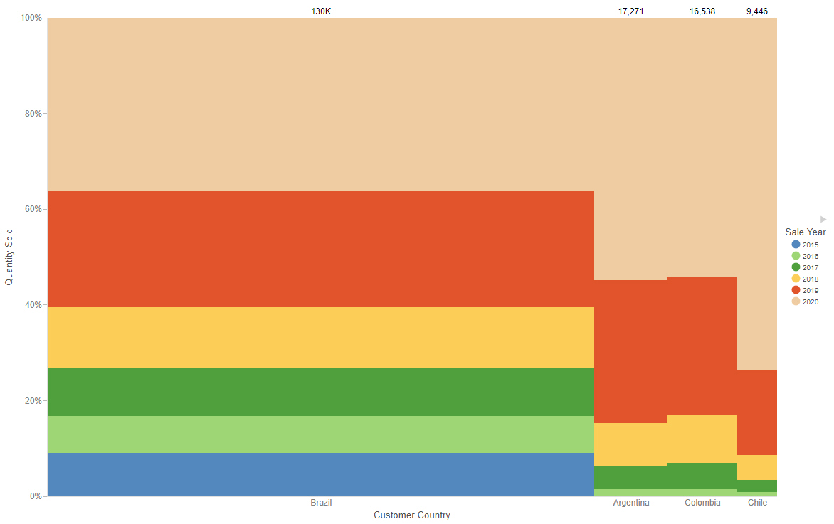
A Mekko chart allows you to see proportional values of a measure field for two dimension fields. The intersections of these dimension fields and their relative sizes make it possible to quickly identify the most significant combinations of values. An example of a Mekko chart is shown in the following image.
The following display options are available for a Mekko chart:
You can add fields to the following buckets for a Mekko chart:
WebFOCUS Designer opens in a new browser tab.
Once you select a data source, WebFOCUS Designer loads with options to create a single content item.
The Mekko chart loads to display the proportional value of the measure field for each segment in each column.
How to: |
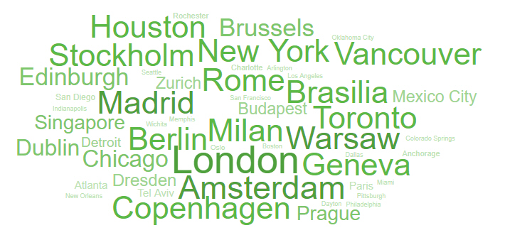
A tag cloud allows you to see the most frequent or largest values in a dimension field based on the size and color of the text, making it easy to identify the most important values. An example of a tag cloud is shown in the following image.
The following display options are available for a tag cloud:
You can add fields to the following buckets for a tag cloud:
WebFOCUS Designer opens in a new browser tab.
Once you select a data source, WebFOCUS Designer loads with options to create a single content item.
The tag cloud loads, showing each value of the Detail field with a font size determined by the Size field.
How to: |
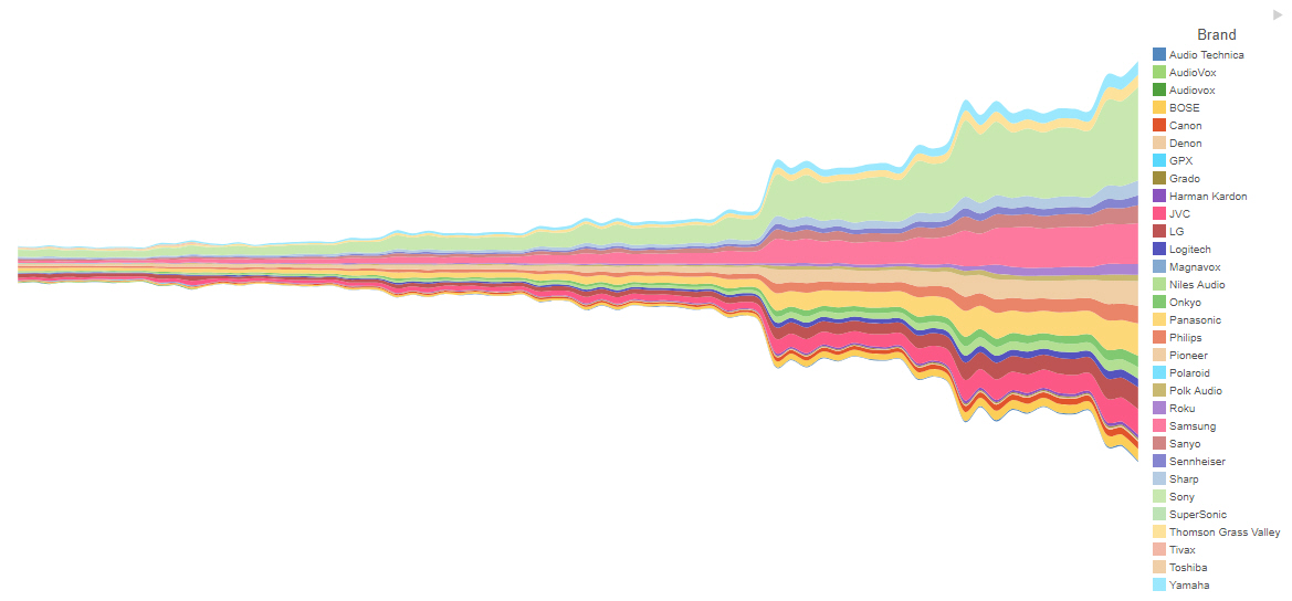
A streamgraph is a simplified area chart. It does not show labels for measure values, but makes it easy to identify trends for different dimension values over time. An example of a streamgraph is shown in the following image.
The following display options are available for a streamgraph:
You can add fields to the following buckets for a streamgraph:
WebFOCUS Designer opens in a new browser tab.
Once you select a data source, WebFOCUS Designer loads with options to create a single content item.
The streamgraph loads, showing comparative changes for each value in the Color bucket.
How to: |
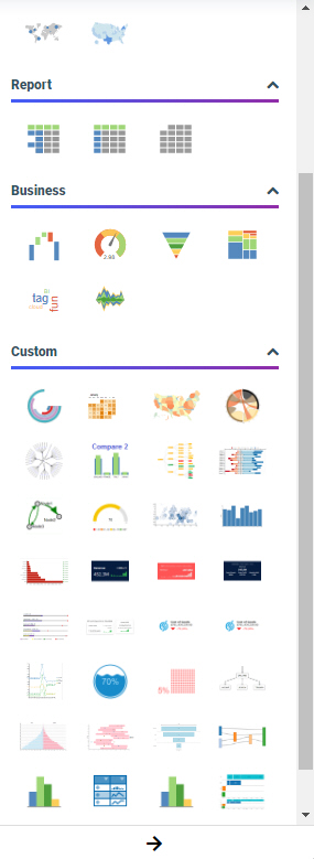
WebFOCUS supports the ability to add new, custom chart types to its list of built-in charts. These custom chart types are called extensions or plug-ins. Once enabled on your WebFOCUS environment, any extensions that you have added are available when you expand the Content picker, in the Custom section, as shown in the following image.
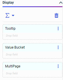
Each chart extension uses a set of buckets and properties unique to that extension. The liquid gauge chart extension uses the Tooltip, Value Bucket, and MultiPage buckets, as shown in the following image.
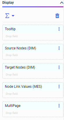
The chord diagram, on the other hand, uses the Tooltip, Source Nodes, Target Nodes, Node Link Values, and MultiPage buckets. It also indicates the type of field that should be used in each bucket, as shown in the following image.
Each of these buckets is configured to allow a certain number of fields, and certain types of fields.
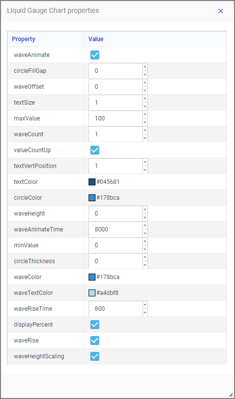
Chart extensions also have a unique set of properties that can be applied to them. To access chart extension properties, on the Format tab, with the General option selected from the Quick Access menu, in the Other section, click Extension properties. This opens the Extension properties panel. The Extension properties panel opens on top of the Resources and Properties panels, and can be resized and moved within the browser window. If you click outside of the Extension properties panel, it closes, and any changes that you made to the chart properties are applied.
The Extension properties panel for a liquid gauge chart is shown in the following image.
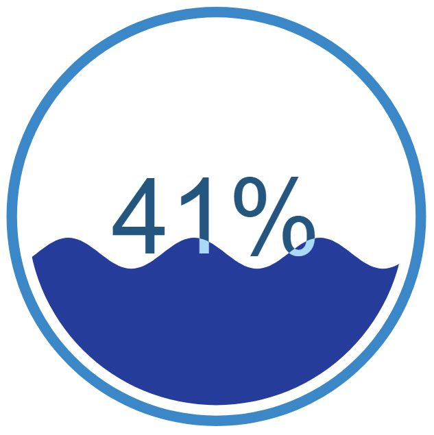
Some of the properties on the Extension properties panel apply to specific elements of the chart extension. For example, in the following image, the color of the wave in the liquid gauge chart has been changed to a darker shade of blue, and the number of waves has been increased from 1 to 3.
For more details about the buckets and properties used in specific chart extensions, see the page for each extension on the GitHub site.
WebFOCUS Designer opens in a new browser tab.
Once you select a data source, WebFOCUS Designer loads with options to create a single content item.
The chart updates to reflect your changes to extension properties.