In this section: |
You can apply styling changes to a report to help it visually match the styling of your other content, and make it easier to read and more visually appealing. You can style a report from the Format tab on the Properties panel.
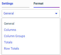
On the Format tab, you can use the quick access menu to select the section or component of the report whose styling properties you want to change, as shown in the following image.
You can style the following sections or components of a report:
If you are styling Columns, Column Groups, or Row Totals in a report, you can select a specific field whose title or values you want to style. You can revert the changes you made in any area by clicking Reset styling on the Format tab. Only the settings in the selected area are reset.
In this section: |
When you select General from the quick access menu on the Format tab, you are presented with options to style and format the entire report. These options include the ability to set a theme, change the output format, change the font style and size, style cells and cell borders, set cell margins, and configure how column widths are set. Font and cell styling options can be set for the entire report, or for specific columns within it.
On the Format tab, in the General settings, in the General Options section, you can select a theme (.sty file, or StyleSheet), to apply to your report from the Theme menu. Themes style multiple components of a report, such as headers, column titles, and data text, all at once. Themes include associated cascading style sheet files along with a StyleSheet to help coordinate styling between an individual report and the entire visualization.
When creating a stand-alone report, the default theme is Designer 2018. When you change a visualization into a page by adding a second new content item, the theme used for the report is applied to the page. When you add items to the page, either by creating them or adding them as external content, the page theme is used as the default for all content items. You then can change the theme for each individual item.
If you prefer, you can specify one of the themes included with WebFOCUS, such as the Designer 2018, Light, Midnight, or Vivid theme, select a custom theme saved to the Global Resources area in the repository, or you can click Custom to select a legacy template or a StyleSheet saved to a workspace in your repository. When you select a StyleSheet using the Custom option, it is applied to the report and added to the Theme list.
To make a custom theme available directly from the Theme menu, create a folder for it in the Global Resources area, in the Custom folder within the Themes folder. In the new folder that you create inside the Custom folder, you can add a custom StyleSheet to use with charts and reports, and a custom CSS file to use for pages. The .sty file and .css file must both be named theme. An .sty file and .css file that share the same theme folder are associated. If you select a theme for a report, which uses the .sty file, then when you convert it to a page, the associated .css file is used as the page theme by default.
Tip: When creating a custom theme, you can copy the CSS and StyleSheet syntax from existing themes to use as a model.
Note: Charts and reports created for use on pages can use a transparent background to allow the defined background color of the page containers to show through. Since the themes used for charts and reports (.sty files) can be associated with themes for pages (.css files), you can coordinate the background, text, and element colors used in both themes to create content with unified styling. At design time, the page theme associated with the chart or report theme is used for the canvas background. This is for visibility purposes only, and shows how the chart or report will appear when added to a page with the associated theme. The stand-alone chart or report does not include this background.
If a chart or report is run stand-alone instead of being added to a page, the run-time view displays a white background only. This means that if, in order to display on a dark colored page, the font color in the selected theme is defined as white and uses a transparent chart background, then the text will not be visible on the white preview background. An example of such a theme is the Midnight theme, provided as one of the default themes in the Global Resources folder. To view the white text, build your chart or report on the canvas, or add it to a page container with a dark background.
You can use text formatting options to change the font, font style, alignment, size, and color of the text in your report. On the Format tab, in the General options, you can set these options for the entire report.
To set the same properties but only apply them to a specific area of your report, select a different option from the quick access menu. For example, select Columns to change the font in the body of the report. In the Select Elements and Columns area, you can specify whether your formatting should apply to the column titles, data values, or both, and which column should be affected. This allows you to set styling options that affect specific columns of the report, highlighting or distinguishing certain fields.
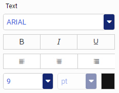
The text formatting options are shown in the following image.
A list of default fonts is provided. To add a font to this list, specify the font files for each font style, such as regular, bold, and italic, in the fontuser.xml file, in your server installation. This file is located in the etc subdirectory of the server configuration directory, for example, drive:\ibi\srv82\wfs\etc. For more information, see the WebFOCUS Font Support topic in Creating Reports With WebFOCUS Language. If you are configuring a TrueType font, you do not need to specify the AFM font metrics file.
You can style the body of your report by applying cell border lines, specifying cell background colors, and setting cell margins. These options can help to make your report more legible by separating and spacing out the text, and by delineating different rows of data. On the Format tab, select General from the quick access menu to apply this formatting to the entire report. Select Columns and then make selections from the Select Elements and Column menus to apply cell formatting to the data values, column headers, or both areas of the selected column or columns.
You can add borders to the report to visually separate each value in the report. Borders are applied around each cell. Select the Show Border check box to enable cell borders. You can then set the border style, thickness, and color. The following border styles are available:
Note that since these border options are applied around the entire cell, they are considered more general than side-specific borders that can be set in a theme or StyleSheet. If your theme or StyleSheet uses these side-specific borders, they will override the borders applied in Designer.
You can also change the background color that appears behind the entire report, only the column titles, or only the data values in one or more columns of a report. Click the color swatch next to Report, Title Row, or Data Row to change the background color for the associated area. If you change the color for Report, the background color of the entire report, including the column title area and data values, is changed. Alternatively, you can set the background color for just the column titles using just the Title Row color option, or for just the data values using the Data Row color option. If you select Columns from the quick access menu and then select a specific column from the Select Elements and Columns menus, the background color is only applied to a single column.
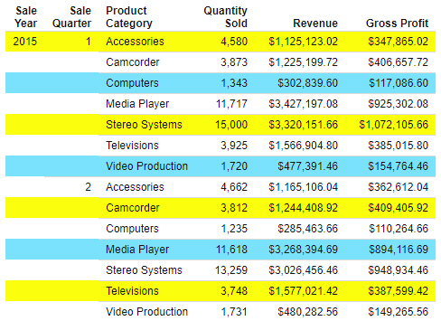
When setting the background color for the data values in the report, you can apply different colored bands to made it easier to differentiate different rows or sort groups. You can set alternating bands in a repeating pattern of up to 4 rows. To add bands, click the plus icon to the right of the Data Row option, then set a second color. To add another color to the band pattern, click the plus sign again. To remove a band color, click the minus sign. The following image shows a report with 4 Data Row colors set in a pattern of yellow, white, blue, and white.
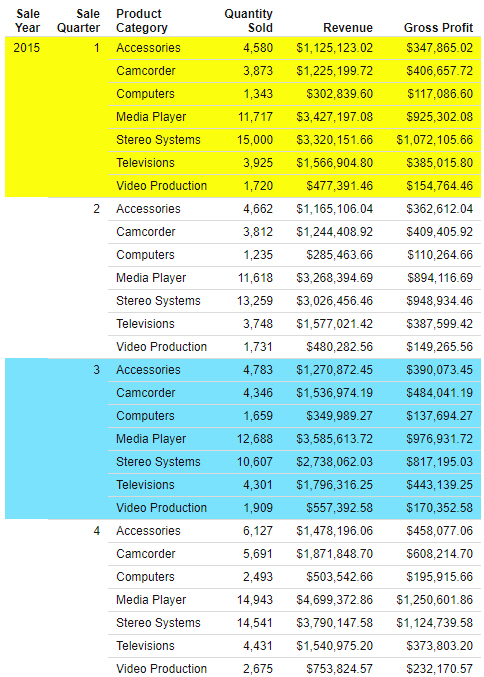
By default, each band spans a single row of the report. As an alternative, you can set each band to span a sort group, visually distinguishing values for different sort fields. To change the scope of each band, open the Alternate On menu and select a sort field in your report. The following image shows a report with 4 Data Row colors set in a pattern of yellow, white, blue, and white, alternating on each value of the Sale Quarter field.
To better space out the values in your report, when using a paginated output format such as HTML, PDF, PowerPoint, or XLSX, you can change the cell margins. You can select preset small, medium, and large margin options, or click the ellipsis button to set custom cell margins. When setting custom margins, you can set different margin sizes for each side of the cells in your report. You can clear the check boxes for different sides of the cells to use default values for them. For example, if you clear the check box for the Top margin, the default margins are used for the top of each cell. Custom margin sizes are set inches. You can use the Cell Margins settings in the General options to set margins for the entire report, or set margins for each area of the report individually by selecting a different option from the quick access menu. When setting margins using the Columns-level options, it may be preferable to set them separately for the column titles and data values. Since each line of text in the column titles is treated as a separate cell, you may prefer to use smaller top and bottom margins for them than for the cells containing data values.
To undo all custom styling changes made in the General options or Columns options, click Reset styling. All options revert to their default values, which are dependent on the theme used in the report.
When you create a report, the width of each column depends upon the values in the column, and the width of the page in which the report is displayed. Three options are available to set column width behavior. They are available in the Column Width menu, in the Other Options section of the General options on the Format tab.
The default Column Width option is autofit. When the autofit option is used, the width of each column is set to fit the column title or row with the most characters, minimizing the amount of space that each column uses while still displaying each value in its entirety.
If you change the Column Width option to based on value, the maximum width of each column is based on the format of each field used in the report. If the report is filtered so that the longest values are not included, the column width is still wide enough to include those values.
Select fixed value to create a report that always fills the width of the container into which it is placed, no matter how wide the container is.
Note that if your theme specifies values for the SQUEEZE or AUTOFIT options, that this may override the Column Width setting in WebFOCUS Designer.
When you edit the text in the heading or footing of a chart or report, a set of basic text styling options appears in the styling toolbar at the top of the canvas. This toolbar provides options to change the font, text size, font style, alignment, text color, and background color of the heading or footing text. For more information about these options, see Adding Headers and Footers to Content.
You can set margins for the headings and footings in a report from the Format tab. Open the Format tab and then select Headings or Footings from the quick access menu. In the Heading Options and Footing Options areas, you can apply a preset margin by selecting the preset Small, Medium, or Large options, or you can select the custom margin option and use a spinner control to set your own top and bottom margins separately. These can be set in intervals of 0.001 inches.
When you add a field to the Column Groups bucket in a report, measure columns are repeated for each value in that field. The column group, or across column, field values are shown above the column titles for each measure field, identifying the dimension values by which they are aggregated.
When creating a report with column group fields, such as a crosstab report, you can select Column Groups from the quick access menu on the Format tab to style the field names and values for each one. As when styling columns in a report, from the Select Elements and Columns menus, you can choose whether to style the field titles and values, or just one or the other. You can also choose whether to style the field titles and values for all column group fields, or a single column group field. Note that while the default field selection is All Columns, column group field names and values display in a row. All Columns in this case refers to all columns from your data source, and allows you to style column group field titles and values for all fields in the Column Groups bucket.
You can style column group field titles and values by changing the font, style, alignment, size, and color of the text; changing the background color of the title and values; and adjusting margins. When adjusting margins for column group labels, you can only set the top and bottom margins, since the left and right margins are based on the widths of the columns in the body of the report.
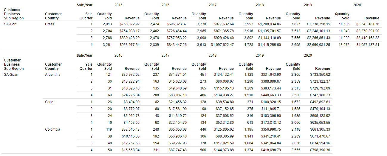
In the Other Options area, you can select Show title on the side to display the column group field titles and value in the same row of text. This is especially useful in Excel output, where placing the column group field title on a separate row from the values would result in empty cells. Select Hide null columns to hide column group values that only have null values on a page of a report, so that columns without values are not shown. For example, the following image shows a report with the Hide null columns option enabled and page breaks on the Customer Business Sub Region field. Since there are no values in the SA-Span subregion for the Sale Year value of 2015, the columns for that year are removed. Since there were sales in 2015 in the SA-Port region, the columns are still included on that page of the report.
You can also select Repeat across values to show the column group value above every measure column in the report instead of only once for each group.
As with the data values in a report, you can apply styling to the row and column totals and subtotals in a report to visually separate them from the rest of the values in your report and to draw attention to them. To add row and column totals to a report, on the Settings tab, in the Content Settings area, select Enable column totals and Enable row totals. To add subtotals, right-click a field in the Rows bucket of a report, point to Insert breaks, and select an option from the Subtotals section of the Insert breaks menu. To style your totals, on the Format tab, select Totals or Row Totals to display column or row total styling options. These options include text styling options, such as the font, style, alignment, size, and color; background color options; and cell margin sizing. Similar to when setting margins for column group labels, you can only set the top and bottom margins for column totals and left and right margins for row totals, since the other margins are based on the margins of the cells in the body of the report.
When styling row totals, from the Select Elements and Columns menu, you can choose whether the styling changes should affect the total label, values, or both. You can also choose which columns are affected if there are across columns in the report. When row totals are added to a report with column groups, a separate row total column is generated for each measure field in the report. Each of these row total columns can be styled separately by changing the text and cell styling. When there are no column group fields, all measure fields are summed into a single row total column to which your styling is applied.
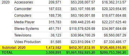
Column totals, on the other hand, are arranged into a single row to which you can apply styling. You can style the grand totals or all subtotals, or you can select a specific sort field whose subtotals you want to style if you have multiple levels of subtotals for different sort fields. The following image shows different styling applied to the grand totals and subtotals in a report so that they can be easily distinguished.
For column totals and subtotals, you style the total label and values separately using the Total Tag Options and Column Options areas. This allows you to differentiate between labels and values in your totals and subtotals. If you select a column in the Column Options area, you can apply different styling to the grand total or subtotal values for different measure fields. You can also change the background color for the grand total or subtotal rows and adjust the margins used for the grand total or subtotal cells.
When creating reports for different types of output, you may want to change the page layout, depending on the type of file that will be generated. For example, PowerPoint slides are typically landscape oriented, and a smaller size than PDF pages, which tend to be vertically oriented. You can set options such as page orientation, page size, and margins, separately for each output format, by selecting Output Settings from the quick access menu on the Format tab.
The settings specified in the Output Settings options are specific to each output format. If you change the output format of your report, then a separate set of page settings appears. This allows you to ensure that the report displays properly in all output formats, even when user output format selection is enabled.
The following page layout options are available for each output format:
Note: When a page margin is set to 0, the default margin size of 0.25 inches is used.
To revert the page layout settings for the selected output format to the default, click Reset styling. The default page layout settings are letter page size, portrait orientation, and 0.25 inch margins.