How to: |
With many chart types, you can use legends to quickly visualize segments of your data by color. In the following image, we have an example of the Year by Revenue stacked bar chart, with the legend showing you subregions.
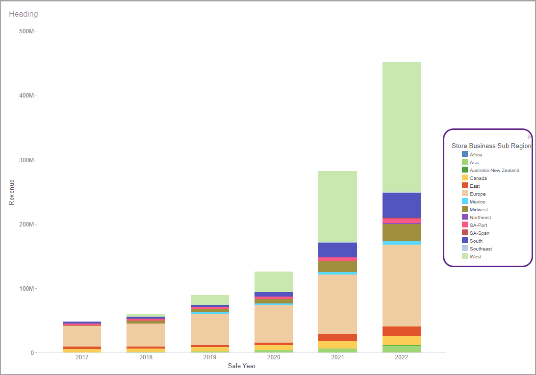
As you can see, the legend is sorted alphabetically, by default. You can change this default sorting to reflect the order that better fits your data narrative. There are two ways to change the legend sorting: by borrowing your sorting order from another field or by configuring a DEFINE field to specify your exact sorting order.
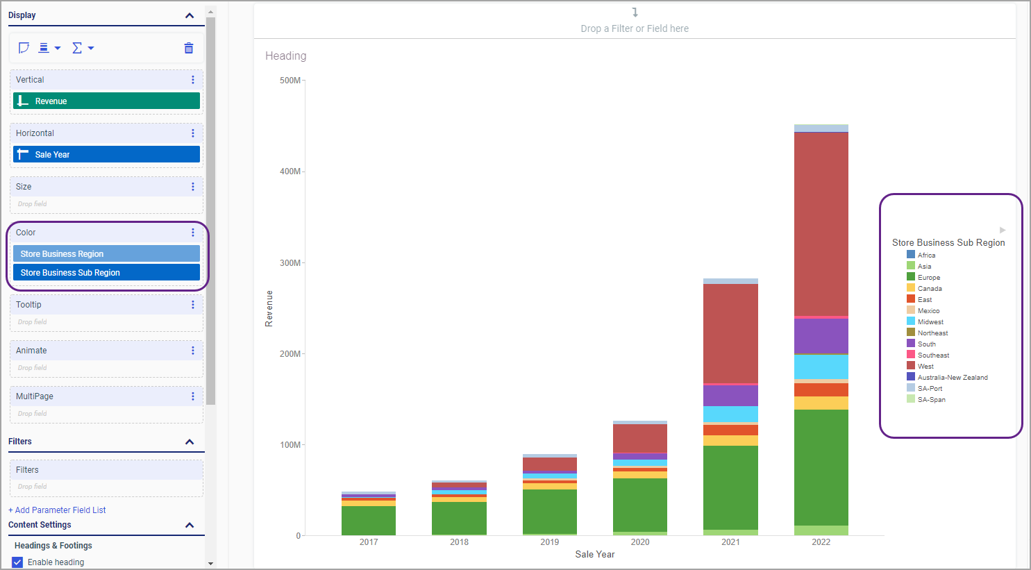
In this procedure, we will sort the subregion legend by region instead of the alphabetical order.
In our example, we are working with the wf_retail_lite master file.
In our example, we are adding the Sale Year field to the Horizontal bucket, and the Revenue field to the Vertical bucket to recreate the Year by Revenue stacked bar chart mentioned earlier.
The field gets added to the Color bucket. Notice that the subregion legend is now sorted according to the hidden Store Business Region field, as shown in the following image.
In this procedure, we will create a DEFINE field with specific sorting parameters and use it to sort the legend.
The New Calculation dialog box opens.
DECODE "Field Title" ('Value 1' 1 'Value 2' 2)
where:
Is the title of the field for which you want to sort the legend. Typically, the field title is already displayed when the New Calculation dialog box opens.
Is the name of the value that you are sorting. Each value, in single quotation marks, followed by a designated number, creates the sorting order for the legend.
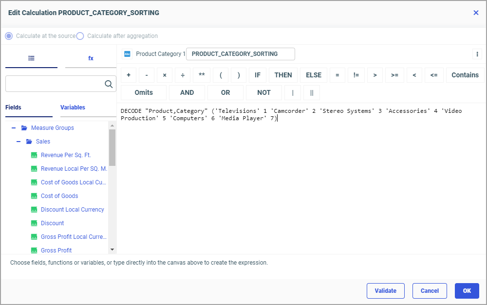
An example of the configured calculation is displayed in the following image.
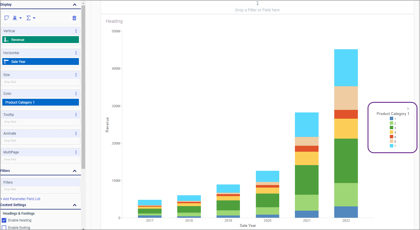
Notice that the sorting order is consistent with the one we configured in our calculation, but the values are represented by sorting numbers
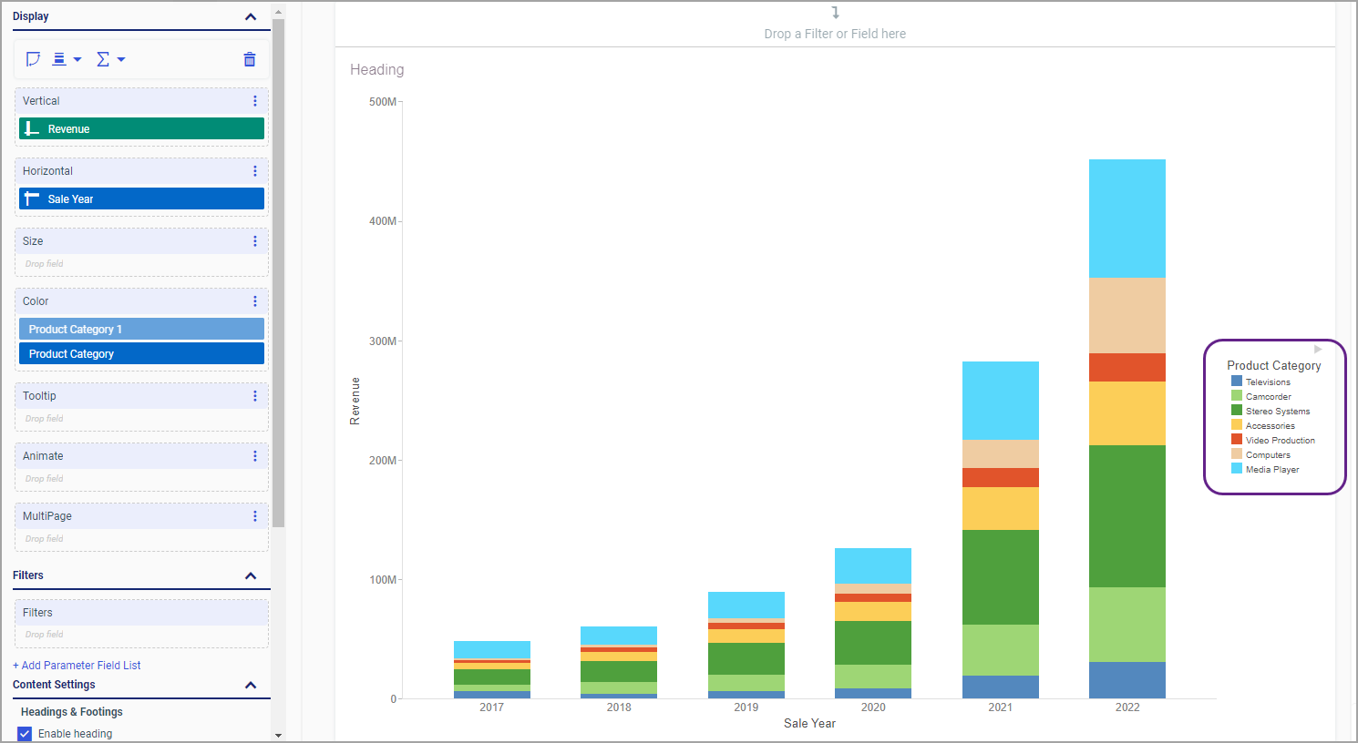
The field gets added to the Color bucket and its legend assumes the same sorting order as the one calculated in the hidden DEFINE field, as shown in the following images.