The WebFOCUS Hub is optimized for viewing on mobile devices. It automatically adjusts to a smaller screen or browser width. Additionally, there are several interface and functionality changes that occur when you access WebFOCUS across different devices. From the tablet or phone, the Hub only allows browsing or searching for content and running visualizations.
When you view the Hub on a mobile device, you get access to the features and elements that are optimal for mobile browsing
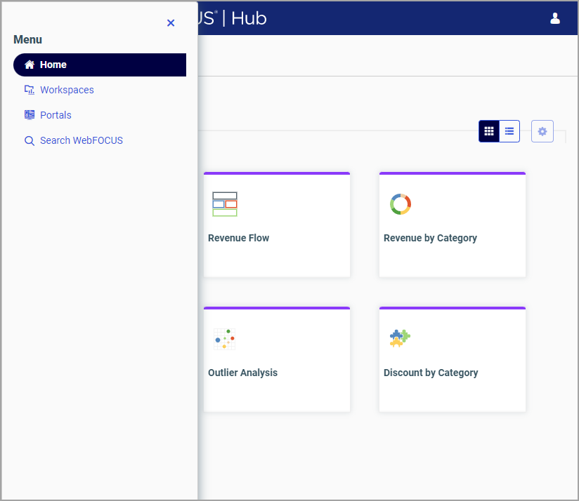
and interaction. Most navigation elements are hidden from view to allow more space for your content. The hamburger menu  in the upper left corner of your display lets you navigate between the four available areas: Home, Workspaces, Portals, and
Searching WebFOCUS. The expanded hamburger menu is shown in the following image.

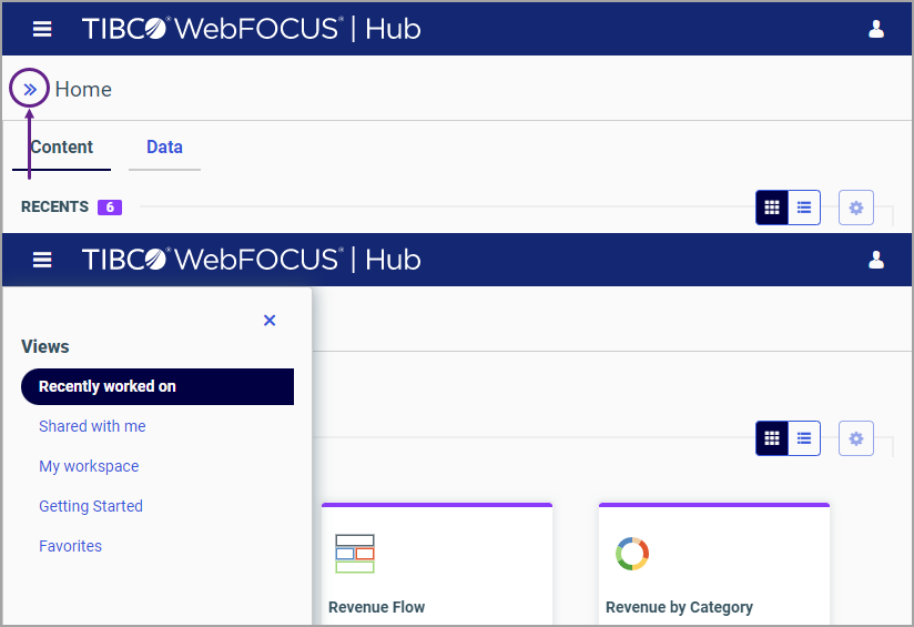
You can navigate between the views of the Home area by tapping the arrow next to the Home area title, as shown in the following images.

The banner menus are also hidden in the mobile view. To access the functionality available from the banner, you need to use the full desktop version of the software. The Sign Out option is available from the user menu in the upper-right corner of your mobile display.
You can run content in the mobile view by double-tapping an item. Select shortcut menu options are also available on mobile devices. To access the shortcut menu options, tap and hold the item. The shortcut menu options are context sensitive, and vary, depending on the item or element you want to access.
To navigate between workspaces and folders on a mobile device, use the Resources tree or the breadcrumb trail in the Workspaces area. The arrows between the directories on the breadcrumb trail allow you to switch between different folders.
You can also search, switch between list and tile views, refresh and sort content in the mobile view. These functions behave in the same way as they do in the full desktop view.