In this section: |
You can customize your default page settings to ensure consistency of your styling, as well as display of content and filters. These settings are available from the Page Defaults dialog box, shown in the following image.
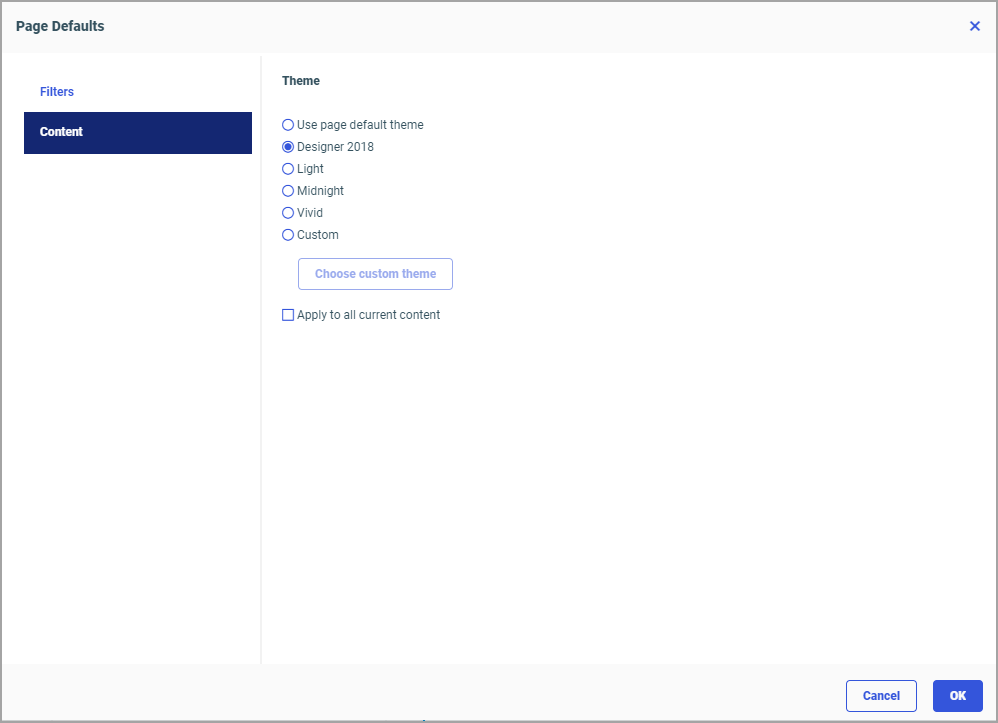
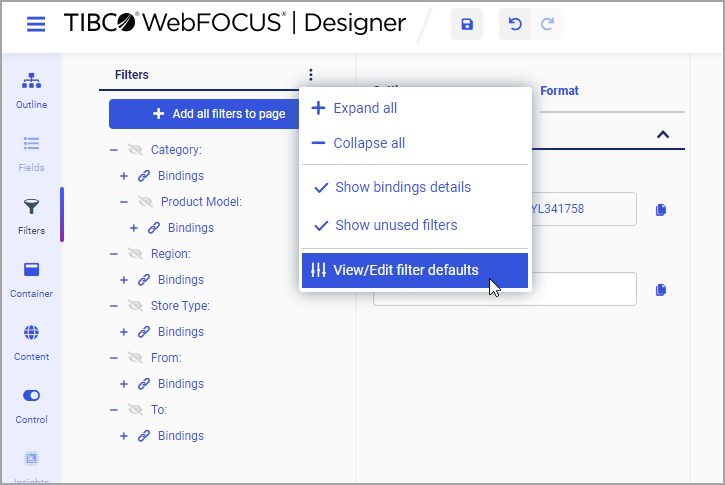
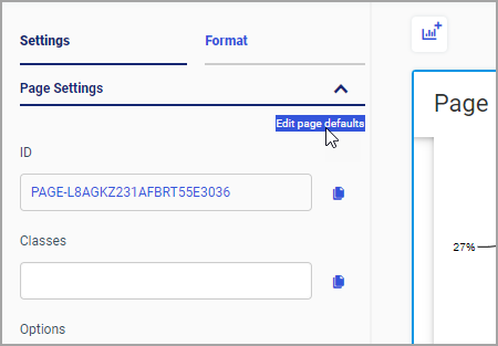
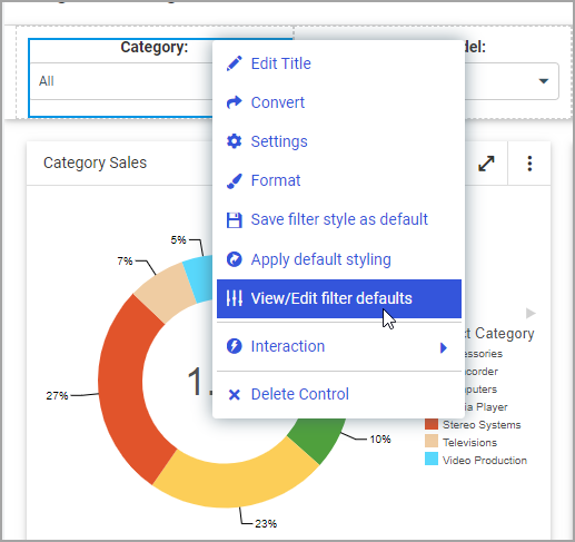
There are two tabs in the Page Defaults dialog box: Filters and Content, each corresponding to the area for which the defaults can be set. You can access the Page Defaults dialog box in one of two ways:
When accessed from this location, the Page Defaults dialog box automatically displays the Filters tab.
When accessed from this location, the Page Defaults dialog box automatically displays the Content tab.
How to: |
When adding content to an assembled page, you can customize the default theme of your content on the page level. The options for the default Theme setting are as follows:
Once the default theme is configured on the page level, the new content added to the page will reflect this theme, regardless whether it is added at design time or at run time using the Add Content button.
The Page Defaults dialog box opens.
The content theme corresponds to the selection you made inside the Page Defaults dialog box.
The Page Defaults dialog box opens.
All existing content on the canvas is updated to reflect the new default theme. All subsequently added content will also reflect this new default theme.
How to: |
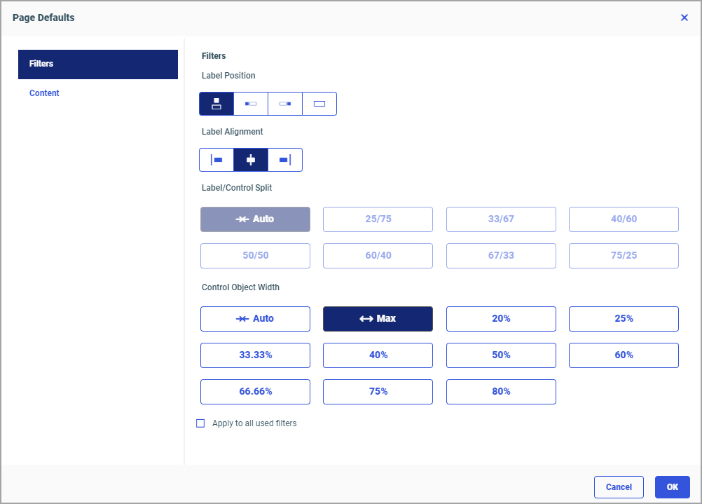
When applying filters to an assembled page, you can customize the default styling of your filters on the page level. You can set default parameters for the following styling options:
The Filters tab of the Page Defaults dialog box is shown in the following image.
Once the default filter styling options are configured on the page level, the new controls added to the page will reflect these specifications, regardless of whether they are added at design time or at run time using the Add Content button.
Keep in mind that in cases where the filter styling is explicitly set by a user, this user setting will be retained as the original setting. For example, if a user sets a label position to right, and the page defaults setting has the filter position set to left, when this filter is removed and re-added, its label position will be again set to right. When a user applies filter defaults to existing filters or saves a particular filter style as a page default, these filters are then considered default-styled and will retain the new styling when removed and re-added.
You can configure default filter styling in one of two ways: from the Filters tab on the sidebar and directly from the filter grid.
You can set default styling for assembled page filters before you add any filters to your page.
The Page Defaults dialog box opens.
Observe that the styling of your filters reflects the choices you just made.
You can set default styling for assembled page filters directly from your filter grid. Using this method, you can also override the existing default styling that you configured earlier.
Controls to your parameters are added to the page filter toolbar.
The Page Defaults dialog box opens.
Notice that this new filter displays the new default styling. You can now make one of the following choices.
Note: If you want to quickly change all existing filters on the page to match this new default styling, open the Page Defaults again, select the Apply to all used filters checkbox, and click OK.
You can also multi-select filter controls on the page, right-click either one of them, point to View/Edit filter defaults, and change filter defaults for these items; or you can click Apply default styling to change the multi-selected items to the existing filter default. Note that the Save filter style as default option is inactive when you multi-select filter controls.
For more information on filter styling, see Styling Filter Controls in a Visualization.