Stacking Measures
|
How to: |
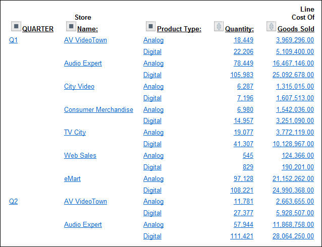
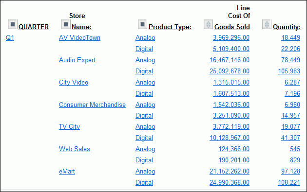
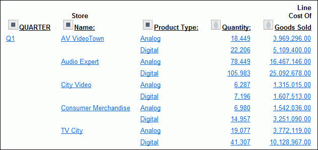
When you have more than one measure in an OLAP report, you can stack the measures in separate rows within the same column to reduce the width of the report.
You cannot apply data visualization bar graphs to stacked measures.
Procedure: How to Display Stacked Measures
- Open the OLAP Control Panel.
- Select the Stack Measures check box to display measures in separate rows under one column.
- Click Run to execute your report.
Tip: To restore the standard display, deselect the Stack Measures check box and rerun the report.
Example: Displaying Stacked Measures
- Run OLAPREP4.
Initially, this report is sorted vertically by Continent and Risk_Class and horizontally by Region, and the measures (Balance and CANADA_DOLLAR) appear as separate columns.
- For this example,
you will not need the Region dimension, but you will need the Country
dimension. You can quickly make these changes to the report:
- Right-click Region and select Delete from the menu.
- Right-click Continent and
select Unhide from the menu, then select Country from
the secondary menu.
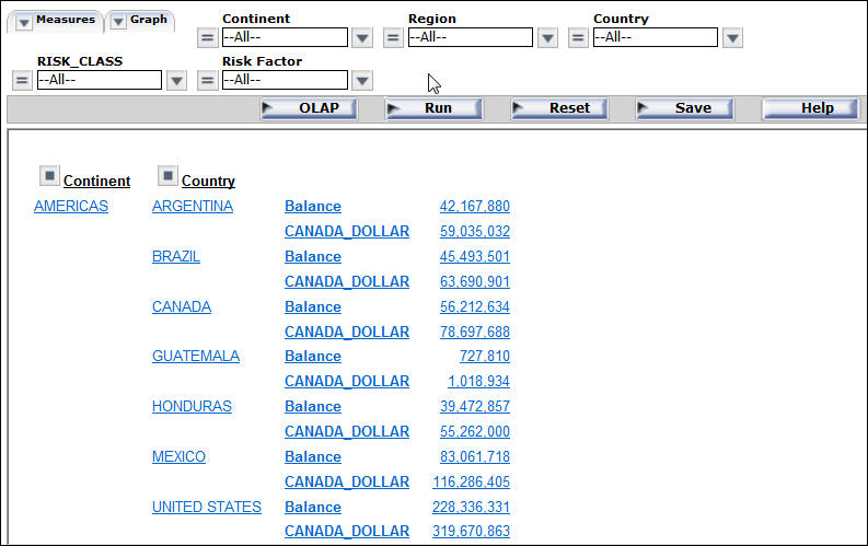
The report now displays data by Continent followed by Country, as shown in the following image.
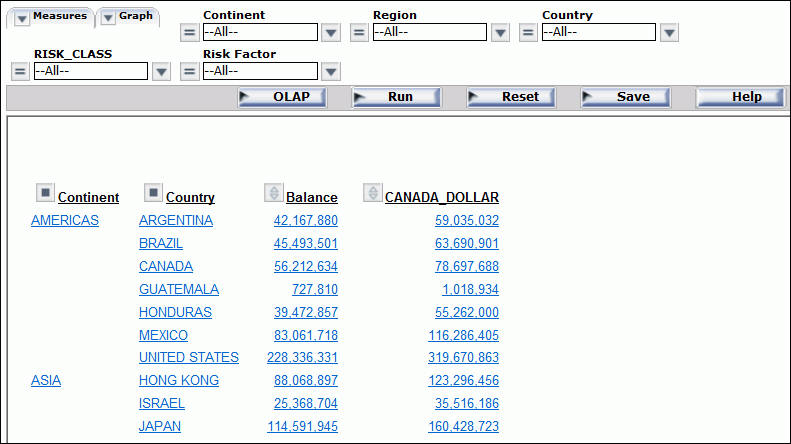
You wish to show the measure titles and data values in rows.
- Click the OLAP button on the band below the Selections panel to open the OLAP Control Panel.
- Click the Stack Measures check box below the Measures pane.
- Click Run to
execute the report and display the titles and values of the measures
stacked over each other in separate rows, as shown in the following
image.
