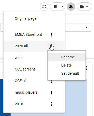
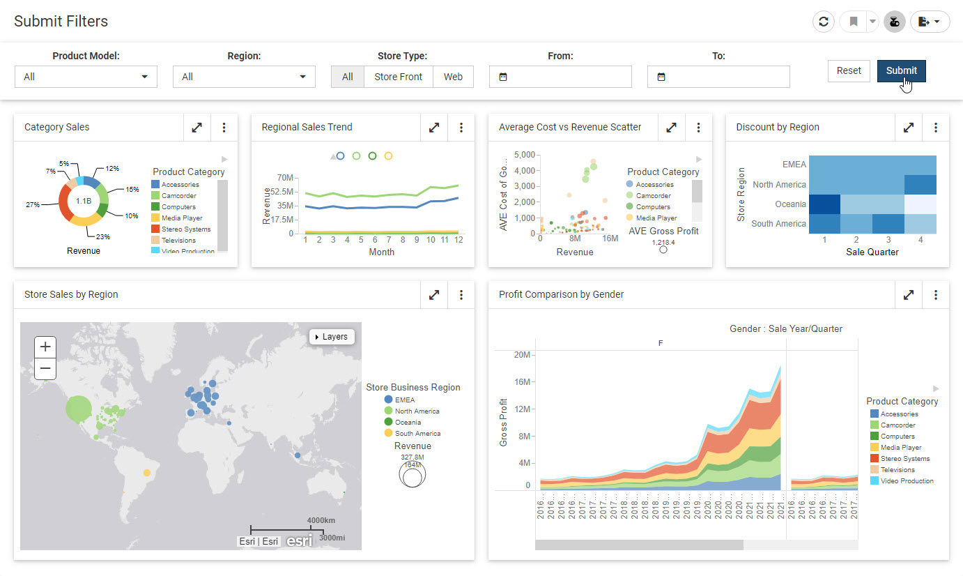
As you create
charts or styled tabular content in WebFOCUS Designer, you may want to narrow
the display of information that is shown. You can do this by creating filters
for data fields in your content. You can also use filters as a way to create
custom displays of the data that you show in your content. For example, you may
only want to show revenue information for specific product categories and
models in a given year.
Prompted filters
can be created for external content added to a page, in which case any
parameters in that content can be added as filter prompts, or for new content,
in which case the filter affects all new content on the page.
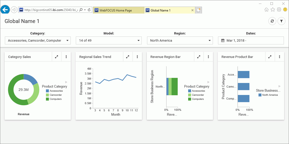
When you add
filtered content to a page, you can open the Filters tab on the sidebar and
click
Add
all filters to page to add the filters to the page automatically,
providing interactive controls that your users can choose from to change the
view of data available to them. Filtered content can also be kept stand-alone,
and you can choose to enable parameter prompting, which requires a user to make
a selection before the content displays. There is no limit to the number of
filters that you add, however, as you add more than five filters, all filters
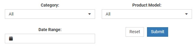
may not fit on your screen. If you are using a carousel filter layout, used for
prompted filters added to new content, you can use the arrow control to scroll
over to see any filters that are not visible in the Filter toolbar, as shown in
the following image.
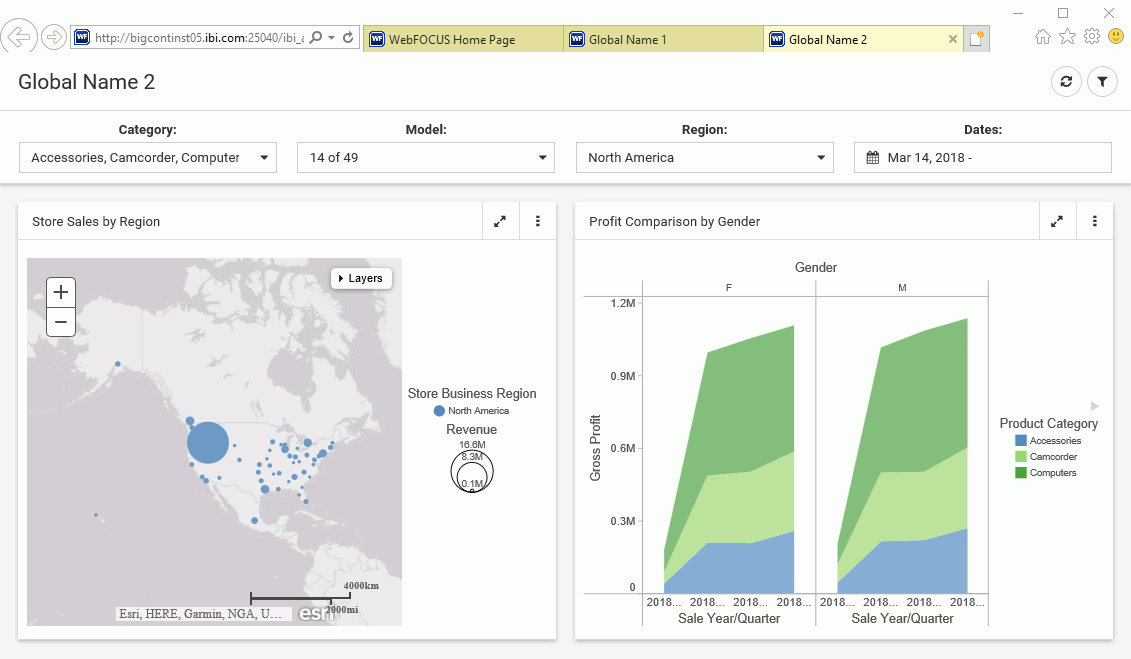
If you are using
a columnar layout, which is used for a visualization assembled from existing
content, then filters are split into additional rows as they exceed the number
of columns on the page, as shown in the following image.
You can add
prompted filters to a chart or styled tabular content in one of the following
ways:
- When creating new
content, drag a data field to the Filter toolbar below the page toolbar.
- When creating new
content, right-click a data field and click
Add
to filter toolbar.
- When creating or
interacting with new content, select one or more sections of a chart by
clicking or lassoing them, then click
Keep.
- When creating or
interacting with new content, use the filter options in the In-Document
Analytics menu on the column of a report.
- When creating a
visualization from existing content, add an item that uses dynamic parameter
filters to the visualization.
Note: You can add data
fields to the filter toolbar even if you do not have it displayed in your view.
You can remove
filters from the filter toolbar by clicking the
X in the upper-right corner of the filter, or by
right-clicking the filter and then clicking
Delete.
You can create a maximum of one filter per measure
field, and a maximum of two filters per dimension field, for individual
dimension field values and for an aggregation of the dimension field. The
aggregation of a dimension field can be a count, count of distinct values, or a
percent of count. You can create an aggregated dimension filter by adding the
dimension to your content as a measure, right-clicking the aggregated field in
a measure bucket, and then clicking
Add to
filter toolbar. If you right-click a field that already has a
filter and click
Add to
filter toolbar, or drag it into the filter toolbar, the existing
filter control expands for you to select filter values.
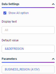
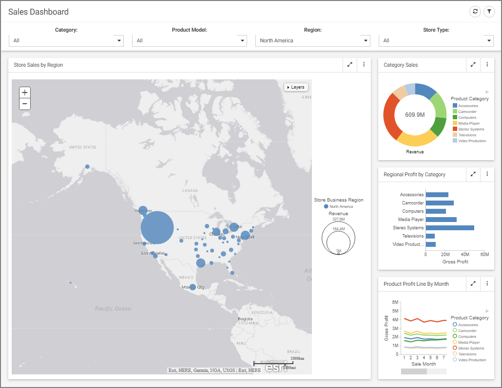
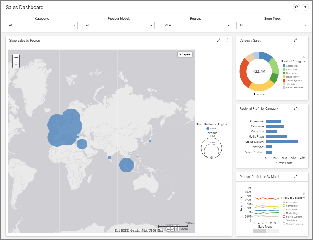
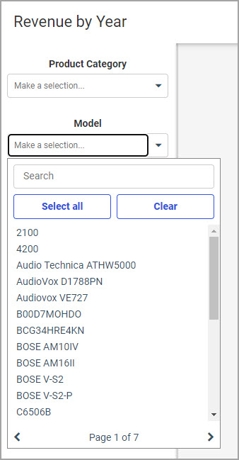
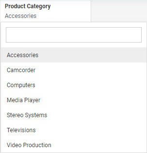
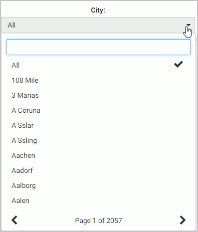
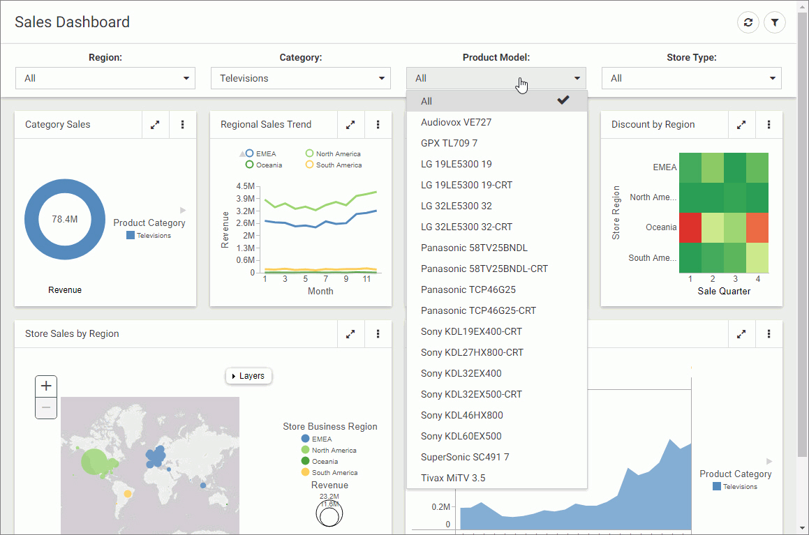
Once you have
created filters, you can click them to select default data values and set
selection options for each filter. For example, when you create a filter using
a dimension, it lists the available data values. You can then select the
default filter values, as shown in the following image.
By default, no
values are initially selected in the list control, which means that all values
are displayed by default. To select default values, you click the filter
control, and begin clicking the data values that you want to use as the
default, then click outside the filter control area to apply the selection.
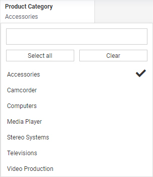
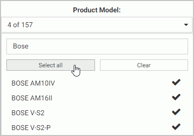
If you select one
or two values, each selected value is listed by name in the filter control. If
you select three or more values, the filter control shows the number of values
selected out of the total number of available values. If no values are
selected, the filter control says All. All available filter values are
reflected in your content. If you select all listed values or click
Select
all, then the filter indicates that
n of
n values
are selected. If the values in the field change in the data source, then the
filter does not dynamically update to include them like it would if no values
had been explicitly selected.
The selected
values are displayed in the chart at run time by default, and users can select
other values to display them.
Note: In charts,
reports, and visualizations with new content, drop-down list controls and
slider controls have a default record limit of 5000 values.
Values beyond this limit are not available for selection in the filter control.
There is no record limit for filters in visualizations assembled from existing
content, or in calendar controls.
You can change this record limit from the Administration Console, on the Other page of the Configuration tab, using the Designer/InfoAssist
record limit setting. You can increase or decrease the record limit, or set it to 0 to display all values in filter controls.
Displaying all values may result in performance issues, however.
When multiple
prompted filters for alphanumeric dimension fields are created in a
visualization created with new content, they are chained in all directions, by
default. This means that the selection from one prompted filter control
automatically filters and updates the available values in the other controls,
so they only display relevant values. This ensures that you cannot select
filter values that result in no data displayed in the visualization. You can
change the chaining setting from multidirectional chaining to hierarchical
chaining, or turn chaining off, from the Filter options menu.
In pages
assembled from existing content, chaining is unidirectional, applied only to
filters lower in the chaining hierarchy than the filter for which you selected
values. Filters for fields in the same hierarchy are chained automatically, and
you can drag a field onto another field in the filter list in the Filters tab
to manually make it a child of that filter for chaining purposes. For more
information about filter chaining in new content and pages assembled from
existing content, see
Chaining Filter Control Selections.
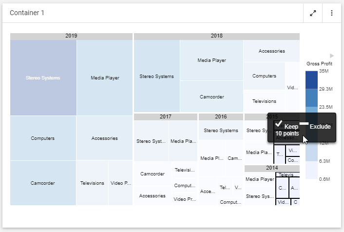
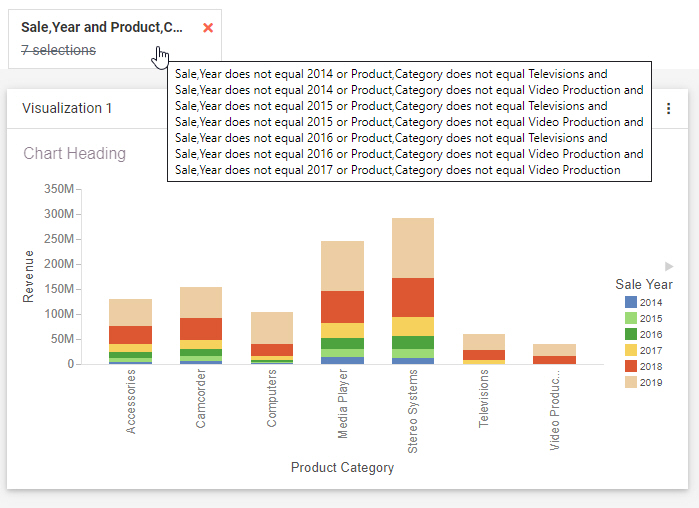
When creating
prompted filters for new content, you can choose to exclude data values from
the list. To do this, right-click the filter and select
Exclude. The not equal icon is added to the filter label to indicate that the selected values are excluded. You can then click the
filter control
again, and begin clicking the data values that you want to exclude from the
list, as shown in the following image. Once you have selected the data values that you want to exclude, your
chart refreshes.
At run time,
instead of choosing which values to display in the chart, users select values
to exclude from the chart.
You can also set a
prompted filter for new content to use a single value instead of multiple
values. If you right-click a prompted filter for new content and click
Single, when you click the filter control again, you
are only able to select a single value. In filters for existing content, you
will have already defined whether or not the filter is multiselect or
single-select.
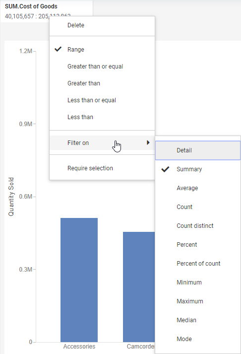
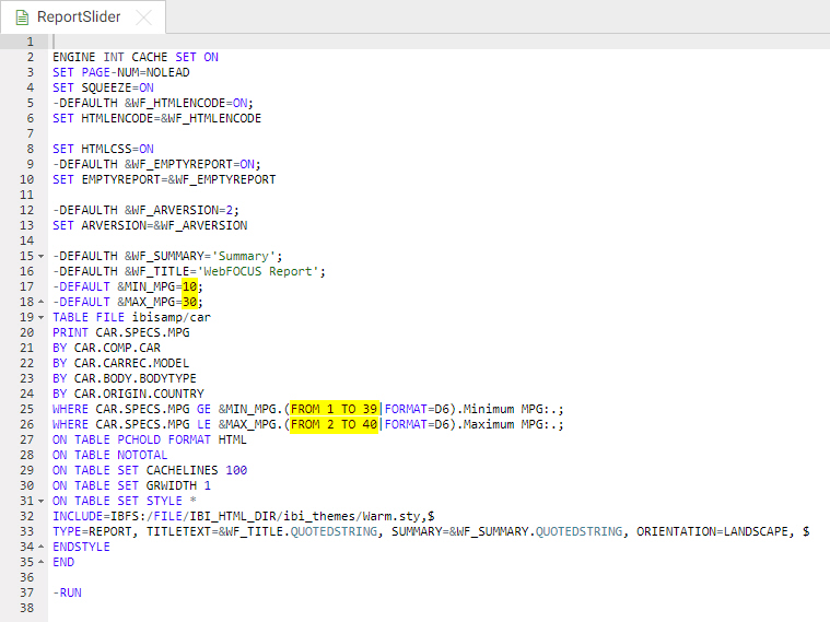
If you add a
filter using a numeric field, such as a measure, (for example, Cost of Goods),
you can use a slider to adjust the range of data values that display, as shown
in the following image.
Click the filter,
and use the slider options on either side to modify the range of data values.
You can set a range using both ends of the slider. To select a single value,
set both ends of the slider to the same value.
The filter for a
numeric field is applied after aggregation by default. That means that the
filter is applied based on summed values for all sort values in the chart
instead of filtering each row of the data source before aggregation. You can
right-click a new prompted filter and point to
Aggregation to select a different aggregation
operation, or select
Detail to apply the filter to each row before
aggregation. For more information, see
Summarizing Numeric Data Using Filters.
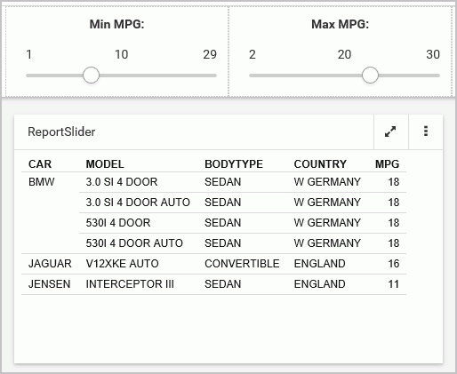
If you right-click a new numeric filter and select
Greater than or equal or
Greater
than, you can select a minimum value for the filter range. The
upper limit on the slider is fixed and cannot be moved.
Selecting
Greater than or equal includes the value indicated
by the slider in the filter, while selecting
Greater than excludes this value. Similarly, if
you right-click a numeric filter and select
Less than or
equal or
Less than, you can select a maximum value to
display. The lower limit on the slider is fixed and cannot be moved.
Selecting
Less
than or equal includes the value indicated by the slider in the
filter, while selecting
Less
than excludes this value. The slider displays the greater than
(>),
less than (<), greater than or equal to (≥), and less than or equal to
(≤) symbols to differentiate your choices.
Note: Selecting the
full range of values in the slider includes all values in the filter. The value
indicated by the slider head is not excluded in this case, even if the
Greater
than or
Less
than filter options are used.
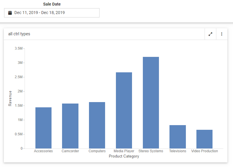
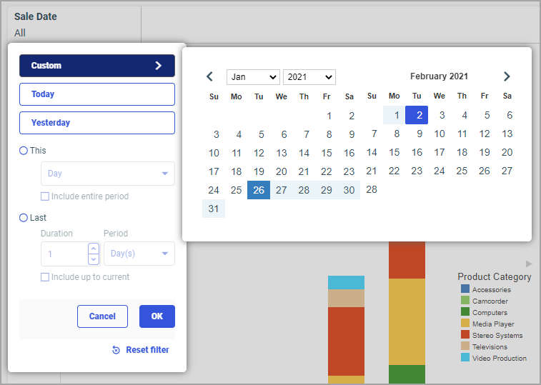
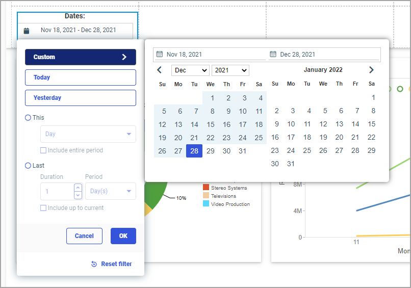
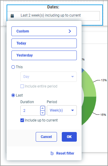
If you add a date
field, you can use the date picker window to select a start or end date, range
of dates, and more, as shown in the following image.
You can use a
default range available in the list on the left, or select your own range of
dates from the calendar.
Click the
same date twice to select a single day.
If you right-click
a new date filter and select
After or
Before, you are unable to select a range using
either the preset or custom range options. Instead, use the calendar to select
a start or end date for the filter.
Similar to
filtering a numeric field, you can right-click a date filter control and click
On or
after or
On or
before, as an alternative to
After or
Before, to include the start or end date selected in
the calendar. The
After and
Before options do not include the selected date in
the date range of the filter.
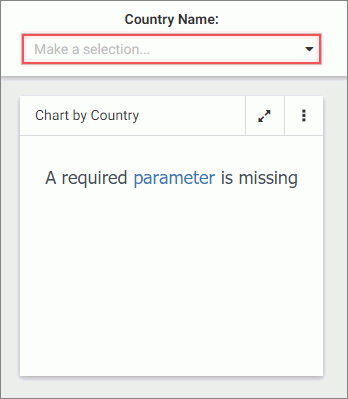
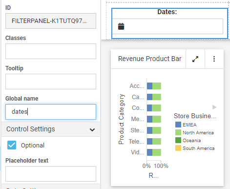
In addition to the
options specific to each type of filter, you can make the filter required. When
a filter is required, filtered content will not load until the user makes a
selection for that filter. To make a prompted filter for new content required,
right-click the filter and click
Require selection. To make a prompted filter for
existing content required, select the filter control and, on the Settings tab
of the Properties panel, clear the
Optional check box.
When this content item runs, the autoprompt window displays, prompting you to choose a value from the drop-down list, as
shown in the following image. You can also use the Search field to locate a value.
You can
right-click a filter control for existing content on a page to access
formatting options. For example, you can convert a list control to radio
buttons, check boxes, or a button pane, merge two related controls, and access
configuration and format options on the Properties panel. For more information,
see
Styling Filter Controls in a Visualization.
Chaining
Filter Control Selections
When a content
item or page includes multiple filters, chaining ensures that those filters
always return valid values to your content. When you select a value from one of
the filter controls, the other controls can be filter and updated based on the
value that you select, if chaining is applied. For example if you have a filter
for Sale Quarter chained to a filter for Sale Month, then when you select Q1
from the Sale Quarter filter, the Sale Month filter updates to show only the
months of January, February, and March, and automatically excludes any month
values that were not in Q1.
Two different
chaining behaviors are available: multidirectional and hierarchical. When
multiple prompted filters for alphanumeric dimension fields are created in a
visualization created with new content, they are chained multidirectionally, by
default. This means that the selection from one prompted filter control
automatically filters and updates the available values in all other controls
for alphanumeric fields, so they only display relevant values. This ensures
that users cannot select filter values that result in no data displayed in the
visualization, regardless of the order and arrangement of the filter controls.
To select a value that has been hidden because of chaining, clear any other
filters that may have resulted in the value being unavailable. Note that
on-chart filtering also affects the available filter values when
multidirectional chaining is enabled.
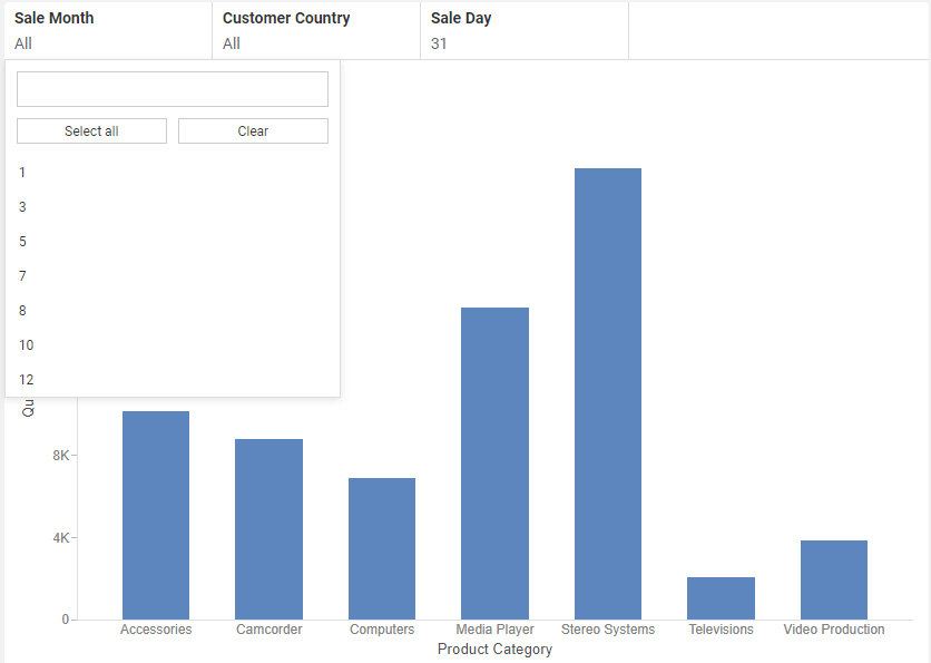
For example,
the following image shows a chart with multidirectional filter chaining
enabled. Notice that, since the filter for Sale Day was set to
31, only months with 31 days are shown in the
drop-down list for Sale Month.
If you make
selections in one filter control, and then make selections in another chained
filter control that make some of the original values unavailable, those
originally selected values are restored when the other filters are cleared. For
example, if you set the Sale Month filter to
September and
December, and then set the Sale Day to
31, September is no longer visible in the Sale Month
control, since it only has 30 days. Only December is selected. When you clear
the Sale Day control, both September and December are selected once again in
the Sale Month control.
Full
multidirectional chaining is only applied to list controls. Calendar and slider
controls are not chained. While slider controls and preset ranges in calendar
controls update to reflect the current range of data, similar to chaining, the
values selected using a slider or calendar do not affect the other controls.
You can change
the chaining setting for filters in the page to hierarchical chaining or no
chaining by clicking the
Filter options menu
 and
selecting
Link hierarchies or
Do
not link filters, respectively. The option to change chaining
behavior is only applicable to stand-alone content or content created within a
visualization.
and
selecting
Link hierarchies or
Do
not link filters, respectively. The option to change chaining
behavior is only applicable to stand-alone content or content created within a
visualization.
Hierarchical
chaining is based on drill levels in your metadata. When you select a filter
value, chaining is applied to fields that are lower in the same filter
hierarchy. Filter controls for fields that are higher in the same hierarchy are
not affected by filter selections when using hierarchical chaining, nor are
filter controls for fields that are not in the same hierarchy.
Hierarchical
chaining is the default behavior for filter controls that are added to a page
from external content. When external content is added to a visualization,
hierarchical chaining is applied automatically to any content with WHERE
filters using a WITHIN phrase. WebFOCUS Designer automatically adds the WITHIN
phrase to filters from the same metadata hierarchy, so hierarchical chaining is
enabled for content items created in WebFOCUS Designer by default when they are
added to a page as external content.
When
assembling a page from existing content, you can manually apply hierarchical
chaining relationships to filter controls from the Filters tab on the sidebar,
even if those fields are not part of the same metadata hierarchy. The Filters
tab shows a list of all parameters in your assembled page. The order of this
list does not impact filtering behavior, but the parameter list does indicate
chaining hierarchies, which display as values indented below their parent
value. Drag a parameter in the list on the Filters tab onto another parameter
to make it a child of that filter control. You can create a multi-level
chaining hierarchy so that selections from one filter apply chaining to a
second filter, and selections from the second filter apply chaining to a third
filter. The following image shows the parameter list with a selection of
filters that have been added to a page assembled from existing content.
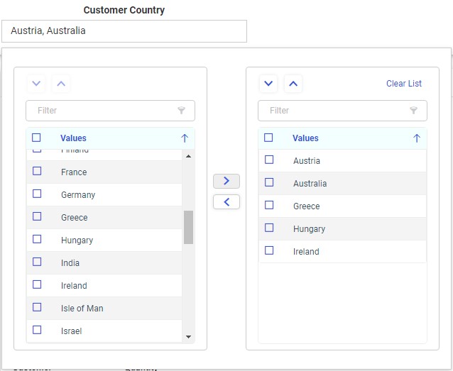
In this
example, the filter selections in the Customer Business Region filter are
chained to the Customer Country and Customer State Province fields, so if you
select North America as the business region, then only countries and provinces
in North America will be available from the other respective filter controls.
Since hierarchical chaining is unidirectional, if you select a country for the
Customer Country filter, the Customer Business Region is not affected, so you
could still select a business region other than the one that contains the
previously selected country.
Filters from
multiple data sources used for content in an assembled page can be chained
together, although if the field name and values of parent filters do not exist
in the data source used for the child filter, chaining will not work properly.
To unchain a parameter, drag it into the empty space between the
Add
all filters to page button and the top parameter in the list. The
parameter is removed from the chaining hierarchy and moved to the bottom of the
list.


 to
move them to the list of applied filter values on the right. You can also
double-click a single value to move it from one list to the other. Click
outside of the double list control to apply the filter selection.
to
move them to the list of applied filter values on the right. You can also
double-click a single value to move it from one list to the other. Click
outside of the double list control to apply the filter selection.
 in the
control, or by dragging an item up or down within the list on the right. When
the double list filter control is used in a multi-select field list parameter,
this allows you to change the order in which user selected fields appear in
dynamic content. For example, you can use the double list control with a
multi-select field list parameter to swap the primary and secondary sort fields
in a report, placing focus on different values. To create a multi-select field
list parameter, click
in the
control, or by dragging an item up or down within the list on the right. When
the double list filter control is used in a multi-select field list parameter,
this allows you to change the order in which user selected fields appear in
dynamic content. For example, you can use the double list control with a
multi-select field list parameter to swap the primary and secondary sort fields
in a report, placing focus on different values. To create a multi-select field
list parameter, click
 . You
can also click
. You
can also click


 , which
appears on the page toolbar at run time. You are prompted to type a name for
the bookmark. Click
, which
appears on the page toolbar at run time. You are prompted to type a name for
the bookmark. Click