Menus and Toolbar Elements
Subordinate to each of the elements that specify where the custom interface is launched, are <menus> and <toolbarButtons> elements (with the exception of the <WorkspaceMasterSelection> location element, which has only a subordinate <toolbarButtons> element).
The <menus> and <toolbarButtons> elements are empty by default. For example:
<WorkspaceToolbar>
   <menus>
   </menus>
   <toolbarButtons>
   </toolbarButtons>
</WorkspaceToolbar>
To configure custom interfaces to launch from a menu, you must add <menu> and <menuItem> elements below <menus>, where <menu> represents a drop-down menu, and <menuItem> configures an individual item on the menu. For example:
<menus>
    <menu>
      <menuItem>
      </menuItem>
      <menuItem
      </menuItem>
    </menu>
  </menus>
To configure custom interfaces to launch from a toolbar button, you must add <toolbarButton> elements below <toolbarButtons>. For example:
<toolbarButtons>
    <toolbarButton
    </toolbarButton>
    <toolbarButton
    </toolbarButton>
  </toolbarButtons>
</WorkItemsList>
Then inside of the <menu> and <toolbarButton> elements, you must add the appropriate attributes that define the desired custom interface. These attributes are described in Configuring <menu> and <menuItem> Elements and Configuring <toolbarButton> Elements.
Configuring <menu> and <menuItem> Elements
The <menu> and <menuItem> elements must contain the appropriate attributes to configure the desired custom interface that is to be launched from a menu selection.
The following is an example of a custom interface that can be launched from a menu on the work item list:
<WorkItemsList>
  <menus>
    <menu name="WIMenu" displayText="Accounts"
      description="accounts payable and receivable access"
      toolTip="open accounts payable or receivable"
      image="JSXAPPS/base/application/images/custom2.gif"
      enable="always">
      <menuItem name="WIitem1" displayText="Payable"
         description="accounts payable access"
         image="JSXAPPS/base/application/images/custom1.gif"
         enable="always">
            <simpleHubIframe location="dialog"
            features="resizable,minimize,maximize,close,center"
            source="http://ozquadling:8090/iFrameInterface/Payable.html">
            </simpleHubIframe>
      </menuItem>
      <menuItem name="WIitem2" displayText="Receivable"
        description="accounts receivable access"
        image="JSXAPPS/base/application/images/custom1.gif"
        enable="always">
        <scriptedInterface location="browser"
        features="resizable,scrollbars,status,center,width=500,height=400"
        source="loadInterface_WIitem2">
        </scriptedInterface>
      </menuItem>
    </menu>
  </menus>
</WorkItemsList>
The <menu> element contains the following attributes:
- name - (required) A unique identifier for the custom interface menu. A user access element is created with this name (for more information, see User Access Elements for Custom Interfaces).
- displayText - (optional) If you are not localizing your application, this can be the text you want to display on the menu title. If you are localizing, this must be the ’id’ record, in the customInterfaceLocale.xml file, that specifies the text to display on the menu title. You may also choose to not provide display text, for instance, if you want only an image to appear.
- description - (optional) This is the description that displays in the Configuration Administrator when the user access control for the menu is selected. If you are not localizing your application, this can be the text you want to display for the user access control description. If you are localizing, this must be the ’id’ record, in the customInterfaceLocale.xml file, that specifies the user access control description.
- toolTip - (optional) This is the text that displays when the cursor hovers over the menu. If you are not localizing your application, this can be the tooltip text you want to display. If you are localizing, this must be the ’id’ record, in the customInterfaceLocale.xml file, that specifies the tooltip text.
- image - (optional) The path to the image associated with the menu.
- enable - (optional) Specifies when the menu should be enabled, as follows
- always - (default) The menu is always enabled. Note that this is the only possible value for menus in the main application toolbar (<WorkspaceToolbar> element).
- any - The menu is enabled when any items in the associated list are selected; it is disabled if no items are selected.
- single - The menu is enabled when a single item in the associated list is selected; it is disabled if no items or multiple items are selected.
- never - The menu is initially disabled; enabling/disabling of the menu is managed in custom JavaScript.
The <menu> element must contain one or more <menuItem> sub-elements that represent items in the drop-down area of the menu. Custom interfaces are launched from the <menuItem> elements, which have the following attributes:
- name - (required) A unique identifier for the custom interface menu item. A user access element is created with this name (for more information, see User Access Elements for Custom Interfaces).
- displayText - (optional) If you are not localizing your application, this can be the text you want to display on the menu item. If you are localizing, this must be the ’id’ record, in the customInterfaceLocale.xml file, that specifies the text to display on the menu item. You may also choose to not provide display text, for instance, if you want only an image to appear.
- description - (optional) This is the description that displays in the Configuration Administrator when the user access control for the menu item is selected. If you are not localizing your application, this can be the text you want to display for the user access control description. If you are localizing, this must be the ’id’ record, in the customInterfaceLocale.xml file, that specifies the user access control description.
- image - (optional) The path to the image associated with the menu item.
- enable - (optional) Specifies when the menu item should be enabled, as follows:
- always - (default) The menu item is always enabled.
- any - The menu item is enabled when any items in the associated list are selected; it is disabled if no items are selected.
- single - The menu item is enabled when a single item in the associated list is selected; it is disabled if no items or multiple items are selected.
- never - The menu item is initially disabled; enabling/disabling of the menu item is managed in custom JavaScript.
The <menuItem> element must also have a sub-element that specifies the type of custom interface that is launched from the menu item. For information about the available custom interface type elements, including their attributes, see Custom Interface Type Specification.
Configuring <toolbarButton> Elements
The <toolbarButton> element must contain the appropriate attributes to configure the desired custom interface that is to be launched from a toolbar button.
The following is an example of a custom interface that can be launched from a toolbar button on the work item list:
<WorkItemsList>
   <toolbarButtons>
     <toolbarButton name="WIbutton1" displayText="Orders"
        description="orders access" toolTip="outstanding orders"
        image="JSXAPPS/base/application/images/custom1.gif"
        enable="any">
        <simplePrototype location="areaB"
          source="JSXAPPS/CustomInterface/prototypes/interface2.xml">
        </simplePrototype>
    </toolbarButton>
    <toolbarButton name="WIbutton2" displayText="Deliverables"
       description="deliverables access"
       toolTip="outstanding deliverables"
       image="JSXAPPS/base/application/images/custom1.gif"
       enable="single">
       <simpleIframe location="areaC"
         source="http://www.acme.com/deliverables/">
       </simpleIframe>
    </toolbarButton>
  </toolbarButtons>
</WorkItemsList>
The <toolbarButton> element contains the following attributes:
- name - (required) A unique identifier for the custom interface toolbar button. A user access element is created with this name (for more information, see User Access Elements for Custom Interfaces).
- displayText - (optional) If you are not localizing your application, this can be the text you want to display on the toolbar button. If you are localizing, this must be the ’id’ record, in the customInterfaceLocale.xml file, that specifies the text to display on the toolbar button. You may also choose to not provide display text, for instance, if you want only an image to appear.
- description - (optional) This is the description that displays in the Configuration Administrator when the user access control for the toolbar button is selected. If you are not localizing your application, this can be the text you want to display for the user access control description. If you are localizing, this must be the ’id’ record, in the customInterfaceLocale.xml file, that specifies the user access control description.
- toolTip - (optional) This is the text that displays when the cursor hovers over the toolbar button. If you are not localizing your application, this can be the tooltip text you want to display. If you are localizing, this must be the ’id’ record, in the customInterfaceLocale.xml file, that specifies the tooltip text.
- image - (optional) The path to the image associated with the toolbar button.
- enable - (optional) Specifies when the toolbar button should be enabled, as follows:
- always - (default) The toolbar button is always enabled. Note that this is the only possible value for toolbar buttons in the main application toolbar (<WorkspaceToolbar> element), as well as in the master selection area (<WorkspaceMasterSelection> element).
- any - The toolbar button is enabled when any items in the associated list are selected; it is disabled if no items are selected.
- single - The toolbar button is enabled when a single item in the associated list is selected; it is disabled if no items or multiple items are selected.
- never - The toolbar button is initially disabled; enabling/disabling of the button is managed in custom JavaScript.
The <toolbarButton> element must also have a sub-element that specifies the type of custom interface that is launched from the toolbar button. For information about the available custom interface type elements, including their attributes, see Custom Interface Type Specification.
Custom Interface Type Specification
Both the <menuItem> and <toolbarButton> elements must have a sub-element that specifies the type of custom interface. This sub-element has attributes that specify the source and location of the custom interface.
The following are valid sub-elements of the <menuItem> and <toolbarButton> elements:
| Custom Interface Type | Description |
|---|---|
<simpleIframe> |
A simple iFrame interface. |
<simpleHubIframe> |
A simple Managed Hub iFrame interface. This must contain <subscribe> or <publish> sub-elements, which contains <topic> sub-elements specifying the event topics to which the interface subscribes and publishes. For more information, see Simple Managed Hub iFrames Subscriptions and Publications . |
<simplePrototype> |
A TIBCO General Interface prototype. |
<scriptedInterface> |
The custom interface is determined in JavaScript. All custom interfaces of this type must have a handler method in the …JSXAPPS\workspace\application\js\AppMain.js file. The name of the method must match the value of the source attribute in the scripted interface definition. The method is automatically invoked when the menu item or toolbar button of the custom interface is selected. Helper methods are provided to use with this interface; see Custom Interface Helper Methods . |
For more information about these custom interface types, see Supported Custom Interfaces.
Each of the custom interface type elements includes the following attributes:
- source - (required) The source of the custom interface.
- For <simpleIframe>, this is a URL to a web page.
- For <simpleHubIframe>, this is a URL to a web application.
- For <simplePrototype>, this is a path to a TIBCO General Interface prototype.
- For <scriptedInterface>, this is the name of a method in JSXAPPS\workspace\application\js\AppMain.js that contains custom JavaScript for creating the custom interface.
- location - (required) The location in the Workspace application where the custom interface will display. Depending on the type of custom interface, and the location of the menu that launches the interface in the Workspace application, only a subset of the following locations may be valid. For specifics regarding valid locations for each type of custom interface, see
Valid Custom Interface Locations. Possible values include:
- areaA - The area where the work views, process views, event views, and business services lists display. See Area A.
- areaB - The area where the work items, process instances, and events lists display. See Area B.
- areaC - The area where the preview pane for work items, and process instances display, and where the event attributes display in the event viewer. See Area C.
- areaD - The combination of areaB and areaC. Note that when areaD is specified, the vertical splitter that separates the left and right (in side-by-side layout), or upper and lower (in stacked layout) areas of the application layout is disabled for the simpleIframe and simpleHubIframe custom interface types. See Area D.
- dialog - The custom interface displays in a floating dialog. See Dialog.
- browser - The custom interface displays in separate browser window. See Browser.
- script - The location is determined in JavaScript (scriptedInterface type only).
- features - If the location is "dialog" or "browser", an additional optional
features attribute may be included to specify positioning and display characteristics of the dialog or browser window. The value of the
features attribute is a comma-separated string that may contain any of the following:
For location = "dialog":
- resizable - Permits resizing of the dialog.
- modal - The dialog is modal and no operation may be performed until the dialog is closed.
- minimize - A button is displayed for minimizing the dialog .
- maximize - A button is displayed for maximizing the dialog.
- close - A button is displayed for closing the dialog.
- fullscreen - The dialog is displayed maximized to fill the screen.
- center - The dialog is displayed in the center of the screen (not applicable if "fullscreen" is specified).
- left=nnn - The dialog is displayed nnn number of pixels from the left of the screen (not applicable if "center" or "fullscreen" is specified).
- top=nnn - The dialog is displayed nnn number of pixels from the top of the screen (not applicable if "center" or "fullscreen" is specified).
- width=nnn - The dialog is displayed nnn number of pixels wide (not applicable if "fullscreen" is specified).
- height=nnn - The dialog is displayed
nnn number of pixels high (not applicable if "fullscreen" is specified).
Example for location = "dialog":
features="resizable,minimize,maximize,close,center"
For location = "browser":
- channelmode - The browser window is displayed in "theater mode", that is, a maximized window (Internet Explorer only).
- dialog - The browser window is displayed as a dialog.
- directories - The "Bookmarks Toolbar" is displayed (Firefox only).
- location - The "Navigation Toolbar" is displayed in Internet Explorer, the "Location Bar" is displayed in Firefox, or the "Toolbar" and "BookMarks Bar" are displayed in Safari.
- menubar - The "Menu Bar" is displayed.
- resizable - The user may resize the browser window (Internet Explorer only).
- scrollbars - Scrollbars are displayed if the contents overflow the size of the browser window (Internet Explorer and Firefox only).
- status - A status bar is included in the browser window (Internet Explorer only).
- toolbar - The "Toolbar" is displayed.
- fullscreen - The browser window is displayed maximized to fill the screen.
- center - The browser window is displayed in the center of the screen (not applicable if "fullscreen" is specified).
- left=nnn - The browser window is displayed nnn number of pixels from the left of the screen (not applicable if "center" or "fullscreen" is specified).
- top=nnn - The browser window is displayed nnn number of pixels from the top of the screen (not applicable if "center" or "fullscreen" is specified).
- width=nnn - The browser window is displayed nnn number of pixels wide (not applicable if "fullscreen" is specified).
- height=nnn - The browser window is displayed
nnn number of pixels high (not applicable if "fullscreen" is specified).
Example for location = "browser":
features="resizable,scrollbars,status,center,width=500,height=400"
Simple Managed Hub iFrames Subscriptions and Publications
If you are configuring a Simple Managed Hub iFrame custom interface, you can specify that the custom interface subscribe to a WCC component event, subscribe to a custom event, or publish an event, as follows.
- Subscribe to a WCC component event
- This is done using a <subscribe> element, which contains one or more <topic> sub-elements, each specifying a WCC component event to which the interface subscribes. For example:
<simpleHubIframe location="dialog"
           features="resizable,minimize,maximize,close,center,width=700,height=700"
           source="http://server:port/HubIframeSample/HubIframeSample.html">
  <subscribe>
      <topic name="com.tibco.wcc.workspace.wccPrototype.wccWorkItems.listItemSelect"
            event="listItemSelect"></topic>
      <topic name="com.tibco.wcc.workspace.wccPrototype.wccWorkItems.listExecute"
            event="listItemSelect"></topic>
  </subscribe>
</simpleHubIframe>
In this example, the custom interface is subscribing to the listItemSelect and listExecute events on the work item list component.
The name attribute in the <topic> element must be in the form:
com.tibco.wcc.workspace.wccPrototype.wccComponent.eventName
where:
- wccComponent identifies the WCC component for the event. The valid component names are:
- wccWorkViews - Work Views
- wccWorkItems - Work Items
- wccProcessViews - Process Views
- wccProcessInstances - Process Instances
- wccBusinessServices - Business Services
- wccEventViews - Event Views
- wccEventViewer - Event Viewer
- wccProcessTemplates - Process Templates
- wccProcessTemplatesEx - Process Templates Ex
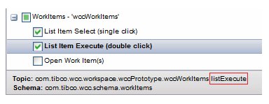
- eventName identifies the event to which the custom interface is subscribing. For information about the names of the events published by each WCC component, see the "Non-WCC Subscribing to WCC Events" section in the
TIBCO Workspace Components Developer Guide. Note that you can also view event names using the Configuration Administrator by selecting a component event in the UI and viewing the comment. For example:
The event attribute in the <topic> element is the name of the event to which the interface is subscribing; this is the same as the eventName token in the name attribute. This attribute is used internally.
- wccComponent identifies the WCC component for the event. The valid component names are:
- Subscribe to a custom event - The custom interface can subscribe to a custom event (that is, a PageBus event other than a WCC component event) by including a <subscribe> element that contains one or more <topic> sub-elements, each specifying a PageBus event to which the interface subscribes. For example:
<simpleHubIframe location="dialog"
          features="resizable,minimize,maximize,close,center,width=700,height=700"
          source="http://server:port/HubIframeSample/HubIframeSample.html">
  <subscribe>
      <topic name="com.customer.main.event.post" </topic>
      <topic name="com.customer.backup.event.post"</topic>
  </subscribe>
</simpleHubIframe>
- Publish a custom event - The custom interface can publish a custom event to PageBus by including a <publish> element, which contains one or more <topic> sub-elements, each specifying a PageBus event to publish. For example:
<simpleHubIframe location="dialog"
           features="resizable,minimize,maximize,close,center,width=700,height=700"
           source="http://server:port/HubIframeSample/HubIframeSample.html">
  <publish>
      <topic name="com.customer.account.val.created" </topic>
  </publish>
</simpleHubIframe>
The WCC client application automatically subscribes to all custom events published by the custom interface.
An onHubSubscribeComplete callback method is provided in JSXAPPS\wccProjectName\application\js\AppMain.js, that is invoked when the client application subscribes to each custom event. This method can be used to verify the success of the Managed Hub subscription:
/**
* onHubSubscribeComplete - callback method that is invoked when the client application
subscribes to a Simple Managed Hub iFrame custom event.
*
* @param {*} item - Id of the event for which the subscribe operation was invoked
* @param {Boolean} success -  If subscribe operation succeeded then true, else false
* @param {OpenAjax.hub.Error} errCode - If success != true, then contains a string error
*                                      code, else is undefined
*/
        classProto.onHubSubscribeComplete = function(item, success, errCode) {
            if (!success) {
                this.logError("Subscribe failed (" + item + "): " + errCode);
            }
        };
When a custom event, to which the client has successfully subscribed, is published by the custom interface, the onHubEventData callback method is invoked in JSXAPPS\wccProjectName\application\js\AppMain.js. This method is used to handle a Managed Hub event that has been published by the custom interface:
/**
* onHubEventData - callback method that is invoked when a Simple Managed Hub iFrame custom
*                  interface publishes a custom event.
*
* @param {String} topic - The topic on which the event was published
* @param {*} data - The event "payload" data. Can be any JSON-serializable value.
*/
        classProto.onHubEventData = function(topic, data) {
            if (topic == 'HubIframeSample.publish') {
                alert('event received: ' + topic + ' - ' + data.body.sample);
            }
        };