Types of Panes
There are several types of panes: vertical, horizontal, tabbed, message, grid, record, embedded form, and modal dialog panes. Each pane type is represented by an icon in the palette.
It can be difficult to distinguish between a vertical pane and a horizontal pane before you place any controls or child panes in them. For this reason, these pane types are distinguished in the Design tab by small chevron icons pointing down for vertical panes and to the right for horizontal panes. (The chevrons do not appear at runtime or in the preview tabs.)
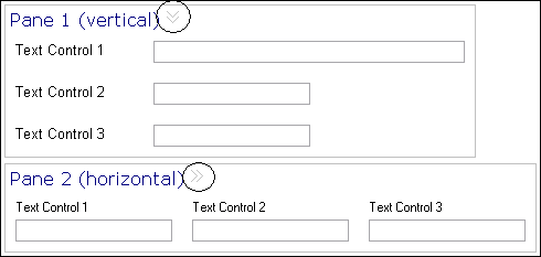
Vertical Pane
A vertical pane is a pane in which controls are arranged vertically, with one above the other. Vertical panes are auto-sized to hold controls, child panes, or both.
Horizontal Pane
A horizontal pane is a pane in which controls or child panes are arranged horizontally, with one next to the other. Horizontal panes are auto-sized to hold the controls or child panes within them.
Tabbed Pane
Tabbed panes provide a means of stacking a set of related panes such that one pane at a time is visible. Each pane has a corresponding tab, which are arranged in sequence along one of the tabbed pane’s vertical or horizontal edges.
The direct children of a tabbed pane must be panes, not controls. The canvas prevents you from inadvertently placing controls directly inside a tabbed pane. Clicking on or otherwise selecting a tab activates its associated pane (make it visible). This “select-tab-to-activate-pane” behavior is common to both design time and runtime. At design time, however, a tabbed pane offers additional capabilities to aid in the design process:
-
- Expand/collapse the tabbed pane
- A special toggle button positioned after the new pane button, that toggles the state of the tabbed pane between a collapsed state and an expanded state. The collapsed state has one pane visible whereas the expanded state has all child panes visible side-by-side. In the expanded state, the tabbed pane behaves similar to a horizontal or vertical pane. You can add, move, and delete controls on the expanded pane. The expanded state is particularly useful when you want to rearrange or delete child panes or move controls between panes.
Message Pane
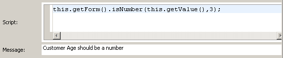
The figure Script and Message Example for a Message Pane shows a typical validation script and message for a Text control.
The appearance of a message pane, the label font and layout, can be configured through the Properties view for the pane.
Record Pane
A record pane is used to edit a list of complex objects, one record at a time. It supports the ability to view and edit the contents of one element of an array of complex objects. A set of navigation controls is provided to support moving between the records in the list. The record pane uses the same layout as the vertical pane.
The record pane displays the contents of a list of objects. The contents of the list in a record pane is linked with the list in one of the following ways:
- The pane value is bound to a multi-valued complex parameter.
- The pane value is bound to a multi-valued child of a complex object.
- The value of the pane is updated with a list of complex objects via an API function call.
- The value of the pane is updated with a list of complex objects via a computation action.
For either of the latter two approaches, the Pane Data Type property needs to be set in the form model to the type of object that is set on the pane with a list.
The Properties tab of a record pane’s Properties view displays a set of properties. You can refer to Properties View for Panes section for the complete listing of the Properties tab.
Navigation Controls
The controls on the navigation bar perform the following operations:
- Go to the first record.
- Go to the previous record. There is no change if you are at the first record.
- Go to the next record. There is no change if you are at last record.
- Go to the last record.
The label displays: Record [index] of ##. The index indicates the current record and ## indicates the length of the list. You can directly edit the index value. If a number less than 1 or a number greater than the length of the list is specified, the index is reset to the value it was set earlier.
Grid Pane
Grid panes are generated in a default form for complex data when the data type is defined as allowing multiple instances, for example, zero-to-many (*) or one-to-many (1..*). When a grid pane is rendered, attributes of complex data types correspond to columns, and each of the multiple instances corresponds to a row.
By default, the data displayed in a grid pane is not sorted by columns. If the default sort column and sort order are specified, the form is loaded initially according to the specified sorting. At runtime, clicking the column header sorts the rows in ascending order based on the values in that column, and clicking the column again sorts the rows in descending order. Clicking once more on the column restores the unsorted natural record order.
Several properties appear in the Properties tab of a grid pane’s Properties view that are particular to this type of pane. Refer to Properties View for Panes section for the complete listing of the Properties tab.
Modal Dialog Pane
A modal dialog pane blocks the rest of the form until the user closes the modal dialog.
This pane has a title bar and an optional Close button. However, by default a Close (X) button is displayed on the title bar. You can configure OK and Cancel buttons as required. By default, the pane also supports the Escape key.
Vertical or horizontal panes can be converted into modal dialog panes. You cannot add a modal dialog pane to another modal dialog pane, nor to a record pane, nor as a direct child (tab) of a tabbed pane. A modal dialog pane cannot be static.
Modal dialog panes support the following events: