Working with the Component Library File
A special folder of type Components is used to store component library files. A library file defines a set of custom controls which are available in the Forms Designer palette.
The option to create the Components special folder is presented at the time of new project creation.
Procedure
Result
- Click Finish: creates a new project with a Components special folder. The <library>.library file is created in the Components special folder.
- Click Next: displays a wizard page that guides you to create a new component library project.
- Specify Folder and Filename on the Business Object Model page and click Next.
- Specify Folder and Library filename on the Component Library page and click Next.
- Specify Folder details on the Set Special Folders page and click Finish. This is an optional step. You can also click Finish in the preceding step. Creates a new project with a Components special folder. The .library file is created based on the details provided in the wizard.Note: You can designate a normal folder as a Components special folder as well, using a similar 'Special Folders > Use as Components Folder' technique as with other special folder types.
The contents of the Components special folder are:
- Right-click the <library>.library file, and select Open. The library file is opened in the Component Library Editor for editing.
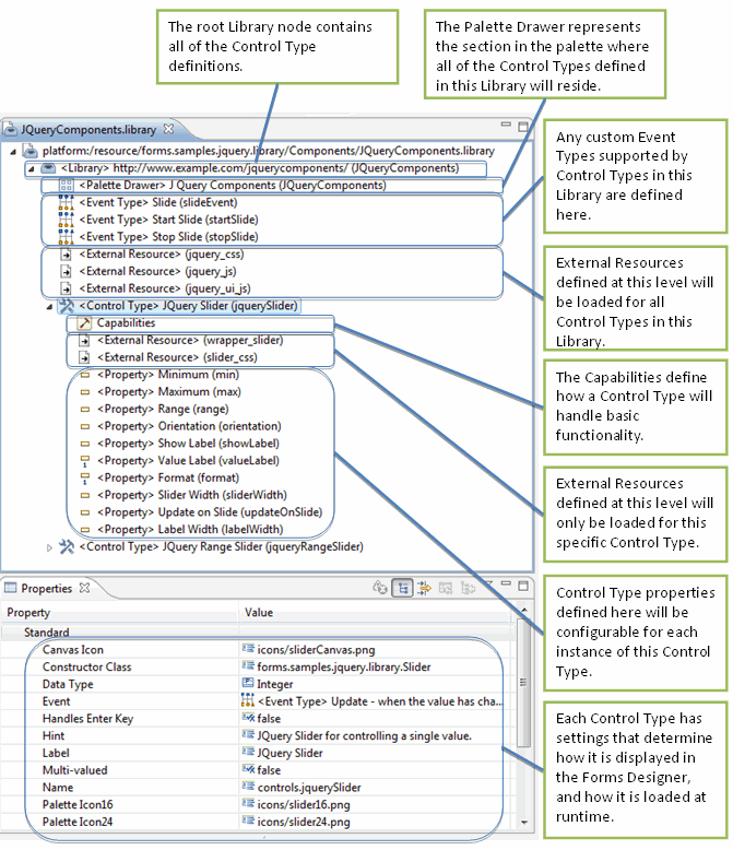
An overview of the various parts of the Component Library Model is provided in the figure Component Library Model.
- Select the <Librarynode to view and edit the configuration details for the library element in the Properties view. Refer to Library section for a detailed description.
The library element can have the following child elements:
- Palette Drawer: a Library has a single Palette Drawer element. Refer to Palette Drawer section for the details.
- Event Type: a Library can have multiple Event Type elements. Refer to Event Type section for the details.
- External Resource: a Library can have multiple External Resource elements. Refer to External Resource section for the details.
- Control Type: a Library can have multiple Control Type elements. Refer to Control Type section for the details.
- To add Event Type and External Resource elements at the Library level:
- Event Type: select the Library element, right-click, and select New Child > Event Type. A new Event Type element is added.
- External Resource: select the Library element, right-click, and select New Child > External Resource.
A new External Resource element is added. An External Resource defined at the Library level applies to all Control Types defined in the Library. It gets loaded into the page if the form uses at least one control type from the library.
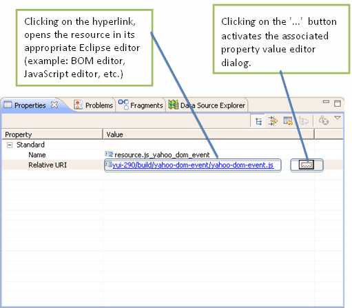
- Select each library element’s child elements to view and edit the configuration details in the Properties view. In the case of properties which refer to elements in the workspace, the cell editor consists of a hyperlink and a '...' button to activate the associated property value editor dialog. The figure Library Editor Properties View provides more details.
- The Control Type element can have the following child elements:
- Capabilities: a Control Type has a single Capabilities element. Refer to Capabilities section for details.
- External Resource: a Control Type can have multiple External Resource elements. The properties are same as for an External Resource element at the Library level.
- Property: a Control Type can have multiple Property elements. Refer to Property section for details.
- To add External Resource and Property elements at the Control Type level:
- External Resource: select the Control Type element, right-click and select New Child > External Resource. A new External Resource element is added. An External Resource defined at the Control Type level is guaranteed to be loaded into the page only when a form uses this control type from the library.
- Property: select the Control Type element, right-click and select New Child > Property. A new Property element is added.
- Select each Control Type’s child elements to view and edit the configuration details in the Properties view.
Copyright © Cloud Software Group, Inc. All rights reserved.


