Charts
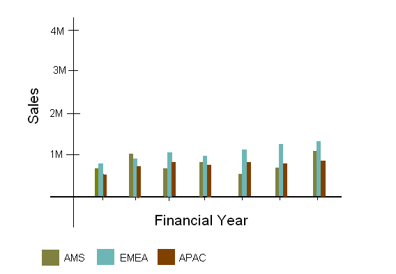
Suppose you need to create a chart that displays your company’s sales figures for each month in a financial year, broken down by region: Americas, Europe, and Asia Pacific.
- Visualize the Chart:
- Create the Chart:
- For this chart you will create three series, one for each region. Sales values go in the value fields and the months go in the category fields. (For more information about creating the chart, see Adding a Chart.)
Copyright © Cloud Software Group, Inc. All rights reserved.

