
The KPI chart is used to, at a quick glance, give information about the current performance of a company or organization. Factors, which are crucial for monitoring how the company performs, are measured and then presented in form of KPIs, Key Performance Indicators. The type of information that is shown varies. Examples of KPIs are information about net revenue, sales growth, and customer satisfaction.
The KPI chart consists of a grid of tiles, where each tile displays various KPI values for a certain category. Moreover, a simple line graph, sparkline, can be included to display the performance over time. Also the color of a tile background is a means to indicate performance. The data, on which the values are based, can differ from one tile to another. Also within a tile, data from different data tables can be used to calculate the displayed values.
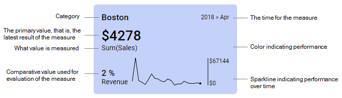
In a tile, performance can be visualized in different ways. You can
display a primary value, which shows the most recent measure of a certain factor.
display a comparative value to which the primary value is to be compared or evaluated. Examples of evaluations are comparisons of the actual value to a target, or to a corresponding value for another time period.
display a sparkline that shows the primary value over time. The dot ending a sparkline indicates the value of the most recent measure, and when on the time line it was measured. The sparklines can be supplemented with a scale showing the vertical range.
use colors of the tile backgrounds to signal the current performance level. Coloring rules can be set up that contain, for example, threshold values, against which the current primary value is evaluated. Depending on the results of the evaluations, the tile backgrounds are colored differently.
The tile details are explained below:
When indicating the performance, often different calculations are required to define the KPI values. For more information on the calculations, see Custom Expressions Introduction, Basic KPI Chart Example, and Comparing to Previous Time Period.
Multiple KPIs in a KPI chart
A KPI chart can contain several KPIs. Each KPI, in turn, can be split into several tiles, as shown below, and each tile shows the KPI values for a specific category of the data.

The tiles can be sorted in different ways. You can simply sort the categories in all the tiles in a common alphabetical sort order, alternatively in a reversed alphabetical order. Another option is to display the tiles in a 'Best First' or 'Worst First' order using measures that you decide to sort by per KPI. For example, the 'Worst First' common sort order makes it possible to gather tiles that show bad results from different KPIs at the very top of the chart.
Note: You can specify a minimum width of the tiles in the KPI chart. Moreover, the number of tiles that can be displayed in a KPI chart is limited to 100. If this number is exceeded, some tiles will not be visible.
Scheduled updates
To keep the data in a KPI chart up-to-date, the latest data can be downloaded using scheduled updates. For more information, see Scheduled Updates.